Boxes enable 1) to group a set of arrows by drawing a rectangle around them; 2) to express alternatives to the flow of the process; and 3) to add comments to the flow of the process. The first two use is by adding a set of arrows to the box, while in the third case no such arrows are added, making the box empty.
The syntax definition for boxes is as follows.
[box]entitynameboxsymbolentityname[attr=value|style, ...] {element; ... };
The box symbol is optional at the beginning of the line.
The boxsymbol can be ‘..’, ‘++’, ‘--’ or ‘==’ for
dotted, dashed, solid and double line boxes, respectively.
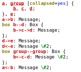
As with arrows the two entity names specify the horizontal span. These can be omitted (even both of them), making the box auto-adjusting to cover all the elements within. If there are no elements within and you omit one or both entities the default is to span to the edge of the chart. Specifying the entity names therefore, is useful if you want a deliberately larger or smaller box, or if you specify an empty box. Contrary to arrows, you can use group entities when specifying a box. The box will then cover all member entities in that group. Specifying the leftmost or rightmost member entity instead of the group entity makes a difference only if the group entity is collapsed. In the former case the box may disappear, in the latter case it will not. See the example below.
 |
 |
Boxes take attributes, controlling colors, numbering, text
identation quite similar to arrows. Specifically boxes also
have a label attribute that can also be shorthanded, as for
arrows. For example: ..: Auto-adjusting empty box; is a valid
definition. The valid box attributes are label,
number, refname, compress, vspacing, color, text.*,
line.*, shadow.* and fill.*. The latter
specifies the background color of the box, while line.*
specifies the attributes of the line around. Note that color for
boxes is equivalent to fill.color. text.ident
defaults to centering for empty boxes and to left identation
for ones having content.
After the (optional) attributes list, the content of the box can be
specified between braces ‘{’ and ‘}’. Anything can be
placed into an box, including arrows, dividers, other
boxes or commands.
If you omit the braces and specify no content, then you
get an empty box, which is useful to make notes, comments or
summarize larger processes into one visual element by omitting the
details.
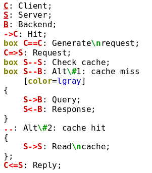
If a box definition is not followed by a semicolon, but another box definition, then the second box will be drawn directly below the first one. This is useful to express alternatives, see the below example.
 |
 |
The subsequent boxes will inherit the fill, line and text attributes
of the first one, but you can override them. The line type of subsequent boxes
(‘--’ in the example) will determine the style separating the boxes —
the border will be as specified in the first one.
The horizontal size of the combined box is determined by the first
definition, entity names in subsequent boxes are ignored.
Boxes can be collapsed, similar to group entities. The ‘indicator’
attribute governs if collapsed boxes show a small indicator to indicate
that there is hidden content inside.
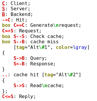
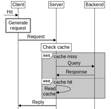
Boxes can also have tags, which are smal l enclosed labels at the top-left corner of the box. Tags are useful to label the content of the box, such as alternatives, loops or optional sections, while keeping the ability to add a regular box label, as well.
To specify a tag, use the tag attribute, and specify the label
of the tag. If the label contains non-alphanumeric characters (or spaces),
you need to put them in between quotation marks. You can specify the
appearance of the tag via the tag.line.*, tag.fill.* and the
tag.text.* attributes. Especially the tag.line.corner
attribute can be used to influence the bottom right corner of the tag
(but not the other corners).
 |
 |