In this tutorial, you will learn how to use the main features provided by the NetBeans Visual Library API. The Visual Library API is a visualization API, useful in the context of, for example, modeling and graphs.
All the information you need to know for working with this API is collected at these two locations:
Also, see Roman Strobl's Visual Library Screencast on Javalobby.
|
|
Before you begin, you need to install the following software on your computer:
Note: If you want to refer to the completed module project, you can download it here.
Also, you will use 3 icons in the tutorial. You can right-click them here and save them locally, then copy them to the module project's location, after you create the module project later in this tutorial. Here are the 3 icons:


In this section, we use wizards to create a module project and a custom window component.
Click OK.
Multiple files are generated, one of them is ShapeTopComponent. Open this file in Design mode. You should now see this:
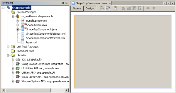
Programming with the Visual Library API is similar to programming in Swing. You build and modify a tree of visual elements that are called "widgets". The root of the tree is represented by a Scene class which holds all the visual data of the scene. The scene is a widget. You have to create a scene view, which is a JComponent. You must then add the JComponent to a JScrollPane.
In this section, we add a JScrollPane to our TopComponent. Then we create a new scene. Next, we pass the scene view to the TopComponent, so that it can be displayed in the TopComponent's JScrollPane. We then install the module project and display our first scene.
A red error underline and a lightbulb appears. Let the IDE generate the import statement.
A red error underline and a lightbulb appears again. Let the IDE generate the class's abstract methods.
public class GraphSceneImpl extends GraphScene {

    public GraphSceneImpl() {
    }

    protected Widget attachNodeWidget(Object node) {
        return null;
    }

    protected Widget attachEdgeWidget(Object edge) {
        return null;
    }

    protected void attachEdgeSourceAnchor(Object edge, Object oldSourceNode, Object newSourceNode) {

    }

    protected void attachEdgeTargetAnchor(Object edge, Object oldTargetNode, Object newTargetNode) {

    }

}
GraphSceneImpl scene = new GraphSceneImpl();
myView = scene.createView();

shapePane.setViewportView(myView);
add(scene.createSatelliteView(), BorderLayout.WEST);
Notice that we are creating two views. The first will be a large view for visualization of your graphs or models, and so on. The second is a satellite view, which we have placed in the WEST (i.e., the left side) of the TopComponent. This will let the user navigate quickly across the view and gives an overview of the entire scene.
Declare the view JComponent:
private JComponent myView;
public int getPersistenceType() {
   return TopComponent.PERSISTENCE_NEVER;
}
When the module installs, look under the Window menu and you will find a new menu item called "Shape", at the top of the list of menu items. Choose it and you will see the start of your Visual Library API implementation:
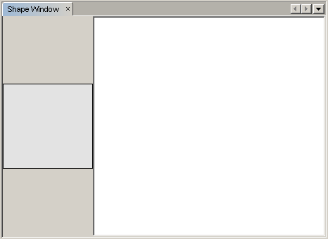
To do something useful with the Visual Library API, we will implement the Palette API so that we end up with a Component Palette containing the shapes shown at the start of this tutorial. Later, we will add the Visual Library API's drag and drop functionality so that we can drag and drop the shapes into the scene. After that, we will be able to enrich the scene with additional features, such as the ability to zoom and pan in the scene.
associateLookup( Lookups.fixed( new Object[] { PaletteSupport.createPalette() } ) );
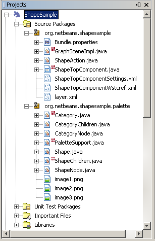
The Projects window should now look as follows:
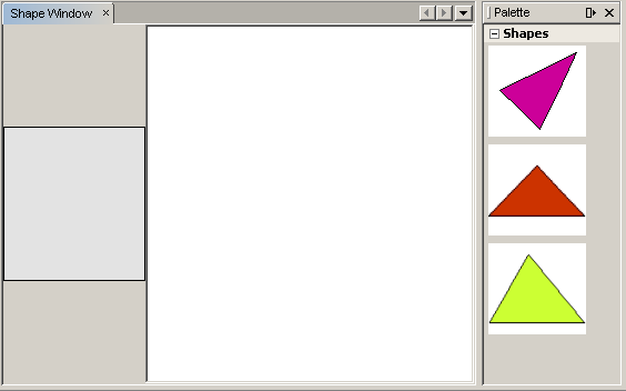
A LayerWidget represents a glasspane, similar to JGlassPane in Swing. It is transparent by default. So, before we go any further, we will add a LayerWidget to the scene, so that we have somewhere to place the visible widgets that we will drag and drop onto the scene.
private LayerWidget mainLayer;
mainLayer = new LayerWidget (this);
addChild (mainLayer);
Now, when we drag and drop items from the palette as widgets to the scene, we will add them as children of the LayerWidget. Because LayerWidgets are transparent by default, you could have various LayerWidgets transparently on top of each other so that, for example, you can add a background image to the scene.
For details, see LayerWidget in the Javadoc.
Earlier, we used the GraphSceneImpl class's constructor to pass a scene to the TopComponent's JScrollPane. So far, the scene exists but has no behavior. Behavior is added through actions. The action that we will look at in this section is called AcceptAction. This action enables drag and drop functionality. The drag and drop functionality could be applied to a widget, but here we apply it to the scene itself.
We use createAcceptAction to specify what should happen when an item from the palette is dragged over the scene. Two methods are involved here. The first, isAcceptable(), is used to determine whether the item is acceptable to the scene. Here you can test the item, by using the transferable. You can also set the drag image, which is all that we do in the implementation below. If true is returned, the accept method is called. Here we get the image from the transferable, using the same helper method as before. Then we call the addNode method, instantiating a new IconNodeWidget and passing the image retrieved from the transferable.
All the code in this section is interrelated, and you will receive red error underlines in your code until all the methods below have been added, but we will try to add everything in some kind of logical order anyway!
getActions().addAction(ActionFactory.createAcceptAction(new AcceptProvider() {

    public ConnectorState isAcceptable(Widget widget, Point point, Transferable transferable) {
        Image dragImage = getImageFromTransferable(transferable);
        JComponent view = getView();
        Graphics2D g2 = (Graphics2D) view.getGraphics();
        Rectangle visRect = view.getVisibleRect();
        view.paintImmediately(visRect.x, visRect.y, visRect.width, visRect.height);
        g2.drawImage(dragImage,
                AffineTransform.getTranslateInstance(point.getLocation().getX(),
                point.getLocation().getY()),
                null);
        return ConnectorState.ACCEPT;
    }

    public void accept(Widget widget, Point point, Transferable transferable) {
        Image image = getImageFromTransferable(transferable);
        Widget w = GraphSceneImpl.this.addNode(new MyNode(image));
        w.setPreferredLocation(widget.convertLocalToScene(point));
    }

}));
Note: After you add the above code, some red underlines will remain, denoting that there are errors. These errors are because the code above refers to a method and a class that you have not yet created. You will create them in the next steps.
private Image getImageFromTransferable(Transferable transferable) {
    Object o = null;
    try {
        o = transferable.getTransferData(DataFlavor.imageFlavor);
    } catch (IOException ex) {
        ex.printStackTrace();
    } catch (UnsupportedFlavorException ex) {
        ex.printStackTrace();
    }
    return o instanceof Image ? (Image) o : Utilities.loadImage("org/netbeans/shapesample/palette/shape1.png");
}
Note that you can define any kind of image when an image is not successfully returned from this helper method. For now we will use the "shape1.png" image instead.
public class MyNode {

    private Image image;

    public MyNode(Image image) {
        this.image = image;
    }

    public Image getImage() {
        return image;
    }
}
extends GraphScene<MyNode, String>
You must let the IDE generate new stubs for the abstract methods.
Also, since we are now using generics, make sure that the IDE is using JDK 1.5. If you are not sure whether 1.6 is being used, right-click the project, choose Properties, and go to the Sources page. Change the Source Level drop-down to 1.5.
protected Widget attachNodeWidget(MyNode node) {
    IconNodeWidget widget = new IconNodeWidget(this);
    widget.setImage(node.getImage());
    widget.setLabel(Long.toString(node.hashCode()));
    widget.getActions().addAction(ActionFactory.createMoveAction());
    mainLayer.addChild(widget);
    return widget;
}
Notice that we set the image retrieved from the node. We also generate a random number so that we have a label. By default, the widget exists but has no behavior. Here, we create a move action, so that the widget can be moved in the scene. Finally, before returning the widget to the scene, we add it as a child to the LayerWidget that we created in the previous section.
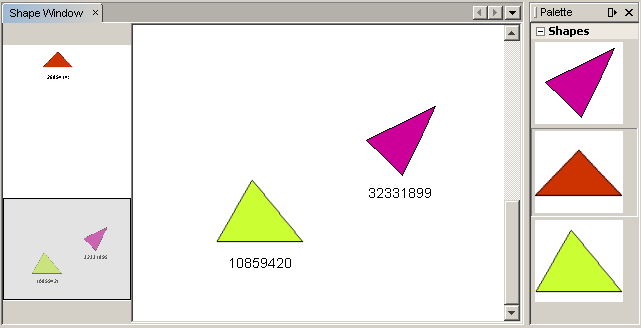
Now you can drag and drop items from the palette. As you drag an item over the scene, you will see the drag image. When you drop an item, it becomes a widget and is visible within the scene as well as within the satellite view, as you can see here:
In the previous section, we added AcceptAction to the scene. We had to define two methods to specify whether the item should be dropped and for resolving the item. In this section, we use ZoomAction, to add zoom/unzoom functionality to the scene.
getActions().addAction(ActionFactory.createZoomAction());
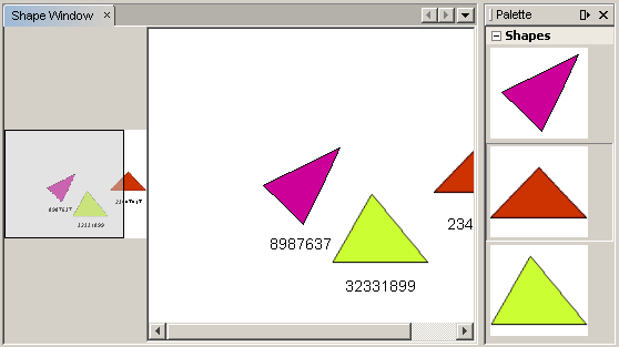
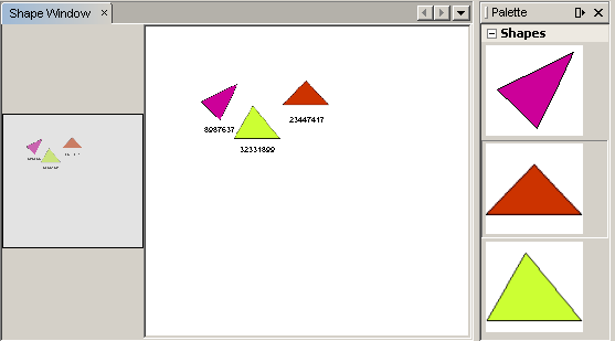
Note: The shapes are rendered as images. SVG is currently not supported.
In the same way as described above, you can add Pan functionality to the scene, by means of this line:
getActions().addAction(ActionFactory.createPanAction());
When you add this line, the user will be able to hold down the mouse wheel and then scroll in any direction in the scene.
Earlier we added MoveAction to the IconNodeWidget, to enable move behavior for the widget. In the same way, a lot of other behavior can be added to the widget. In this section, we add HoverAction, SelectAction, and InplaceEditorAction.
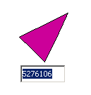
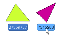
The InplaceEditorAction will let the user change the label:
The SelectAction will change the color of the label when the widget is selected, while the HoverAction will change the color of the label when the mouse hovers over the widget:
private WidgetAction editorAction = ActionFactory.createInplaceEditorAction(new LabelTextFieldEditor());
private class LabelTextFieldEditor implements TextFieldInplaceEditor {

    public boolean isEnabled(Widget widget) {
        return true;
    }

    public String getText(Widget widget) {
        return ((LabelWidget) widget).getLabel();
    }

    public void setText(Widget widget, String text) {
        ((LabelWidget) widget).setLabel(text);
    }

}
widget.getLabelWidget().getActions().addAction(editorAction);
Here, we first get the IconNodeWidget's LabelWidget. Then we add the editor action to the LabelWidget.
widget.getActions().addAction(createSelectAction());
widget.getActions().addAction(createObjectHoverAction());
protected Widget attachNodeWidget(MyNode node) {
    IconNodeWidget widget = new IconNodeWidget(this);
    widget.setImage(node.getImage());
    widget.setLabel(Long.toString(node.hashCode()));

    //double-click, the event is consumed while double-clicking only:
    widget.getLabelWidget().getActions().addAction(editorAction);

    //single-click, the event is not consumed:
    widget.getActions().addAction(createSelectAction());

    //mouse-dragged, the event is consumed while mouse is dragged:
    widget.getActions().addAction(ActionFactory.createMoveAction());

    //mouse-over, the event is consumed while the mouse is over the widget:
    widget.getActions().addAction(createObjectHoverAction());

    mainLayer.addChild(widget);
    return widget;
}
Congratulations, you have completed the Visual Library 2.0 Tutorial for NetBeans 6.0.
For more information on working with the Visual Library API, see: