 |  |
| | |
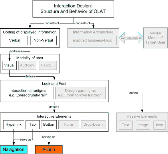 |
Conceptual overview of the OLAT interaction design. Shaded entities are not in the scope of this chapter.
The most important layout elements used in OLAT
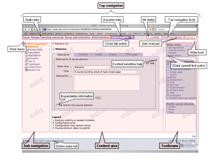
Since OLAT is a dynamic webapplication and not a static website the whole layout and navigation is generated on the fly and can't be changed by the common user. You can still customize the look and feel of your OLAT installation, this is explained in Customizing. For navigation in OLAT we separate the page in four parts: top navigation, content menu, content area and toolbox actions.
The interaction design is characterized by consistency regarding position (relative and absolute), structure, semantics, and function. I.e. interaction elements of similar types or conglomerates thereof
are at same absolute positions: e.g. site navigation is always on the top of the window, content menu is always on the left of the window, and tools as well as spanning actions are always in corresponding boxes on the right.
are at same relative positions: e.g. close command is always at the bottom of an action box.
have same structures: e.g. hyperlinks have same color, mouse-over behavior etc.
use same semantics: e.g. the search action is always called “Search” (not sometimes “Find”)
trigger same functions: e.g. the search action always returns a list to choose an entry.
The following guidelines do not act as laws of nature, you will certainly find exceptions in OLAT. But (intended) guideline deviation should be well-founded and should result in better usability.
Function: Interactive elements either aim at navigation or at action.
Structure: The two different functions are pointed out with a fundamentally different element design (hyperlinks and buttons). There are some exceptions described later.
Semantics: Interactive elements are labeled with an initial capital letter. There are no "title rules" in the English version, i.e. "Back to search" instead of "Back to Search".
Navigation elements are visualized by hyperlinks (in site navigation, content menu, and continuous text), tabs (in tabbed panes), and icons. Their labelings never include verbs.
Hyperlinks in the top navigation
Structure: They are characterized by the position indicator color: users can identify the active site by the coloring of the link (white text on blue background), inactive sites are labeled inversely (blue text on white background). Neither is underlined.
Function: Hyperlinks in the static and dynamic tabs always refresh the remaining screen (content menu, content area, and toolboxes). No pop-up windows and/or external sites are launched.
Hyperlinks in the content menu
Structure: They are characterized by the two position indicators formatting and color, i.e. users can identify their position in OLAT by means of bold, orange entries in the menu tree. Inactive locations are characterized by plain, blue entries. Both get underlined on mouse-over.
Function: Hyperlinks in the menu tree always point to the content area of the own site.
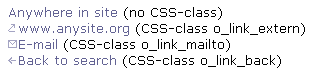
Hyperlinks in continuous text
Structure: They have no position indicator and are always plain, blue and underlined (on mouse-over).
Function: Contrary to links in the menu, they can point to external locations, launch the e-mail client or navigate one step back in a workflow (see the following three CSS-classes).
Tabs in tabbed panes
Structure: They are charcterized by the position indicator color , i.e. users can identify the active tab by means of the link and background colors. Tabs in tabbed panes never contain icons.
Function: Links in tabs always open the respective card.
Icons
Structure: Linked icons are neither framed nor underlined. Mouse pointer changes on mouse over. Provide alt texts where the icon is not followed by a descriptive link text.
Function: Aim at visual aid for frequently used textual links, or are used to reduce text load on the GUI.
Action elements are visualized either by dedicated boxes or by three types of buttons (small, main and form buttons). Labelings always include a verb.
Action- and toolboxes
Structure: Always located on the right of the page, wrapped in a colored, entitled box. Entries are preceded by icons.
Function: Each box comprises similar actions. Rule of thumb: whenever possible place actions of spanning nature as hyperlinks in boxes, instead of as buttons in the content area.
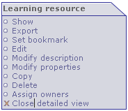
Example of an action box.
Buttons
Structure: Small, main, and form buttons are visualized by the css-classes o_small-button, o_main-button and o_form-button.
Function: All buttons trigger an action or workflow inside the current content area. Small buttons are used for auxiliary actions, main buttons for actions which are crucial to reach a goal. Form buttons are used to visualize the common html functions cancel, submit and reset.
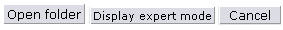
Main, small, and form (browser specific) buttons.
Exception: Listings
Actions corresponding to individual entries of a listing are placed as hyperlinks in dedicated columns, i.e. no buttons are used for repetitive actions.
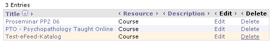
As an exception, actions in listing are visualized as hyperlinks.
| |  | |
 |