example
LZX Reference
filename: combobox.lzx
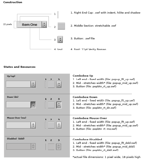
The combo box is defined by three pieces:
1. The button, which activates the menu (right side)
2. The text area, containing the default menu item
3. The menu (aka floating list)
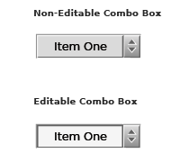
The combo box contains an attribute to create either editable or non-editable instances of this component. The button is the same for both versions and consists of a multi-frame resource for the different states. The text area has a different look for editable and non-editable versions. The floating list is the same for both.
The default combo box has a height of 22 pixels and a width determined by the length of the largest content item and its padding. The type is left aligned.