example
LZX Reference
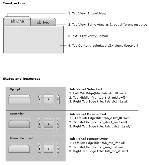
filename: tabs.lzx
The default tabs have a height of 26 pixels and the width is determined by the length of the tab text and its padding. Although the resources appear to be different sizes, the selected and deselected resources are actually the same height. The deselected pieces have a transparent layer that makes up the difference. The type is centered on the tab face and changes its position programatically. The tab is comprised of scalable vector resources which enable proportional resizing without distortion. resizing the button will not alter the text size or position.
The tab is constructed of five views:
1. The left side of the tab
2. The middle stretchable section of the tab
3. The right side of the tab
4. The "border" of the content area.
5. The content area background
Each of the first three views contains multiple resource frames which change based on the state of the tab.
The left and right tab resources (and each of their states) are constructed of vector .swf files and are designed to be used at their current size. The middle piece is a vector .swf file constructed to scale horizontally as the tab width increases.
The border and content area are both colorized LZX views. The default border is set at 1 pixel and retains that dimension as the content area grows. The content area has an 8 pixel inset on all sides, so that content is automatically inset.