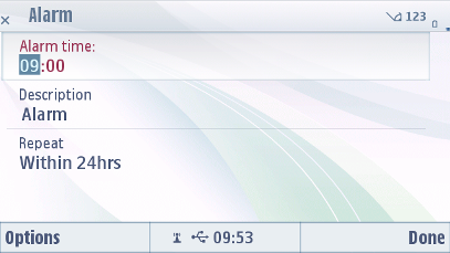
Forms
A form is a specific kind of selection list, where all items (fields) have some editable content.
A form can be in the View state or in the Edit state. The item layouts and functionality are different in these states:
In the View state, the items are not editable. The form functions and looks exactly like a similar selection list. Items can be selected to perform an application-specific function.
In the Edit state, the user can edit all the fields. Forms can contain text fields (alphanumeric or numeric content), pop-up fields and sliders.
Forms work with single click. The view state of the form follows list behavior. Edit state works with single click but it has the highlight always visible to indicate the active form item. Note that the entire form component item should be touch sensitive in normal state. This means that even if the user does not touch the edit field but instead the field header, the item is still activated.
The user can switch from the View state to the Edit state using the Edit command in the Options menu. In the Edit state, the contents of the form can be accepted using the right softkey labeled as Done. The form then returns to the View state.
The following table lists the default touch events for forms:
User action |
State change |
Feedback |
|---|---|---|
In Edit State |
||
Touch down on item |
No change |
Highlight is shown on the item and focus shifts to the item. Tactile: Basic list effect and audio feedback is provided with touch down event. Note: Only
form-specific feedback is provided. No sensitive edit feedback provided on
editor item in the form.
|
Touch release on item |
Item is activated. When the user moves a cursor to a text field, the cursor is placed at the end of the text in the field. If the field is empty, the cursor is placed at the beginning of the field. Touch release on a radio button list item selects the item and closes the pop-up. |
Highlight remains on the item. In case of a radio button list, highlight stays on the full list, and not on any single selection item. Tactile: Basic list effect provided with release event. |
Touch down and hold on item |
Inactive |
Tactile: No effect |
Touch down and move inside form |
Refer to Dragging and flicking events |
Highlight remains on the item that is currently active, when the user starts to move. Tactile: Refer to Dragging and flicking events. |
Touch down and move outside the form without releasing touch. |
Refer to Dragging and flicking events |
Tactile: Refer to Dragging and flicking events. |
Touch down and release outside the radio button list |
Radio button list is closed. |
Tactile: Pop-up effect is provided with touch down event. |
In View State |
||
Touch down on item |
No effect |
Highlight is shown. Tactile: Basic list effect and audio feedback is provided with the touch down event. |
Touch release |
One of the following occurs:
|
Highlight disappears. Tactile: Basic list effect is provided with touch release event. If the touch release opens a pop-up, the pop-up open effect is provided with the touch release. If theme effects are ON, then increasing long touch effect with touch release is provided. |
Touch down and hold |
Inactive |
Tactile: No effect |
Touch down and move inside form |
Refer to Dragging and flicking events |
Tactile: Refer to Dragging and flicking events. |
Touch down and move outside the form without releasing touch. |
Refer to Dragging and flicking events |
Tactile: Refer to Dragging and flicking events. |
Using forms in applications
The API to use for creating forms is the Form API. For implementation information, see Using the Form API.
Typically, a form will be derived from the class CAknForm and the methods SaveFormDataL() and DoNotSaveFormData() will be implemented by the developer. These are called when users switch from edit mode to view mode and are prompted by the form as to whether they wish to save their modifications.
For customization, the class CAknForm provides a single-line or double-line layout and it is possible to use icons on forms.
In the following example, the form is pushed on the cleanup stack before ConstructL() (a potentially leaving method) is called, and popped off before ExecuteLD().
CAknExFormAdd* form = new(ELeave) CAknExFormAdd;
CleanupStack::PushL(form);
form->ConstructL();
CleanupStack::Pop();
form->ExecuteLD(R_AKNEXFORM_TEXT_FIELD_DIALOG);
