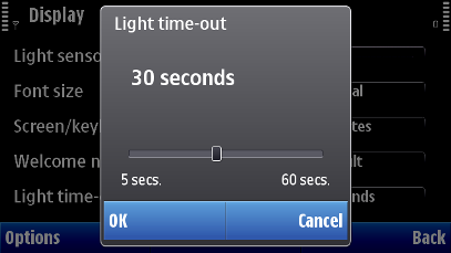
Slider setting item
A slider setting item has a value (numeric or textual) that can be adjusted using an interface with a slider appearance. The control area for slider setting item is same as that of the scrollbar.
The actual slider item usage is specified in applications.
User action |
State change |
Feedback |
|---|---|---|
Touch down (on slider) |
Slider thumb is moved to the nearest slider step position on the slider. Value is changed accordingly. If touch down event is performed in the middle of two slider step positions, the slider thumb is moved towards the greater (larger) value. |
Tactile: No touch down effect. Sensitive slider effect and audio given when thumb moves. |
Touch down (on slider thumb) |
Slider thumb is activated and can be moved. |
Tactile: Sensitive slider effect and audio given with touch down. |
Touch release |
No effect |
Tactile: Sensitive slider effect given with touch release (on slider thumb). |
Touch down and hold (on slider) |
Moves the thumb step by step to the place where touched down. |
Tactile: Hold slider effect is given with long touch on slider. Effect is tied to the steps. If there are more than 15 steps, then smooth slider effect is given instead. |
Touch down and hold (on slider thumb) |
Inactive |
Tactile: No effect |
Touch down and move |
Slider thumb is moved along with the touch event. It moves step by step via its possible positions. Value is changing accordingly. If touch release in the middle of two slider step positions, the slider thumb is moved towards the greater (larger) value. The slider control area is the entire main pane area. |
Tactile: Smooth slider effect is provided when dragging from thumb. Smooth feedback can be increasing and decreasing when there is a meaning to use this kind of feature (e.g., in volume and zoom slider). |
Touch down and cancel (slider thumb) |
Slider thumb is moved to the nearest slider step position where it was when the touch left the slider control area. |
Tactile: No feedback given with touch release after drag outside. |
