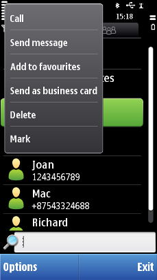
Stylus pop-up menu
Stylus pop-up menu is the primary menu for showing item-specific options. Application only needs to tag items to be item-specific and the application framework handles the remaining tasks. Item-specific options can be attached to almost all the items.
Stylus pop-up is mainly used to offer dynamic functions, and the functions supported by touch-enabled devices. The stylus pop-up menu can also be used directly on top of applications. For example, on an image in Browser, the stylus pop-up menu can be used for offering Save as… and similar options.
Following are the guidelines to be followed while designing the menu:
Item-specific pop-up menu should not be used with buttons and multi-selection list or grid items.
Stylus pop-up menu should have only six items.
If used for items other than item-specific menu items, it is recommended to open the pop-up with touch down and hold.
Stylus pop-up menu has no sub-menus.
Functions that are performed via touch down and release are not duplicated in the stylus pop-up menu. For example, 'Open' or 'Change' should not be in the stylus pop-up menu.
Background is not dimmed when the stylus pop-up menu is shown. The menu disappears automatically after six seconds (or as soon as the user selects an item or taps outside the pop-up area).
The stylus pop-up menu is scrollable and a scrollbar is added if the number of items exceeds what fits the component.
User action |
State change |
Feedback |
|---|---|---|
Touch down |
No effect |
Highlight is shown. Tactile: Basic list effect and audio feedback is provided with touch down event. |
Touch release |
The item is activated. |
Highlight disappears and stylus pop-up is closed. Tactile: Basic list effect is provided with touch release event. |
Touch down and hold |
Inactive |
Tactile: No effect |
Touch down and move inside the stylus pop-up |
Refer to Dragging and flicking events |
Tactile: Refer to Dragging and flicking events. |
Touch down and move out of the stylus pop-up menu |
Refer to Dragging and flicking events |
Tactile: Refer to Dragging and flicking events. |
Touch down and release out of menu area |
Stylus pop-up menu disappears. No selection is made. |
Tactile: Opens via long touch, provides only the increasing long touch effect during the touch down and hold event. No additional pop-up effect is provided when the menu opens. |
Touch down and move horizontally |
Inactive |
Highlight stays on the item that is touched down before moving horizontally. Tactile: No effect |
Using stylus pop-up menus in applications
The API to use for creating a stylus pop-up menu is the Stylus pop-up menu API.
For implementation information, see Displaying commands in a context menu.
