Home Screen Publishing API: Appendices
Appendix A: Widget templates
This section provides the information about widget templates.
All the style settings of widget templates (described in the table below)
are applied in context of the home screen view style for the plugin.AI3_widget widget
which is defined as follows:
plugin.AI3_widget

{

    height: 82px;

    width: 312px;

    margin-bottom: 4px;

    margin-right: 5px;

    margin-left: 5px;

    background-color: "SKIN(268458534 9916)";

    background-size:100%;

}
The table below lists the style settings of widget templates. The style
settings are defined relative to plugin.AI3_widget widget
and they comply with Cascading Style Sheets Level 2 (CSS2) specification.
Table 1: Names, layouts and style settings of widget templates
| Name |
Layout |
Style settings |
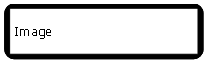
| wideimage |
|
box#wideimagewidget

{

    width:100%;

    height:100%;

    background-color: "SKIN(268458534 9886)";

}


image#image_container

{

    width:auto;

    height:auto;

}


text

{

    width:auto;

    height:auto;

    padding-left: 5px;

    font-family: EAknLogicalFontSecondaryFont;

    font-size: 3.5u;

    color: "SKIN(268458534 13056 74)";

}
|
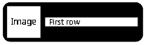
| onerow |
|
box#onerowwidget

{

    width:100%;

    height:100%;

    padding-left:2%;

    background-color: "SKIN(268458534 9886)";

}


image#image_container

{

	padding-top:5%;

	height: 90%;

	width: 20%;

            _s60-aspect-ratio:preserve;

}


box#text_container

{

    width:auto;

    height:auto;

}


text

{

    padding-left:5%;

    width:auto;

    height:auto;

    font-line-space: 15;

    text-align:left;

    text-overflow-mode: wrap;

    max-line-amount: 2;

    font-family: EAknLogicalFontSecondaryFont;

    font-size: 20px;

    color:"SKIN(268458534 13056 19)";

}
|
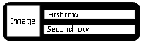
| tworows |
|
box#tworowswidget

{

    width:100%;

    height:100%;

    padding-left:2%;

    background-color: "SKIN(268458534 9886)";

}


image#image_container

{

	padding-top:5%;

	height: 90%;

	width: 20%;

	_s60-aspect-ratio:preserve;

}


box#text_container

{

    width:auto;

    height:auto;

}


text.text_box

{

    padding-left:5%;

    width:auto;

    height:auto;

    font-family: EAknLogicalFontSecondaryFont;

    font-size: 20px;

    color:"SKIN(268458534 13056 19)";

}
|
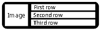
| threerows |
|
box#threerowswidget

{

    width:100%;

    height:100%;

    padding-left:2%;

    background-color: "SKIN(268458534 9886)";

}


image#image_container

{

	padding-top:5%;

	height: 90%;

	width: 20%;

	_s60-aspect-ratio:preserve;

}


box#text_container

{

    width:auto;

    height:auto;

}


text.text_box

{

    padding-left:5%;

    width:auto;

    height:auto;

    font-family: EAknLogicalFontSecondaryFont;

    font-size: 20px;

    color:"SKIN(268458534 13056 19)";

}
|
| threetextrows |
|
box#threetextrowswidget

{

    width:100%;

    height:100%;

    padding-left:2%;

    background-color: "SKIN(268458534 9886)";

}


box#text_container

{

    width:auto;

    height:auto;

}


text.text_box

{

    padding-left:5%;

    width:auto;

    height:auto;

    font-family: EAknLogicalFontSecondaryFont;

    font-size: 20px;

    color:"SKIN(268458534 13056 19)";

}
|
You can use only above described widget templates. Furthermore, you can
use wideimage template as a generic template for your own
layouts.
In the table above
- the
background-color: "SKIN(268458534 9886)"; setting's
268458534 is the major skin ID corresponding to the KAknsIIDQgnHomeButtonWidget skin
item defined in AknsConstants.h by EAknsMajorSkin9886 is the minor skin ID corresponding to the KAknsIIDQgnHomeButtonWidget skin
item defined in AknsConstants.h by EAknsMinorQgnHomeButtonWidget
- the
color:"SKIN(268458534 13056 19)"; setting's
268458534 is the major skin ID corresponding to the KAknsIIDQgnHomeButtonWidget skin
item defined in AknsConstants.h by EAknsMajorSkin13056 is the minor skin ID corresponding to the KAknsIIDQgnHomeButtonWidget skin
item defined in AknsConstants.h by EAknsMinorQsnTextColors19 is the color corresponding to the EAknsCIQsnTextColorsCG20 constant
defined in AknsConstants.h by EAknsMinorQsnTextColors
Appendix B: Publishing images
User defined transparent images are supported with user-provided icons
and masks as any S60 icon defined in the S60 SDK. There are the following
three ways you can publish your image to your widget:
- Publish an image as a file path. The image can be in any of the Symbian
supported file format.
Example:
KWidgetIMG = "c:\\data\\Installs\\ContactImage\\TGadget.jpg";
- Publish image as a handle. Example:
_LIT(KImageKey, "image1");

_LIT(KImageMaskKey, "image1_mask");


 CFbsBitmap* bitmap = new ( ELeave ) CFbsBitmap();

 bitmap->Load( KImageMBM, EMbmImage );

 TInt handle = bitmap->Handle();


 CFbsBitmap* mask= new ( ELeave ) CFbsBitmap();

 mask->Load( KImageMBM, EMbmImageMask );

 TInt maskHandle = mask->Handle();


HsWidget& widget = iHsWidgetPublisher->getHsWidget( "onerow", "[Ex] HS Widget", "0xA0007E04" );

widget.setItem( KImageKey, handle );

widget.setItem( KImageMaskKey, maskHandle );
- Publish an image from a skin or a mif file.
A publisher can publish
scalable icons in the form of skin ids and mif ids.
Syntax
:
[skin(<majorId> <minorId>)]:[mif(<MifFileName.mif> <bitmapId> <maskId>)]
Example:
      KNature_IMG = "SKIN(270501603 8586)");      // only Skin Id

      KGadget2_IMG = "mif(c:\\data\\Installs\\TemplateData\\templateIcons.mif 16384 16385");  // only Mif id


       // with fall back support

       // means if the given skin id is invalid then it will use the Mif ids to get the image

      KWeather_IMG = "SKIN(000000000 0000):mif(c:\\data\\Installs\\TemplateData\\templateIcons.mif 16386 16387");
Tags (e.g. SKIN and mif) are not
case sensitive.