| Tkinter Widget Overview | |
|
| Copyright © 1997 by Fredrik Lundh <[email protected]> | ||
| Updated 9 Nov 1997 |
The Button, Checkbutton and Radiobutton widgets are standard Tkinter widget used to implement various kinds of buttons. Buttons can contain text or images, and you can associate a Python function or method with each button. When the button is pressed, the function or method is automatically called.
The button can only display text in a single font, but the text may span more than one line. In addition, one of the characters can be underlined, for example to mark a keyboard shortcut. By default, the Tab key can be used to move to a button widget.
The Checkbutton and Radiobutton widgets should be associated with variables. Each check button has its own variable, which can have one of two possible values, while a group of radio buttons all share a single variable. Each button then represents a single value for that variable.
Plain buttons are pretty straightforward to use. Simply specify the button contents (text, bitmap, or image) and a callback to call when the button is pressed:
b = Button(master, text="OK", command=self.ok)
A button without a callback is pretty useless; it simply doesn't do anything when you press the button. You might wish to use such buttons anyway when developing an application. In that case, it is probably a good idea to disable the button to avoid confusing your beta testers:
b = Button(master, text="Help", state=DISABLED)
If you don't specify a size, the button is made just large enough to hold its contents. You can use the padx and pady option to add some extra space between the contents and the button border. You can also use the height and width options to explicitly set the size. If you display text in the button, these options define the size of the button in text units. If you display bitmaps or images instead, they define the size in pixels (or other screen units). You can actually specify the size in pixels even for text buttons, but it takes some magic. Here's one way to do it (there's others):
f = Frame(master, height=32, width=32) f.pack_propagate(0) #don't shrinkb = Button(f, text="Sure!") b.pack(fill=BOTH, expand=1)
Buttons can display multiple lines of text (but only in one font). You can use newlines or the wraplength option to make the button wrap text by itself. When wrapping text, use the anchor, justify, and possibly padx options to make things look exactly as you wish. An example:
b = Button(master, text=longtext, anchor=W, justify=LEFT, padx=2)
To make an ordinary button look like it's held down, for example if you wish to implement a toolbox of some kind, you can simply change the relief from RAISED to SUNKEN:
b.config(relief=SUNKEN)
You might wish to change the background as well. Note that a possibly better solution is to use a Checkbutton or Radiobutton with the indicatoron option set to false:
b = Checkbutton(master, image=bold, variable=var, indicatoron=0)
To use a Checkbutton, you must create a Tkinter variable:
var = IntVar()
c = Checkbutton(master, text="Expand", variable=var)
By default, the variable is set to 1 if the button is selected, and 0 otherwise. You can change these values using the onvalue and offvalue options. The variable doesn't have to be an integer variable:
var = StringVar()
c = Checkbutton(master, text="Color image", variable=var,
    onvalue="RGB", offvalue="L")
If you need to keep track of both the variable and the widget, you can simplify your code by attaching the variable to the widget reference object.
v = IntVar()
c = Checkbutton(master, text="Don't show this again", variable=v)
c.var = v
This also allows you to access the variable from within the widget callback:
def cb(event):
    print "variable is", event.widget.var.get()
v = IntVar()
c = Checkbutton(master, text="Lock position", variable=v, command=cb)
c.var = v
If your Tkinter code is already placed in a class (as it should be), it is probably cleaner to store the variable in an attribute, and use a bound method as callback:
def __init__(self, master):
    self.var = IntVar()
    c = Checkbutton(master, text="Enable Tab",
                    variable=self.var, command=self.cb)
    c.pack()

def cb(self, event):
    print "variable is", self.var.get()
The Radiobutton widget is very similar to the check button. To get a proper radio behaviour, make sure to have all buttons in a group point to the same variable, and use the value option to specify what value each button represents:
v = IntVar()
Radiobutton(master, text="One", variable=v, value=1).pack(anchor=W)
Radiobutton(master, text="Two", variable=v, value=2).pack(anchor=W)
If you need to get notified when the value changes, attach a command callback to each button.
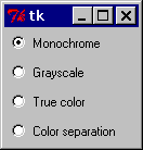
To create a large number of buttons, use a loop:
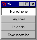
MODES = [
    ("Monochrome", "1"),
    ("Grayscale", "L"),
    ("True color", "RGB"),
    ("Color separation", "CMYK")
]

v = StringVar()
v.set("L") # initialize

for text, mode in MODES:
    b = Radiobutton(master, text=text,
                    variable=v, value=mode)
    b.pack(anchor=W)
Figure: Standard radiobuttons
To turn the above example into a "button box" rather than a set of radio buttons, set the indicatoron option to 0. In this case, there's no separate radio button indicator, and the selected button is drawn as SUNKEN instead of RAISED:
Figure: Using indicatoron=0
The Button widgets support the standard Tkinter Widget interface, plus the following methods:
deselect(). (Checkbutton, Radiobutton). Deselect the button.
flash(). Redraw the button several times, alternating between active and normal appearance.
invoke(). Call the command associated with the button.
select(). (Checkbutton, Radiobutton). Select the button.
toggle(). (Checkbutton). Toggle the selection state.
tkButtonDown(), tkButtonEnter(), tkButtonInvoke(), tkButtonLeave(), tkButtonUp(). (Button only). These can be used in customized event bindings. All these methods accept zero or more dummy arguments.
The Button widgets support the following options:
Option Type Description activebackground, activeforeground color The color to use when the button is activated. anchor constant Controls where in the button the text (or image) should be located. Use one of N, NE, E, SE, S, SW, W, NW, or CENTER. Default is CENTER. If you change this, it is probably a good idea to add some padding as well, using the padx and/or pady options. background, foreground color The button color. The default is platform specific. bitmap bitmap name The bitmap to display in the widget. If the image option is given, this option is ignored. borderwidth or bd int The width of the button border. The default is platform specific, but is usually 1 or 2 pixels. command callback A function or method that is called when the button is pressed. The callback can be a function, bound method, or any other callable Python object. cursor cursor name The cursor to show when the mouse is moved over the button. default int If set, the button is a default button. Tk will indicate this by drawing a platform specific indicator (usually an extra border). Note: The syntax has changed in 8.0b2!!! disabledforeground color The color to use when the button is disabled. The background is shown in the background color. font font The font to use in the button. The button can only contain text in a single font. highlightbackground, highlightcolor, highlightthickness image image The image to display in the widget. If specified, this takes precedence over the text and bitmap options. indicatoron bool (Checkbutton, Menubutton, Radiobutton). Controls if the indicator should be drawn or not. For check and radio buttons, this is on by default. Setting this option to false means that the relief will be used as the indicator. If the button is selected, it is drawn as SUNKEN instead of RAISED. For a menu button, this is off by default. Setting it to true draws a small indicator to the right. This is used by the OptionMenu widget. justify constant Defines how to align multiple lines of text. Use LEFT, RIGHT, or CENTER. offvalue, onvalue (Checkbutton). The values corresponding to a non-checked or checked button, respectively. Defaults are 0 and 1. padx, pady int Button padding. These options specify the horizontal and vertical padding between the text or image, and the button border. relief constant Button border relief. Usually, the button is SUNKEN when pressed, and RAISED otherwise. Other possible values are GROOVE, RIDGE and FLAT. selectcolor color (Checkbutton, Radiobutton). Color to use for the selector. selectimage image (Checkbutton, Radiobutton). Graphic image to use for the selector. state constant The button state: NORMAL, ACTIVE or DISABLED. Default is NORMAL. takefocus bool Indicates that the user can use the Tab key to move to this button. Default is on. text string The text to display in the button. The text can contain newlines. If the bitmap or image options are used, this option is ignored. textvariable variable Associates a Tkinter variable (usually a StringVar) to the button. If the variable is changed, the button text is updated. underline int Default is -1. value (Radiobutton). The value to assign to the associated variable when the button is pressed. variable variable (Checkbutton, Radiobutton). Associates a Tkinter variable to the button. When the button is pressed, the variable is either toggled between offvalue and onvalue (for a Checkbutton), or set to value (for a Radiobutton). Explicit changes to the variable are automatically reflected by the buttons. width, height int The size of the button. If the button displays text, the size is given in text units. If the button displays an image, the size is given in pixels (or screen units). If the size is omitted, it is calculated based on the button contents. wraplength int Determines when a button's text should be wrapped into multiple lines. This is given in screen units. Default is no wrapping.