| Tkinter Widget Overview |
|
|
| Copyright © 1997 by Fredrik Lundh <[email protected]> | ||
| Updated 11 Aug 1997 |
The Grid geometry manager puts the widgets in a 2-dimensional table. The master widget is split into a number of rows and columns, and each 'cell' in the resulting table can hold a widget.
The grid manager is the most flexible of the geometry managers in Tkinter. If you don't want to learn how and when to use all three managers, you should at least make sure to learn this one.
The grid manager is especially convenient to use when designing dialogue boxes. If you're using the packer for that purpose today, you'll be surprised how much easier it is to use the grid manager instead. Instead of using lots of extra frames to get the packing to work, you can in most cases simply pour all the widgets into a single container widget (I tend to use two; one for the dialogue body, and one for the button box at the bottom), and use the grid manager to get them all where you want them.
Consider the following example:
<label 1> <entry 2> <image>
<label 1> <entry 2> <checkbutton> <button 1> <button 2>
Creating this layout using the pack manager is possible, but it takes a number of extra frame widgets, and a lot of work to make things look good. If you use the grid manager instead, you only need one call per widget to get everything laid out properly (see next section for the code needed to create this layout).
Warning: Don't mix grid and pack in the same master window. Tkinter will happily spend the rest of your lifetime trying to negotiate a solution that both managers are happy with. Instead of waiting, kill the application, and take another look at your code. A common mistake is to use the wrong parent for some of the widgets.
Using the grid manager is very simple. Just create the widgets, and use the grid method to tell the manager in which row and column to place them. You don't have to specify the size of the grid beforehand; the manager automatically determines that from the widgets in it.
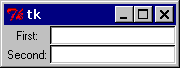
Label(master, text="First:").grid(row=0)
Label(master, text="Second:").grid(row=1)

e1 = Entry(master)
e2 = Entry(master)

e1.grid(row=0, column=1)
e2.grid(row=1, column=1)
Note that the column number defaults to 0 if not given.
Running the above example produces the following window:
Figure: simple grid example
Empty rows and columns are ignored. The result would have been the same if you had placed the widgets in row 10 and 20 instead.
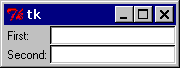
Note that the widgets are centered in their cells. You can use the sticky option to change this; this option takes one or more values from the set N, S, E, W. To align the labels to the left border, you could use W (west):
Label(master, text="First:").grid(row=0, sticky=W)
Label(master, text="Second:").grid(row=1, sticky=W)

e1 = Entry(master)
e2 = Entry(master)

e1.grid(row=0, column=1)
e2.grid(row=1, column=1)
Figure: using the sticky option
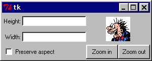
You can also have the widgets span more than one cell. The columnspan option is used to let a widget span more than one column, and the rowspan option lets it span more than one row. The following code creates the layout shown in the previous section:
label1.grid(sticky=E)
label2.grid(sticky=E)
entry1.grid(row=0, column=1)
entry2.grid(row=1, column=1)
checkbutton.grid(columnspan=2, sticky=W)
image.grid(row=0, column=2, columnspan=2, rowspan=2,
           sticky=W+E+N+S, padx=5, pady=5)
button1.grid(row=2, column=2)
button2.grid(row=2, column=3)
There's plenty of things to note in this example. First, no position is specified for the label widgets. In this case, the column defaults to 0, and the row to the first unused row in the grid. Next, the entry widgets are positioned as usual, but the checkbutton widget is placed on the next empty row (row 2, in this case), and is configured to span two columns. The resulting cell will be as wide as the label and entry columns combined. The image widget is configured to span both columns and rows at the same time. The buttons, finally, is packed each in a single cell:
Figure: using column and row spans
The following methods are available on widgets managed by the grid manager:
grid( option=value, ... ). Place the widget in a grid as described by the options (see below).
grid_config(). Not in Tkinter 1.63. Same as grid_configure.
grid_configure( option=value, ... ). Not in Tkinter 1.63. Use grid() instead. Place the widget in a grid as described by the options.
grid_forget(). Remove the widget. The widget is not destroyed, and can be displayed again by grid or any other manager.
grid_info(). Return a dictionary the current options.
grid_propagate()
grid_remove().
The following methods are available on widgets used as grid managers (that is, masters for widgets managed by the grid manager).
grid_location( x, y ).
grid_size().
columnconfigure( column, option=value, ... ), rowconfigure( row, option=value, ... ). Set options for the given column (or row). See below.
grid_slaves(). Returns a list of the "slave" widgets managed by this widget. The widgets are returned as Tkinter widget references.
The following options can be used with the grid and grid_configure methods:
Option Type Description column integer Insert the widget at this column. Column numbers start with 0. If omitted, defaults to 0. columnspan integer If given, indicates that the widget cell should span more than one column. in or in_ widget ipadx, ipady integer Optional internal padding. Works like padx and pady, but the padding is added inside the widgets border. Default is 0. padx, pady integer Optional padding to place around the widget in a cell. Default is 0. row integer Insert the widget at this row. Row numbers start with 0. If omitted, defaults to the first empty row in the grid. rowspan integer If given, indicates that the widget cell should span more than one row. sticky constant Defines how to expand the widget if the resulting cell is larger than the widget itself. This can be any combination of the constants S, N, E, and W, or NW, NE, SW, and SE. For example, W (west) means that the widget should be aligned to the left cell border. W+E means that the widget should be stretched horizontally to fill the whole cell. W+E+N+S means that the widget should be expanded in both directions. Default is to center the widget in the cell.
The following options can be used with the columnconfigure and rowconfigure methods:
Option Type Description minsize integer Defines the minimum size for the column (row). Note that if a column or row is completely empty, it will not be displayed, even if this option is set. pad integer Padding to add to the size of the largest widget in the column (row) when setting the size of the whole column. weight integer A relative weight used to distribute additional space between columns (rows). A column with the weight 2 will grow twice as fast as a column with weight 1. The default is 0, which means that the column will not grow at all.