Groupboxes
This section describes a way to include elements into groups.
Groupboxes
HTML provides an element, fieldset which can be used to group elements together. A border is typically drawn around the elements to show that they are related. An example would be a group of check boxes. XUL provides an equivalent element, groupbox which can be used for a similar purpose.
As its name implies, the groupbox is a type of box. That means that the elements inside it align themselves according to the rules of boxes. There are two differences between groupboxes and regular boxes:
- A beveled border is drawn around the groupbox by default. You can change this behavior by changing the CSS style.
- The groupbox supports a caption which is placed along the top part of the border.
Because groupboxes are types of boxes, you can use the same attributes such as orient and flex. You can put whatever elements you want inside the box, although typically they will be related in some way.
The label across the top of the groupbox can be created by using the caption element. It works much like the HTML legend element. A single caption element placed as the first child is sufficient.
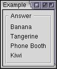
The example below shows a simple groupbox:
Example 3.4.1: Source View<groupbox> <caption label="Answer"/> <description value="Banana"/> <description value="Tangerine"/> <description value="Phone Booth"/> <description value="Kiwi"/> </groupbox>
 This will cause four pieces of text to be displayed surrounded by a box with
the label Answer. Note that the groupbox has a vertical orientation by default
which is necesssary to have the text elements stack in a single column.
You can also add child elements inside the caption element to create a more complex caption. For example, Mozilla's Font preferences panel uses a drop-down menu as a caption. Although any content can be used, usually you would use a checkbox or dropdown menu.
Example 3.4.2: Source View<groupbox flex="1">
<caption>
<checkbox label="Enable Backups"/>
</caption>
<hbox>
<label control="dir" value="Directory:"/>
<textbox id="dir" flex="1"/>
</hbox>
<checkbox label="Compress archived files"/>
</groupbox>
 In this example, a checkbox has been used as a caption. We might use a script
to enable and disable the contents of the groupbox when the checkbox is checked
and unchecked. The groupbox contains a horizontal box with a label and textbox.
Both the textbox and groupbox have been made flexible so the textbox expands when
the window is expanded. The additional checkbox appears below the textbox because
of the vertical orientation of the groupbox. We'll add a groupbox to the find
files dialog in the next section.
Radio Groups
You can use the radiogroup element to group radio elements together. The radiogroup is a type of box. You can put any element you want inside it, and apart from its special handling of radio buttons, it works like any other box.
Any radio buttons placed inside the radio group will be grouped together, even if they are inside nested boxes. This could be used to add extra elements within the structure, such as in the following example:
Example 3.4.3: Source View<radiogroup>
<radio id="no" value="no" label="No Number"/>
<radio id="random" value="random" label="Random Number"/>
<hbox>
<radio id="specify" value="specify" label="Specify Number:"/>
<textbox id="specificnumber"/>
</hbox>
</radiogroup>Note that the radiogroup element does not draw a border around it. You should place a groupbox element around it if a border and caption are desired.
(Next) Next, we'll use what we've learned so far and add some additional elements to the find files dialog.
