A component could have different appearance even at the same page. The concept is called mold (aka., template). Developers could dynamically change the mold by use of the setMold method in the Component interface. All components support a mold called default, which is the default value. Some components might have support two or more molds For example, tabbox supports both default and accordion molds.
<tabbox><!-- if not specified, the default mold is assumed. -->
<tabs> 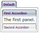 <tab label="Default"/>
</tabs>
<tabpanels>
<tabpanel>
<tabbox mold="accordion">
<tabs>
<tab label="First Accordion"/>
<tab label="Second Accordion"/>
</tabs>
<tabpanels>
<tabpanel>The first panel.</tabpanel>
<tabpanel>The second panel.</tabpanel>
</tabpanels>
</tabbox>
</tabpanel>
</tabpanels>
</tabbox>
<tab label="Default"/>
</tabs>
<tabpanels>
<tabpanel>
<tabbox mold="accordion">
<tabs>
<tab label="First Accordion"/>
<tab label="Second Accordion"/>
</tabs>
<tabpanels>
<tabpanel>The first panel.</tabpanel>
<tabpanel>The second panel.</tabpanel>
</tabpanels>
</tabbox>
</tabpanel>
</tabpanels>
</tabbox>