A radio button is a component that can be turned on and off. Radio buttons are grouped together in a group, called radiogroup. Only one radio button with the same group may be selected at a time.
<radiogroup onCheck="alert(self.selectedItem.label)">
    <radio label="Apple"/>
    <radio label="Orange"/>
    <radio label="Banana"/>
</radiogroup>
You can mix radiogroup and radio to have the layout you want, as illustrated below.
<radiogroup>
<grid>
<rows>
<row><radio label="Apple" selected="true"/> Fruit, music or computer</row>
<row><radio label="Orange"/><textbox/></row>
<row><radio label="Banana"/><datebox/></row>
</rows> 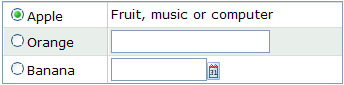 </grid>
</radiogroup>
</grid>
</radiogroup>
The radio button belongs to the nearest ancestor radiogroup. You can even nest one radio group to another as follow. Each of them operate independently, though there might be some sort of visual overlap.
<radiogroup>
<grid>
<rows>
<row><radio label="Apple" selected="true"/> Fruit, music or computer</row>
<row><radio label="Orange"/>
<radiogroup>
<radio label="Small"/>
<radio label="Large" selected="true"/>
</radiogroup>
</row>
<row><radio label="Banana"/><datebox/></row>
</rows> 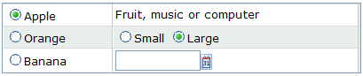 </grid>
</radiogroup>
</grid>
</radiogroup>