Combobox

Components: combobox and comboitem.

A combobox is a special text box that embeds a drop-down list. With comboboxes, users are allowed to select from a drop-down list, in addition to entering the text manually.
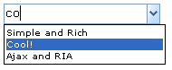
<combobox>
    <comboitem label="Simple and Rich"/>    
    <comboitem label="Cool!"/>    
    <comboitem label="Ajax and RIA"/>    
</combobox>

Class Name

org.zkoss.zul.Combobox

Supported Child Components

Comboitem

Supported Events

Name

Event Type

onChange

org.zkoss.zk.ui.event.InputEvent

Description: Denotes the content of an input component has been

modified by the user.

onChanging

org.zkoss.zk.ui.event.InputEvent

Description: Denotes that user is changing the content of an input component. Notice that the component's content (at the server) won't be changed until onChange is received.

Thus, you have to invoke the getValue method in the InputEvent class to retrieve the temporary value.

onSelection

org.zkoss.zk.ui.event.SelectionEvent

Description: Denotes that user is selecting a portion of the text of an input component. You can retrieve the start and end position of the selected text by use of the getStart and getEnd methods.

onFocus

org.zkoss.zk.ui.event.Event

Description: Denotes when a component gets the focus.

onBlur

org.zkoss.zk.ui.even.Event

Description: Denotes when a component loses the focus.

onOpen

org.zkoss.zk.ui.event.OpenEvent

Description: Denotes user has opened or closed a component. Note:

unlike onClose, this event is only a notification. The

client sends this event after opening or closing the

component.

It is useful to implement load-on-demand by listening to

the onOpen event, and creating components when the

first time the component is opened.

onSelect

org.zkoss.zul.event.SelectEvent

Description: Represents an event cause by user's the list selection is changed at the client.

Properties

Property

Description

Data Type

Default Value

aut ocomplete

Sets whether to automatically complete this text box by matching the nearest item.

boo lean

false

aut odrop

Sets whether to automatically drop the list if users is changing this text box.

boolean

false

buttonVisible

Sets whether the button (on the right of the textbox) is visible.

boo lean

true

image

Sets the URI of the button image.

java.lang.String

<null>

Methods

Name

Description

Return Data Type

isChildable()

Determines whether it accepts child components

Value: true

Note: child is allowed.

boo lean

appendItem(java.lang.String)

Appends an item.

org .zkoss.zul.Comboitem

getInnerAttrs()

Generates the Client-Side-Action attributes to the interior tag.

java.lang.Str ing

getItemAtIndex(int)

Returns the item at the specified index.

org .zkoss.zul.Comboitem

getItemCount()

Returns the number of items.

int

getItems()

Returns a 'live' list of all org.zkoss.zul.Comboitem.

java.util.List

getOuterAttrs()

java.lang.String

getSelectedItem()

Returns the selected item, or null if no matched.

org .zkoss.zul.Comboitem

ins ertBefore(org.zkoss.zk.ui.Component)

boo lean

onChildAdded(org.zkoss.zk.ui.Component)

void

onChildRemoved(org.zkoss.zk.ui.Component)

void

removeItemAt(int)

Removes the child item in the list box at the given index.

org .zkoss.zul.Comboitem

setMultiline(boolean)

Sets whether it is multiline.

Note: Combobox doesn't support multiline.

void

setRows(int)

Sets the rows.

Note: Combobox doesn't support multiple rows.

void

Inherited From