A radio button is a component that can be turned on and off. Radio buttons are grouped together in a group, called radiogroup. Only one radio button with the same group may be selected at a time.
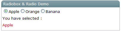
<window title="Radiobox & Radio Demo" > <vbox> <radiogroup onCheck="fruit.value = self.selectedItem.label"> <radio label="Apple"/> <radio label="Orange"/> <radio label="Banana"/> </radiogroup> You have selected :<label id="fruit" style="color:red"/> </vbox> </window>
|
Name |
Event Type |
|---|---|
|
|
|
|
|
|
|
|
|
|
Name |
Description |
Return Data Type |
|---|---|---|
|
|
Determines whether it accepts child components Note: No child is allowed. |
|
|
|
Appends interior attributes for generating the HTML |
|
|
|
Returns |
|
|
|
Returns the name of this radio button. |
|