An element which should appear before or after an element inside a box (Box, Vbox and Hbox).
When the splitter is dragged, the sibling elements of the splitter are resized. If
getCollapse()
is true, a grippy in placed inside the splitter, and one sibling element of the splitter is collapsed when the grippy is clicked.
<hbox spacing="0" width="100%">
<vbox height="200px">
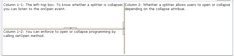
Column 1-1: The left-top box. To know whether a splitter
is collapsed, you can listen to the onOpen event.
<splitter collapse="after"/>
Column 1-2: You can enforce to open or collapse programming
by calling setOpen method.
</vbox>
<splitter collapse="before"/>
Column 2: Whether a splitter allows users to open or collapse
depending on the collapse attribue.
</hbox>
|
Name |
Inherited From |
|---|---|
|
|
|
|
Property |
Description |
Data Type |
Default Values |
|---|---|---|---|
|
|
Returns which side of the splitter is collapsed when its grippy is clicked. If this attribute is not specified, the splitter will not cause a collapse. Values: |
|
|
|
|
the maximum position of the slider. Values: |
|
|
|
|
the amount that the value of curpos changes by when the tray of the scroll bar is clicked Values: |
|
|