Portals usually render the markup fragments of several portlets, and aggregate these fragments into one page that ultimately gets sent back as response. Each portlet on that page will be decorated by the portal to limit the real estate the portlet has on the page, but also to allow the portal to inject extra functionality on a per portlet basis. Classic examples of this injection are the maximize, minimize and mode change links that will appear in the portlet window , together with the title.
Layouts and themes allow to manipulate the look and feel of the portal. Layouts are responsible to render markup that will wrap the markup fragments produced by the individual portlets. Themes, on the other hand, are responsible to style and enhance this markup.
In JBoss Portal, layouts are implemented as a JSP or a Servlet. Themes are implemeted using CSS Style sheets, javascript and images. The binding elemement between layouts and themes are the class and id attributes of the rendered markup.
JBoss Portal has the concept of regions on a page. When a page is defined, and portlet windows are assigned to the page, the region, and order inside the region, has to be specified as well. For portal layouts this has significant meaning. It defines the top most markup container that can wrap portlet content (other then the static markup in the JSP itself). In other words: from a layout perspective all portlets of a page are assigned to one or more regions. Each region can contain one or more portlets. To render the page content to return from a portal request, the portal has to render the layout JSP, and for each region, all the portlets in the region.
Since the markup around each region, and around each portlet inside that region, is effectively the same for all the pages of a portal, it makes sense to encapsulate it in its own entity.
To implement this encapsulation there are several ways:
- JSPs that get included from the layout JSP for each region/portlet
- a taglib that allows to place region, window, and decoration tags into the layout JSP
- a taglib that uses a pluggable API to delegate the markup generation to a set of classes
In JBoss Portal you can currently see two out of these approaches, namley the first and the last. Examples for the first can be found in the portal-core.war, implemented by the nodesk and phalanx layouts. Examples for the third approach can be found in the same war, implemented by the industrial and Nphalanx layout. What encapsulates the markup generation for each region, window, and portlet decoration in this last approach is what's called the RenderSet.
The RenderSet consist of four interfaces that correspond with the four markup containers that wrap the markup fragments of one of more portlets:
- Region
- Window
- Decoration
- Portlet Content
While we want to leave it open to you to decide which way to implement your layouts and themes, we strongly believe that the last approach is superior, and allows for far more flexibility, and clearer separation of duties between portal developers and web designers.
The last topic to introduce in this overview is the one of portal themes. A theme is a collection of web design artifacts. It defines a set of css, java script and image files that together decide about the look and feel of the portal page. The theme can take a wide spectrum of control over the look and feel. It can limit itself to decide fonts and colors, or it can take over a lot more and decide the placement (location) of portlets and much more.
The default header is divided into two parts, links to pages displayed as tabs and links to navigate between portals and dahsboards as well as loggin in and out. Those two parts are included into the template thanks to the layout as defined in Section 21.3, “Layouts”. In fact, the region named, dashboardnav will include the navigation links, while the region named navigation will include the navigation tabs. It is then easy to hide one and/or the other by removing the corresponding inclusion in the layout.

Scheenshot of the header with the 'renaissance' theme
Note
Here, we use split content from rendering by using a CSS style sheet, it allow us to change the display by switching the CSS without affecting the content. THe Maple theme will display the links on the left side with a different font for example. THis is up to you to choose or not this approachTo customize the header there are several options detailed after.
- The first option would simply require to modify the theme CSS, by doing this you could change the fonts, the way tabs are rendered, colors and many other things but not change the content.
- The second option is to modify the provided JSPs, header.jsp and tabs.jsp. It gives you more flexibility than the previous solution on modifying the content. Links to legacy application could easily be added, URLs could be arranged differently, the CSS approach could be replaced by good old HTML, CSS style names could be changed... The drawback of this method compare to the next one is the limitation in what is accessible from the JSP.
The content of those two parts are displayed thanks to two different JSP pages. By default you would find those pages in the directory portal-core.war/WEB-INF/jsp/header/. The file header.jsp is used to display the links that are displayed on the upper right of the default theme. The file tabs.jsp is used to display the pages tabs appearing on the left.
Again, you have several choices, either to edit the included JSPs directly or create your own, store them in a web application then edit the following file: portal-core.sar/META-INF/jboss-service.xml. The interesting part in that file is the following:
<mbean
   code="org.jboss.portal.core.aspects.controller.PageCustomizerInterceptor"
   name="portal:service=Interceptor,type=Command,name=PageCustomizer"
   xmbean-dd=""
   xmbean-code="org.jboss.portal.jems.as.system.JBossServiceModelMBean">
   <xmbean/>
   <attribute name="TargetContextPath">/portal-core</attribute>
   <attribute name="HeaderPath">/WEB-INF/jsp/header/header.jsp</attribute>
   <attribute name="TabsPath">/WEB-INF/jsp/header/tabs.jsp</attribute>
   <depends
      optional-attribute-name="PortalAuthorizationManagerFactory"
      proxy-type="attribute">portal:service=PortalAuthorizationManagerFactory</depends>
</mbean>
The three attibutes are:
- TargetContextPath: Defines the web application context where the JSPs are located
- HeaderPath: Defines the location (in the web application previously defined) of the JSP in charge of writing the header links
- TabsPath: Defines the location (in the web application previously defined) of the JSP in charge of writing the pages links (note that it doesn't have to be renderer as tabs)
Writing the header JSP
A couple of request attributes are set so that they can be used by the JSP, here is the list of attributes and their meaning:
- org.jboss.portal.header.USER: A org.jboss.portal.identity.User object of the logged-in user, null if the user is not logged-in.
- org.jboss.portal.header.LOGIN_URL: URL to logging-in.
- org.jboss.portal.header.DASHBOARD_URL: URL to the dashboard, null if the user is already on the dashboard, null if the user is on the default portal already.
- org.jboss.portal.header.DEFAULT_PORTAL_URL: URL to the default page of the portal named 'default', null if the user is on the default portal already.
- org.jboss.portal.header.ADMIN_PORTAL_URL: URL to the default page of the admin portal (named 'admin'), null if the user is on the admin portal already.
- org.jboss.portal.header.EDIT_DASHBOARD_URL: URL to the page content editor of the dashboard, set only if the user is on the dashboard, null otherwise.
- org.jboss.portal.header.COPY_TO_DASHBOARD_URL: URL to copy a page from a portal to the personal dashboard, null if the user is on the dashboard.
- org.jboss.portal.header.SIGN_OUT_URL: URL to log out the portal.
Every attribute that is an URL attribute is an object implementing the org.jboss.portal.api.PortalURL interface. Therefore it is possible to generate the URL using the toString() method and change various things related to the URL. With that in hand, if someone just wanted to display the logged-in username and a link to log out, he could write:
<%@ page import="org.jboss.portal.identity.User" %>

<%
   User user = (User) request.getAttribute("org.jboss.portal.header.USER");
   PortalURL signOutURL = (PortalURL)request.getAttribute("org.jboss.portal.header.SIGN_OUT_URL");
   PortalURL loginURL = (PortalURL)request.getAttribute("org.jboss.portal.header.LOGIN_URL");


   if (user == null)
   {
%>
   <a href="<%= loginURL %>">Login</a>
<%
   }
   else
   {
%>
Logged in as: <%= user.getUserName() %>
<br/>
<a href="<%= signOutURL %>">Logout</a>
<%
   }
%>
Writing the tabs JSP
A couple of request attributes are set so that they can be used by the JSP, here is the list of attributes and their meaning:
- org.jboss.portal.api.PORTAL_NODE: A org.jboss.portal.api.node.PortalNode object of the root Portal node. Authorized children and siblings of this object are accessible.
- org.jboss.portal.api.PORTAL_RUNTIME_CONTEXT: A org.jboss.portal.api.PortalRuntimeContext object that can be used to render URLs.
The default file in charge of displaying the tabs can be found in: portal-core.war/WEB-INF/jsp/header/
Layouts are used by the portal to produce the actual markup of a portal response. After all the portlets on a page have been rendered and have produced their markup fragments, the layout is responsible for aggregating all these pieces, mix them with some ingredients from the portal itself, and at the end write the response back to the requesting client.
Layouts can be either a JSP or a Servlet. The portal determines the layout to use via the configured properties of the portal, or the requested page. Both, portal and pages, can define the layout to use in order to render their content. In case both define a layout, the layout defined for the page will overwrite the one defined for the portal.
A Layout is defined in the layout descriptor named portal-layouts.xml. This descriptor must be part of the portal application, and is picked up by the layout deployer. If the layout deployer detects such a descriptor in a web application, it will parse the content and register the layouts with the layout service of the portal. Here is an example of such a descriptor file:
<layouts>
   <layout>
      <name>phalanx</name>
      <uri>/phalanx/index.jsp</uri>
   </layout>
   <layout>
      <name>industrial</name>
      <uri>/industrial/index.jsp</uri>
      <uri state="maximized">/industrial/maximized.jsp</uri>
   </layout>
</layouts>
Portals and pages can be configured to use a particular layout. The connection to the desired layout is made in the portal descriptor (YourNameHere-object.xml). Here is an example of such a portal descriptor:
<portal>
   <portal-name>default</portal-name>
   <properties>
      <!-- Set the layout for the default portal -->
      <!-- see also portal-layouts.xml -->
      <property>
         <name>layout.id</name>
         <value>phalanx</value>
      </property>
   </properties>
   <pages>
      <page>
         <page-name>theme test</page-name>
         <properties>
            <!-- set a difference layout for this page -->
            <property>
               <name>layout.id</name>
               <value>industrial</value>
            </property>
         </properties>
      </page>
   </pages>
</portal>
The name specified for the layout to use has to match one of the names defined in the portal-layouts.xml descriptor of one of the deployed applications.
As you can see, the portal or page property points to the layout to use via the name of the layout. The name has been given to the layout in the layout descriptor. It is in that layout descriptor where the name gets linked to the physical resource (the JSP or Servlet) that will actually render the layout.
To access a layout from code, you need to get a reference to the LayoutService interface. The layout service is an mbean that allows access to the PortalLayout interface for each layout that was defined in a portal layout descriptor. As a layout developer you should never have to deal with the layout service directly. Your layout hooks are the portal and page properties to configure the layout, and the layout strategy, where you can change the layout to use for the current request, before the actual render process begins.
Both descriptors, the portal and the theme descriptor, are located in the WEB-INF/ folder of the deployed portal application. Note that this is not limited to the portal-core.war, but can be added to any WAR that you deploy to the same server. The Portal runtime will detect the deployed application and introspect the WEB-INF folder for known descriptors like the two metioned here. If present, the appropriate meta data is formed and added to the portal runtime. From that time on the resources in that application are available to be used by the portal. This is an elegant way to dynamically add new layouts or themes to the portal without having to bring down , or even rebuild the core portal itself.
The portal comes with a set of JSP tags that allow the layout developer faster development.
There are currently two taglibs, containing tags for different approaches to layouts:
- portal-layout.tld
- theme-basic-lib.tld
The theme-basic-lib.tld contains a list of tags that allow a JSP writer to access the state of the rendered page content. It is built on the assumption that regions, portlet windows and portlet decoration is managed inside the JSP.
The portal-layout.tld contains tags that work under the assumption that the RenderSet will take care of how regions, portlet windows and the portlet decoration will be rendered. The advantage of this approach is that the resulting JSP is much simpler and easier to read and maintain.
Here is an example layout JSP that uses tags from the latter:
               <%@ taglib uri="/WEB-INF/theme/portal-layout.tld" prefix="p" %>
<!DOCTYPE html PUBLIC "-//W3C//DTD XHTML 1.0 Transitional//EN"
                      "http://www.w3.org/TR/xhtml1/DTD/xhtml1-transitional.dtd">
<html xmlns="http://www.w3.org/1999/xhtml">
   <head>
      <title>JBoss Portal</title>
      <meta http-equiv="Content-Type" content="text/html;" />
      <p:theme themeName='renaissance' />
      <p:headerContent />
   </head>
   <body id="body">
      <div id="portal-container">
         <div id="sizer">
            <div id="expander">
               <div id="logoName"></div>
               <table border="0" cellpadding="0" cellspacing="0" id="header-container">
                  <tr>
                     <td align="center" valign="top" id="header">
                        <div id="spacer"></div>
                     </td>
                  </tr>
               </table>
               <div id="content-container">
                  <p:region regionName='This-Is-The-Page-Region-To-Query-The-Page'
                     regionID='This-Is-The-Tag-ID-Attribute-To-Match-The-CSS-Selector'/>
                  <p:region regionName='left' regionID='regionA'/>
                  <p:region regionName='center' regionID='regionB'/>
                  <hr class="cleaner" />
                  <div id="footer-container" class="portal-copyright">Powered by
                     <a class="portal-copyright"
                        href="http://www.jboss.com/products/jbossportal">
                        JBoss Portal
                     </a>
                  </div>
               </div>
            </div>
         </div>
      </div>
   </body>
</html>
The theme tag looks for the determined theme of the current request (see Portal Themes for more details). If no theme was determined, this tag allows an optional attribute 'themeName' that can be used to specifiy a default theme to use as a last resort. Based on the determined theme name, the ThemeService is called to lookup the theme with this name and to get the resources associated with this theme. The resulting style and link elements are injected, making sure that war context URLS are resolved appropriately.
This tags allows portlets to inject content into the header. More details about this function are mentioned in the 'other Theme Functions' section of this document.
The region tag renders all the portlets in the specified region of the current page, using the determined RenderSet to produce the markup that surrounds the individual portlet markup fragments. The regionName attribute functions as a query param into the current page. It determines from what page region the portlets will be rendered in this tag. The regionID attribute is what the RenderSet can use to generate a css selector for this particular region. In case of the divRenderer, a DIV tag with an id attribute corresponding to the provided value will be rendered for this region. This id in turn can be picked up by the CSS to style the region.
A RenderSet can be used to produce the markup containers around portlets and portlet regions. The markup for each region, and each portlet window in a region is identical. Further more, it is most likely identical across several layouts. The way portlets are arranged and decorated will most likely not change across layouts. What will change is the look and feel of the decoration, the images, fonts, and colors used to render each portlet window on the page. This is clearly a task for the web designer, and hence should be realized via the portal theme. The layout only needs to provide enough information to the theme so that it can do its job. The RenderSet is exactly that link between the layout and the theme that takes the information available in the portal and renders markup containing the current state of the page and each portlet on it. It makes sure that the markup around each region and portlet contains the selectors that the theme css needs to style the page content appropriately.
A RenderSet consists of the implementations of four interfaces. Each of those interfaces corresponds to a markup container on the page.
Here are the four markup containers and their interface representation:
- Region - RegionRenderer
- Window - WindowRenderer
- Decoration - DecorationRenderer
- Portlet Content - PortletRenderer
All the renderer interfaces are specified in the org.jboss.portal.theme.render package.
The four markup containers are hierarchical. The region contains one or more windows. A window contains the portlet decoration and the portlet content.
The region is responsible for arranging the positioning and order of each portlet window. Should they be arranged in a row or a column? If there are more then one portlet window in a region, in what order should they appear?
The window is responsible for placing the window decoration, including the portlet title, over the portlet content, or under, or next to it.
The decoration is responsible for inserting the correct markup with the links to the portlet modes and window states currently available for each portlet.
The portlet content is responsible for inserting the actually rendered markup fragment that was produced by the portlet itself.
Similar to layouts, render sets must be defined in a RenderSet descriptor. The RenderSet descriptor is located in the WEB-INF/layout folder of a web application, and is named portal-renderSet.xml. Here is an example descriptor:
               <?xml version="1.0" encoding="UTF-8"?>
<portal-renderSet>
 <renderSet name="divRenderer">
  <set content-type="text/html">
   <region-renderer>org.jboss.portal.theme.impl.render.DivRegionRenderer</region-renderer>
   <window-renderer>org.jboss.portal.theme.impl.render.DivWindowRenderer</window-renderer>
   <portlet-renderer>org.jboss.portal.theme.impl.render.DivPortletRenderer</portlet-renderer>
   <decoration-renderer>
     org.jboss.portal.theme.impl.render.DivDecorationRenderer
   </decoration-renderer>
  </set>
 </renderSet>
 <renderSet name="emptyRenderer">
  <set content-type="text/html">
   <region-renderer>org.jboss.portal.theme.impl.render.EmptyRegionRenderer</region-renderer>
   <window-renderer>org.jboss.portal.theme.impl.render.EmptyWindowRenderer</window-renderer>
   <portlet-renderer>
     org.jboss.portal.theme.impl.render.EmptyPortletRenderer
   </portlet-renderer>
   <decoration-renderer>
     org.jboss.portal.theme.impl.render.EmptyDecorationRenderer
   </decoration-renderer>
  </set>
 </renderSet>
</portal-renderSet>
Analogous to how a strategy is specified, the RenderSet can be specified as a portal or page property, or a particular layout can specify an anonymous RenderSet to use. Here is an example of a portal descriptor:
               <?xml version="1.0" encoding="UTF-8"?>
<portal>
  <portal-name>default</portal-name>
    <properties>
      <!-- use the divRenderer for this portal -->
      <property>
        <name>theme.renderSetId</name>
        <value>divRenderer</value>
      </property>
    </properties>
    <pages>
      <default-page>default</default-page>
      <page>
        <page-name>default</page-name>
        <properties>
          <!-- overwrite the portal's renderset for this page -->
          <property>
            <name>theme.renderSetId</name>
            <value>emptyRenderer</value>
          </property>
        </properties>
      <window>
        <window-name>TestPortletWindow</window-name>
        <instance-ref>TestPortletInstance</instance-ref>
        <region>center</region>
        <height>0</height>
      </window>
    </page>
  </pages>
</portal>
Here is an example of a layout descriptor with an anonymous RenderSet:
               <?xml version="1.0" encoding="UTF-8"?>
<layouts>
<renderSet>
<set content-type="text/html">
<region-renderer>org.foo.theme.render.MyRegionRenderer</region-renderer>
<window-renderer>org.foo.theme.render.MyWindowRenderer</window-renderer>
<portlet-renderer>org.foo.theme.render.MyPortletRenderer</portlet-renderer>
<decoration-renderer>org.foo.theme.render.MyDecorationRenderer</decoration-renderer>
</set>
</renderSet>
<layout>
<name>generic</name>
<uri>/generic/index.jsp</uri>
<uri state="maximized">/generic/maximized.jsp</uri>
</layout>
</layouts>
Again, anologous to layout strategies, the anonymous RenderSet overwrites the one specified for the page, and that overwrites the one specified for the portal. In other words: all pages that use the layout that defines an anonymous RenderSet will use that RenderSet, and ignore what is defined as RenderSet for the portal or the page.
In addition to specifying the renderSet for a portal or a page, each individual portlet window can define what renderSet to use for the one of the three aspects of a window, the window renderer, the decoration renderer, and the portlet renderer. This feature allow you to use the the window renderer implementation from one renderSet, and the decoration renderer from another. Here is an example for a window that uses the implementations of the emptyRenderer renderSet for all three aspects:
               <window>
   <window-name>NavigationPortletWindow</window-name>
   <instance-ref>NavigationPortletInstance</instance-ref>
   <region>navigation</region>
   <height>0</height>
   <!-- overwrite portal and page properties set for the renderSet for this window -->
   <properties>
      <!-- use the window renderer from the emptyRenderer renderSet -->
      <property>
         <name>theme.windowRendererId</name>
         <value>emptyRenderer</value>
      </property>
      <!-- use the decoration renderer from the emptyRenderer renderSet -->
      <property>
         <name>theme.decorationRendererId</name>
         <value>emptyRenderer</value>
      </property>
      <!-- use the portlet renderer from the emptyRenderer renderSet -->
      <property>
         <name>theme.portletRendererId</name>
         <value>emptyRenderer</value>
      </property>
   </properties>
</window>
A portal theme is a collection of CSS styles, JavaScript files, and images, that all work together to style and enhance the rendered markup of the portal page. The theme works together with the layout and the RenderSet in procuding the content and final look and feel of the portal response. Through clean separation of markup and styles a much more flexible and powerfull approach to theming portals is possible. While this approach is not enforced, it is strongly encouraged. If you follow the definitions of the Theme Style Guide (see later), it is not necessary to change the layout or the strategy, or the RenderSet to achieve very different look and feels for the portal. All you need to change is the theme. Since the theme has no binary dependencies, it is very simple to swapt it, or change individual items of it. No compile or redeploy is necessary. Themes can be added or removed while the portal is active. Themes can be deployed in separate web applications furthering even more the flexibility of this approach. Web developers don't have to work with JSPs. They can stay in their favorite design tool and simple work against the exploded war content that is deployed into the portal. The results can be validated life in the portal.
Themes can be added as part of any web application that is deployed to the portal server. All what is needed is a theme descriptor file that is part of the deployed archive. This descriptor indicates to the portal what themes and theme resources are becoming available to the portal. The theme deployer scans the descriptor and adds the theme(s) to the ThemeService, which in turn makes the themes available for consumption by the portal. Here is an example of a theme descriptor:
               <themes>
<theme>
<name>nodesk</name>
<link href="/nodesk/css/portal_style.css" rel="stylesheet" type="text/css" />
<link rel="shortcut icon" href="/images/favicon.ico" />
</theme>
<theme>
<name>phalanx</name>
<link href="/phalanx/css/portal_style.css" rel="stylesheet" type="text/css" />
<link rel="shortcut icon" href="/images/favicon.ico" />
</theme>

<theme>
<name>industrial-CSSSelect</name>
<link rel="stylesheet" id="main_css" href="/industrial/portal_style.css" type="text/css" />
<link rel="shortcut icon" href="/industrial/images/favicon.ico" />

<script language="JavaScript" type="text/javascript">
// MAF - script to switch current tab and css in layout...
function switchCss(currentTab,colNum) {
var obj = currentTab;
var objParent = obj.parentNode;

if (document.getElementById("current") != null) {
var o = document.getElementById("current");
o.setAttribute("id","");
o.className = 'hoverOff';
objParent.setAttribute("id","current");
}

var css = document.getElementById("main_css");
source = css.href;
if (colNum == "3Col") {
if (source.indexOf("portal_style.css" != -1)) {
source = source.replace("portal_style.css","portal_style_3Col.css");
}
if (source.indexOf("portal_style_1Col.css" != -1)) {
source = source.replace("portal_style_1Col.css","portal_style_3Col.css");
}
}
if (colNum == "2Col") {
if (source.indexOf("portal_style_3Col.css" != -1)) {
source = source.replace("portal_style_3Col.css","portal_style.css");
}
if (source.indexOf("portal_style_1Col.css" != -1)) {
source = source.replace("portal_style_1Col.css","portal_style.css");
}
}
if (colNum == "1Col") {
if (source.indexOf("portal_style_3Col.css" != -1)) {
source = source.replace("portal_style_3Col.css","portal_style_1Col.css");
}
if (source.indexOf("portal_style.css" != -1)) {
source = source.replace("portal_style.css","portal_style_1Col.css");
}
}

css.href = source;
}
</script>
</theme>
</themes>
Themes are defined in the portal-themes.xml theme descriptor, which is localted in the WEB-INF/ folder of the web application.
Again, analogous to the way it is done for layouts, themes are specified in the portal descriptor as a portal or page property. The page property overwrites the portal property. In addition to these two options, themes can also be specified as part of the theme JSP tag , that is placed on the layout JSP. Here is an example portal descriptor that specifies the phalanx theme as the theme for the entire portal, and the industrial theme for the theme test page:
               <portal>
  <portal-name>default</portal-name>
  <properties>
    <!-- Set the theme for the default portal -->
    <property>
      <name>layout.id</name>
      <value>phalanx</value>
    </property>
  </properties>
  <pages>
    <page>
      <page-name>theme test</page-name>
      <properties>
        <!-- set a difference layout for this page -->
        <property>
          <name>layout.id</name>
          <value>industrial</value>
        </property>
      </properties>
      <window>
        <window-name>CatalogPortletWindow</window-name>
        <instance-ref>CatalogPortletInstance</instance-ref>
        <region>left</region>
        <height>0</height>
      </window>
    </page>
  </pages>
</portal>
And here is an example of a layout JSP that defines a default theme to use if no other theme was defined for the portal or page:
               <%@ taglib uri="/WEB-INF/theme/portal-layout.tld" prefix="p" %>
<!DOCTYPE html PUBLIC "-//W3C//DTD XHTML 1.0 Transitional//EN"
                      "http://www.w3.org/TR/xhtml1/DTD/xhtml1-transitional.dtd">
<html xmlns="http://www.w3.org/1999/xhtml">
  <head>
    <title><%= "JBoss Portal :: 2.2 early (Industrial)" %></title>
    <meta http-equiv="Content-Type" content="text/html;" />
    <p:theme themeName='industrial' />
    <p:headerContent />
  </head>
  <body id="body">
    <div id="portal-container">
      <div id="sizer">
        <div id="expander">
          <div id="logoName"></div>
          <table border="0" cellpadding="0" cellspacing="0"
            id="header-container">
            <tr>
              <td align="center" valign="top" id="header">
                <div id="spacer"></div>
              </td>
            </tr>
          </table>
          <div id="content-container">
            <p:region
              regionName='This-Is-The-Page-Region-To-Query-The-Page'
              regionID='This-Is-The-Tag-ID-Attribute-To-Match-The-CSS-Selector' />
            <p:region regionName='left' regionID='regionA' />
            <p:region regionName='center' regionID='regionB' />
            <hr class="cleaner" />
            <div id="footer-container" class="portal-copyright">
              Powered by
              <a class="portal-copyright"
                href="http://www.jboss.com/products/jbossportal">
                JBoss Portal
              </a>
              <br />
              Theme by
              <a class="portal-copyright"
                href="http://www.novell.com">
                Novell
              </a>
            </div>
          </div>
        </div>
      </div>
    </div>
  </body>
</html>
For the function of the individual tags in this example, please refere to the layout section of this document.
This section contains all the functionalities that don't fit with any of the other topics. Bits and pieces of useful functions that are related to the theme and layout functionality.
Portlets can have their content rewritten by the portal. This is useful if you want to uniquely namespace markup (JavaScript functions for example) in the scope of a page. The rewrite functionality can be applied to the portlet content (the markup fragment) and to content a portlet wants to inject into the header. The rewrite is implemented as specified in the WSRP (OASIS: Web Services for Remote Portlets; producer write). As a result of this, the token to use for rewrite is the WSRP specified "wsrp_rewrite_". If the portlet sets the following response property
res.setProperty("WSRP_REWRITE","true");all occurences of the wsrp_rewrite_ token in the portlet fragment will be replaced with a unique token (the window id). If the portlet also specifies content to be injected into the header of the page, that content is also subject to this rewrite.
res.setProperty("HEADER_CONTENT", "
               <script>function wsrp_rewrite_OnFocus(){alert('hello button');}</script>
               ");
Note that in order for the header content injection to work, the layout needs to make use of the headerContent JSP tag, like:
               <%@ taglib uri="/WEB-INF/theme/portal-layout.tld" prefix="p" %>
<!DOCTYPE html PUBLIC "-//W3C//DTD XHTML 1.0 Transitional//EN"
                      "http://www.w3.org/TR/xhtml1/DTD/xhtml1-transitional.dtd">
<html xmlns="http://www.w3.org/1999/xhtml">
  <head>
    <title><JBoss Portal 2.2 early</title>
    <meta http-equiv="Content-Type" content="text/html;" />

    <p:headerContent />
  </head>
  <body id="body">
    <p>...</p>
  </body>
</html>
If a portlet needs a CSS style sheet to be injected via a link tag in the page header, it can do so by providing the context relative URI to the file in the jboss-portlet.xml descriptor, like:
               <portlet-app>
  <portlet>
    <portlet-name>HeaderContentPortlet</portlet-name>
    <header-content>
      <link rel="stylesheet" type="text/css" href="/portlet-styles/HeaderContent.css"
                                       title="" media="screen" />
    </header-content>
  </portlet>
</portlet-app>
This functionality, just like the previously described header content injection, requires the layout JSP to add the "headerContent" JSP tag (see example above). One thing to note here is the order of the tags. If the headerContent tag is placed after the theme tag, it will allow portlet injected CSS files to overwrite the theme's behaviour, making this feature even more powerful!
One possible use of window properties is demonstrated in the divRenderer RenderSet implementation. If a window definition (in the portal descriptor) contains a property like:
               <window>
   <window-name>HintPortletWindow</window-name>
   <instance-ref>HintPortletInstance</instance-ref>
   <region>center</region>
   <height>0</height>
   <properties>
      <!-- turn the decoration off for this portlet (i.e. no title and mode/state links) -->
      <property>
         <name>theme.decorationRendererId</name>
         <value>emptyRenderer</value>
      </property>
   </properties>
</window>
the DivWindowRenderer will use the decoration renderer from the emptyRenderer RenderSet to render the decoration for this window (not delegate to the DivDecorationRenderer). As a result, the portlet window will be part of the rendered page, but it will not have a title, nor will it have any links to change the portlet mode or window state.
Note
This section to be updated soon with new CSS selectors found in JBoss Portal 2.6. The cuirrent definititions remain, but the newer additions with regards to dashboards/drag-n-drop have not been documented as of yet.This document outlines the different selectors used to handle the layout and look/feel of the Industrial theme included in the JBoss portal.
A couple of things to know about the theming approach discussed below:
- Main premise behind this approach was to provide a clean separation between the business and presentation layer of the portal. As we go through each selector and explain the relation to the visual presentation on the page, this will become more apparent.
- The flexibility of the selectors used in the theme stylesheet allow a designer to very easily customize the visual aspects of the portal, thereby taking the responsibility off of the developers hands through allowing the designer to quickly achieve the desired effect w/out the need to dive down into code and/or having to deploy changes to the portal. This saves time and allows both developers and designers to focus on what they do best.
- This theme incorporates a liquid layout approach which allows elements on a page to expand/contract based on screen resolution and provides a consistent look across varying display settings. However, the stylesheet is adaptable to facilitate a fixed layout and/or combination approach where elements are pixel based and completely independent of viewport.
- The pieces that make up the portal theme consist of at least one stylesheet and any associated images. Having a consolidated set of files to control the portal look and feel allows administrators to effortlessly swap themes on the fly. In addition, this clean separation of the pieces that make up a specific theme will enable sharing and collaboration of different themes by those looking to get involved or contribute to the open source initiative.
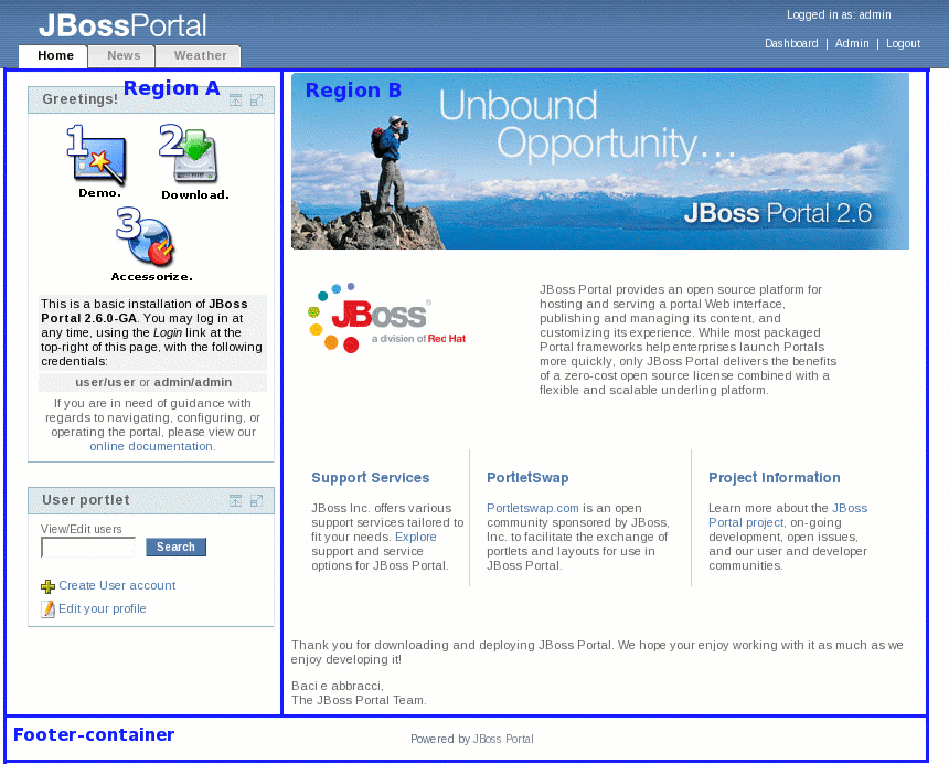
Screen shot using color outline of main ID selectors used to control presentation and layout:

- Red Border - portal-container
- Yellow Border - header-container
- Orange Border - content-container
- Blue Border - regionA/regionB
- Green Border - portlet-container
The following is a list of the selectors used in the theme stylesheet, including a brief explanation of how each selector is used in the portal:
Portal Body Selector
#body {
   background-color: #FFFFFF;
   background-image: url( images/header_bg.gif );
   background-repeat: repeat-x;
   margin: 0px;
   padding: 0px;
   font-family: Verdana, Arial, Helvetica, sans-serif;
   background-repeat: repeat-x;
   font-size: 11px;
   color: #656565;
}
Usage: This selector controls the background of the page, and can be modified to set a base font-family, layout margin, etc. that will be inherited by all child elements that do not have their own individual style applied. By default, the selector pulls an image background for the page.
Portal Header Selectors
#spacer {
   width: 770px;
   line-height: 0px;
   font-size: 0px;
   height: 0px;
}
Usage: Spacer div used to keep header at certain width regardless of display size. This is done to avoid overlapping of tab navigation in header. To account for different display sizes, this selector can be modified to force a horizontal scroll in the browser which eliminates any issue with overlapping elements in the header.
#header-container {
  background-repeat: repeat-y;
  height: 100%;
  min-width: 1000px;
  width: 100%;
  position: absolute;
  bottom: 5px;*/
 }
Usage: Wrapper selector used to control the position of the header on the page. This selector is applied as an ID on the table used to structure the header. You can adjust the attributes to reposition the header location on the page and/or create margin space on the top, right, bottom and left sides of the header.
Screenshot:
#header {
   height: 65px;
   width: 100%;
   padding: 0px;
   margin: 0px;
   z-index: 1;
}
Usage: This selector applies the header background image in the portal. It can be adjusted to accommodate a header background of a certain width/height or, as it currently does, repeat the header graphic so that it tiles across the header portion of the page.
#logoName {
   background-image: url( images/logo.gif );
   background-repeat: no-repeat;
   float: left;
   width: 250px;
   height: 25px;
   z-index: 2;
   position: absolute;
   left: 20px;
   top: 10px;
}
Usage: Logo selector which is used to brand the header with a specific, customized logo. The style is applied as an ID on an absolutely positioned DIV element which enables it to be moved to any location on the page, and allows it to be adjusted to accommodate a logo of any set width/height.
Portal Layout Region Selectors
#portal-container {
/* part of below IE hack to preserve min-width for portlet regions */
/*width: 100%;*/
   margin: 4px 2% 0px 2%;

   padding: 0 350px 0 350px;
}
Usage: Wrapper for entire portal which starts/ends after/before the BODY tag (see red border in screen shot). The padding attribute for this selector is used to preserve a minimum width setting for the portlet regions (discussed below). Similar to body selector, this style can modified to create margin or padding space on the top, right, bottom and left sections of the page. It provides the design capability to accommodate most layouts (e.g. a centered look such as the phalanx theme where there is some spacing around the content of the portal, or a full width look as illustrated in the Industrial theme).
Screenshot:
/* min width for IE */
#expander {
   position: relative;
   padding: 0 0 0 0;

   margin: 0 -350px 0 -350px;
   min-width: 770px;
   padding: 0 0 0 0;
}

/* min width hack for IE */
#sizer {
   width: 100%;
}

/* IE Hack \*/
* html #portal-container,
   * html #sizer,
   * html #expander {
   height: 0;
}
Usage: These selectors are used in conjunction with the above, portal-container, selector to preserve a minimum width setting for the portlet regions. This was implemented to maintain a consistent look across different browsers.
#content-container {
   height: 100%;
   text-align: left;
   width: 100%;
   min-width: 770px;
   /*
   position: absolute;
   top: 70px;
   left: 0px; / * z-index: 1; * /
   / * part of below IE hack
padding: 0 350px 0 350px; * /
   padding: 0px 100px 0px 0px;
   */
}
Usage: Wrapper that contains all regions in portal with the exception of the header (see orange border in screen shot). Its attributes can be adjusted to create margin space on page, as well as control positioning of the area of the page below the header.
/* portlet regions within content-container. this includes footer-container. */
#regionA {
   width: 30%;
   float: left;
   margin: 0px;
   padding: 0px;
   min-width: 250px; /*height: 300px;*/
}
Usage: First portlet region located within the content-container (see blue border in screen shot). This selector controls the width of the region as well as its location on the page. Designers can very easily reposition this region in the portal (e.g. swap left regionA with right regionB, etc.) by adjusting the attributes of this selector.
#regionB {
   /* test to swap columns..
margin: 0 30% 0 0; */

   /*two column layout
margin: 0 0 0 30%;*/
   padding: 0px; /* test to add 3rd region in layout...*/
   width: 67%;
   float: left; /*height: 300px;*/
}
Usage: Second portlet region located within the content-container (see blue border in screen shot). Similar to regionA, this selector controls the width of the region as well as its location on the page.
#regionC {
/* inclusion of 3rd region - comment out for 2 region testing */
   padding: 0px;
   margin: 0px;
   width: 28%;
   float: left; /*hide 3rd region*/
   display: none;
}
Usage: Third portlet region located within the content-container (please refer to blue border in screen shot representing regionA and regionB for an example). Used for 3 column layout. Similar to regionA and regionB, this selector controls the width of the region as well as its location on the page.
Screenshot:
hr.cleaner {
clear:both;
height:1px;
margin: -1px 0 0 0;
padding:0;
border:none;
visibility: hidden;
}
Usage: Used to clear floats in regionA, regionB and regionC DIVs so that footer spans bottom of page.
#footer-container {
   padding: 10px;
   text-align: center;
   clear: both;
}
Usage: Footer region located towards the bottom of the content-container (see above screen shot). This region spans the entire width of the page, but can be adjusted (just like regionA, regionB and regionC) to take on a certain position and width/height in the layout.
Portlet Container Window Selectors
.portlet-container {
  padding: 10px;
}
Usage: Wrapper that surrounds the portlet windows (see green border in screen shot). Currently, this selector is used to create space (padding) between the portlets displayed in each particular region.
.portlet-titlebar-title {
   color: #656565;
   font-family: Verdana, Arial, Helvetica, sans-serif;
   font-size: 12px;
   font-weight: bold;
   white-space: nowrap;
   line-height: 100%;
   float: left;
   text-indent: 5px;
   padding-top: 5px;
   padding-bottom: 6px;
}
Usage: Class used to style the title of each portlet window. Attributes of this selector set font properties, indentation and position of title.
.portlet-mode-container {
   float: right;
   padding-top: 4px;
   white-space: nowrap;
}
Usage: Wrapper that contains the portlet window modes that display in the top right section of the portlet windows.
.portlet-titlebar-left {
   background-image: url( images/portlet-top-left.gif );
   background-repeat: no-repeat;
   width: 9px;
   height: 29px;
   min-width: 9px;
   background-position: bottom;
}
Usage: Used to style the top left corner of the portlet window. Each portlet window consists of one table that has 3 columns and 3 rows. This selector styles the first column (TD) in the first row (TR).
Screenshot:

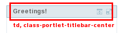
.portlet-titlebar-center {
   background-image: url( images/portlet-top-middle.gif );
   background-repeat: repeat-x;
   height: 29px;
   background-position: bottom;
}
Usage: Used to style the center section of the portlet title bar. Each portlet window consists of one table that has 3 columns and 3 rows. This selector styles the second column (TD) in the first row (TR).
Screenshot:
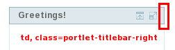
.portlet-titlebar-right {
   background-image: url( images/portlet-top-right.gif );
   background-repeat: no-repeat;
   width: 10px;
   height: 30px;
   min-width: 10px;
   background-position: bottom left;
}
Usage: Used to style the top right corner of the portlet window. Each portlet window consists of one table that has 3 columns and 3 rows. This selector styles the third column (TD) in the first row (TR).
Screenshot:
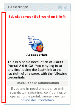
.portlet-content-left {
   background-image: url( images/portlet-left-vertical.gif );
   background-repeat: repeat-y;
   width: 9px;
   min-width: 9px;
   /*
      width:20px;
      background-color:#FFFFFF;
      border-left: 1px solid #dfe8ed;
   */
}
Usage: Used to style the left hand vertical lines that make up the portlet window. Each portlet window consists of one table that has 3 columns and 3 rows. This selector styles the first column (TD) in the second row (TR).
Screenshot:
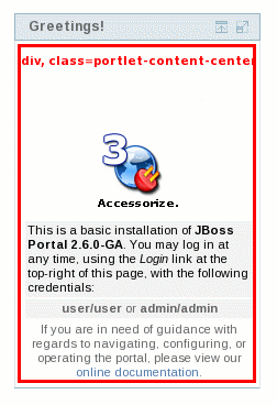
.portlet-content-center {
   vertical-align: top;
   padding: 0;
   margin: 0;
}
Usage: Used to style the center, content area where the portlet content is injected into the portlet window (see below screen). Attributes for this selector control the positioning of the portlet content as well as the background and font properties. Each portlet window consists of one table that has 3 columns and 3 rows. This selector styles the second column (TD) in the second row (TR).
Screenshot:
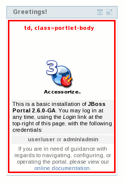
.portlet-body {
   background-color: #FFFFFF;
   padding: 0;
   margin: 0;
}
Usage: An extra selector for controlling the content section of the portlet windows (see below screen). This was added to better deal with structuring the content that gets inserted/rendered in the portlet windows, specifically if the content is causing display problems in a portlet.
Screenshot:
.portlet-content-right {
   background-image: url( images/portlet-right-vertical.gif );
   height: 100%;
   background-repeat: repeat-y;
   background-position: left;
   width: 5px;
   min-width: 5px;
   padding: 0;
   margin: 0;
   /*
      width:5px;
      background-color:#FFFFFF;
      border-right: 1px solid #dfe8ed;
   */
}
Usage: Used to style the right hand vertical lines that make up the portlet window. Each portlet window consists of one table that has 3 columns and 3 rows. This selector styles the third column (TD) in the second row (TR).
Screenshot:

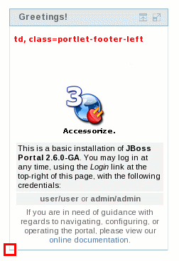
.portlet-footer-left {
   background-image: url( images/portlet-bottom-left.gif );
   width: 9px;
   height: 4px;
   background-repeat: no-repeat;
   background-position: top right;
   min-width: 9px;
   padding: 0;
   margin: 0;
   /*
   background-color:#FFFFFF;
   border-bottom: 1px solid #98b7c6;
   border-left: 1px solid #dfe8ed;
   height:5px;
   */
}
Usage: Used to style the bottom left corner of the portlet window. Each portlet window consists of one table that has 3 columns and 3 rows. This selector styles the first column (TD) in the third row (TR).
Screenshot:
.portlet-footer-center {
   background-image: url( images/portlet-bottom-middle.gif );
   height: 4px;
   background-repeat: repeat-x;
   /*	background-color:#FFFFFF;
      border-bottom: 1px solid #98b7c6;
      height:5px;
   */
}
Usage: Used to style the bottom, center of the portlet window (i.e. the bottom horizontal line in the Industrial theme). Each portlet window consists of one table that has 3 columns and 3 rows. This selector styles the second column (TD) in the third row (TR).
Screenshot:
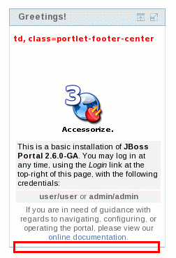
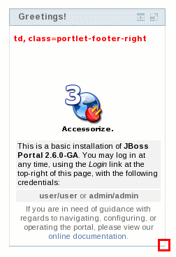
.portlet-footer-right {
   background-image: url( images/portlet-bottom-right.gif );
   width: 5px;
   height: 4px;
   background-repeat: no-repeat;
   min-width: 5px;
   /*
      background-color:#FFFFFF;
      border-bottom: 1px solid #98b7c6;
      border-right: 1px solid #dfe8ed;
      height:5px;
   */
}
Usage: Used to style the bottom right corner of the portlet window. Each portlet window consists of one table that has 3 columns and 3 rows. This selector styles the third column (TD) in the third row (TR).
Screenshot:
Portlet Window Mode Selectors
.portlet-mode-maximized {
   background-image: url( images/ico_16_maximize.gif );
   background-repeat: no-repeat;
   width: 16px;
   height: 16px;
   float: left;
   display: inline;
   cursor: pointer;
   padding-left: 3px;
}
Usage: Selector used to display the portlet maximize mode. Attributes for this selector control the display and dimensions of the maximize icon, including the behavior of the mouse pointer when hovering the mode.
.portlet-mode-minimized {
   background-image: url( images/ico_16_minimize.gif );
   background-repeat: no-repeat;
   width: 16px;
   height: 16px;
   float: left;
   display: inline;
   cursor: pointer;
   padding-left: 3px;
}
Usage: Selector used to display the portlet minimize mode. Attributes for this selector control the display and dimensions of the minimize icon, including the behavior of the mouse pointer when hovering the mode.
.portlet-mode-normal {
   background-image: url( images/ico_16_normal.gif );
   width: 16px;
   height: 16px;
   background-repeat: no-repeat;
   float: left;
   display: inline;
   cursor: pointer;
   padding-left: 3px;
}
Usage: Selector used to display the portlet normal mode (i.e. the icon that when clicked, restores the portlet to the original, default view). Attributes for this selector control the display and dimensions of the normal icon, including the behavior of the mouse pointer when hovering the mode.
.portlet-mode-help {
   background-image: url( images/ico_16_help.gif );
   width: 16px;
   height: 16px;
   background-repeat: no-repeat;
   float: left;
   display: inline;
   cursor: pointer;
   padding-left: 3px;
}
Usage: Selector used to display the portlet help mode. Attributes for this selector control the display and dimensions of the help icon, including the behavior of the mouse pointer when hovering the mode.
.portlet-mode-edit {
   background-image: url( images/ico_edit.gif );
   background-repeat: no-repeat;
   width: 28px;
   height: 16px;
   float: left;
   display: inline;
   cursor: pointer;
   padding-left: 3px;
}
Usage: Selector used to display the portlet edit mode. Attributes for this selector control the display and dimensions of the edit icon, including the behavior of the mouse pointer when hovering the mode.
.portlet-mode-remove {
   background-image: url( images/ico_16_remove.gif );
   background-repeat: no-repeat;
   width: 16px;
   height: 16px;
   float: left;
   display: inline;
   cursor: pointer;
   padding-left: 3px;
}
Usage: Currently not available. But here is the intended use: Selector used to display the portlet remove mode. Attributes for this selector control the display and dimensions of the remove icon, including the behavior of the mouse pointer when hovering the mode.
.portlet-mode-view {
   background-image: url( images/ico_cancel.gif );
   background-repeat: no-repeat;
   width: 28px;
   height: 16px;
   float: left;
   display: inline;
   cursor: pointer;
   padding-left: 3px;
   padding-right: 20px;
}
Usage: Selector used to display the portlet view mode. Attributes for this selector control the display and dimensions of the view icon, including the behavior of the mouse pointer when hovering the mode.
.portlet-mode-reload {
   background-image: url( images/ico_16_reload.gif );
   background-repeat: no-repeat;
   width: 16px;
   height: 16px;
   float: left;
   display: inline;
   cursor: pointer;
   padding-left: 3px;
}
Usage: Currently not available. But here is the intended use: Selector used to display the portlet reload mode. Attributes for this selector control the display and dimensions of the reload icon, including the behavior of the mouse pointer when hovering the mode.
Copyright Selectors
.portal-copyright {
   font-family: Verdana, Arial, Helvetica, sans-serif;
   font-size: 10px;
   color: #5E6D7A;
}

a.portal-copyright {
   color: #768591;
   text-decoration: none;
}

a.portal-copyright:hover {
   color: #bcbcbc;
   text-decoration: underline;
}
Usage: The above three selectors are used to style copyright content in the portal. The portal-copyright selector sets the font properties (color, etc.), and the a.portal-copyright/a.portal-copyright:hover selectors style any links that are part of the copyright information.
Table Selectors
.portlet-table-header {
   background-color: #eef;
   padding: 0 5px 5px 5px;
   font-weight: bold;
   color: #656565;
   font-size: 12px;
   border-bottom: 1px solid #d5d5d5;
}
Usage: Intended for styling tables (specifically, the TH or table header elements) that get rendered within a portlet window.
.portlet-table-body {

}
Usage: Intended for styling the table body element used to group rows in a table.
.portlet-table-alternate {
   background-color: #E6E8E5;
   border-bottom: 1px solid #d5d5d5;
}
Usage: Used to style the background color (and possibly other attributes) for every other row within a table.
.portlet-table-selected {
   color: #000;
   font-size: 12px;
   background-color: #CBD4E6;
}
Usage: Used to style text, color, etc. in a selected cell range.
.portlet-table-subheader {
   font-weight: bold;
   color: #000;
   font-size: 12px;
}
Usage: Used to style a subheading within a table that gets rendered in a portlet.
.portlet-table-footer {
   padding: 5px 5px 0 5px;
   font-weight: bold;
   color: #656565;
   font-size: 12px;
   border: none;
   border-top: 1px solid #d5d5d5;
}
Usage: Similar to portlet-table-header and portlet-table-body, this selector is used to style the table footer element which is used to group the footer row in a table.
.portlet-table-text {
   padding: 3px 5px;
   border-bottom: 1px solid #d5d5d5;
}
Usage: Text that belongs to the table but does not fall in one of the other categories (e.g. explanatory or help text that is associated with the table). This selector can also be modified to provide styled text that can be used in all tables that are rendered within a portlet.
FONT Selectors
.portlet-font {
   color: #000000;
   font-family: Verdana, Arial, Helvetica, sans-serif;
   font-size: 11px;
}
Usage: Used to style the font properties on text used in a portlet. Typically this class is used for the display of non-accentuated information.
.portlet-font-dim {
   color: #777777;
   font-family: Verdana, Arial, Helvetica, sans-serif;
   font-size: 11px;
}
Usage: A lighter version (color-wise) of the portlet-font selector.
FORM Selectors
.portlet-form-label {
   font-size: 10px;
   color: #656565;
}
Usage: Text used for the descriptive label of an entire form (not the label for each actual form field).
.portlet-form-button {
   font-size: 10px;
   font-weight: bold;
   color: #FFFFFF;
   background-color: #5078aa;
   border-top: 1px solid #97B7C6;
   border-left: 1px solid #97B7C6;
   border-bottom: 1px solid #254869;
   border-right: 1px solid #254869;
}
Usage: Used to style portlet form buttons (e.g. Submit).
.portlet-icon-label {

}
Usage: Text that appears beside a context dependent action icon.
.portlet-dlg-icon-label {

}
Usage: Text that appears beside a "standard" icon (e.g Ok, or Cancel).
.portlet-form-field-label {
   font-family: Verdana, Arial, Helvetica, Sans-Serif, sans-serif;
   font-size: 10px;
   color: #000;
   vertical-align: bottom;
   white-space: nowrap
}
Usage: Selector used to style portlet form field labels.
.portlet-form-field {
   font-family: Verdana, Arial, Helvetica, Sans-Serif, sans-serif;
   font-size: 10px;
   color: #000; /*margin-top: 10px;*/
}
Usage: Selector used to style portlet form fields (i.e. INPUT controls, SELECT elements, etc.).
LINK Selectors
.portal-links:link {
   font-family: Verdana, Arial, Helvetica, Sans-Serif, sans-serif;
   font-size: 11px;
   font-weight: bold;
   color: #242424;
   text-decoration: none;
}

.portal-links:hover {
   font-family: Verdana, Arial, Helvetica, Sans-Serif, sans-serif;
   font-size: 11px;
   font-weight: bold;
   color: #5699B7;
   text-decoration: none;
}

.portal-links:active {
   font-family: Verdana, Arial, Helvetica, Sans-Serif, sans-serif;
   font-size: 11px;
   font-weight: bold;
   color: #242424;
   text-decoration: none;
}

.portal-links:visited {
   font-family: Verdana, Arial, Helvetica, Sans-Serif, sans-serif;
   font-size: 11px;
   font-weight: bold;
   color: #242424;
   text-decoration: none;
}
Usage: The above four selectors are used to style links in the portal. Each pseudo class (i.e. hover, active, etc.) provides a different link style.
MESSAGE Selectors
.portlet-msg-status {
   font-family: Verdana, Arial, Helvetica, Sans-Serif, sans-serif;
   font-size: 12px;
   font-style: normal;
   color: #336699;
}
Usage: Selector used to signify the status of a current operation that takes place in the portlet (e.g. "saving results", "step 1 of 4").
.portlet-msg-info {
   font-family: Verdana, Arial, Helvetica, Sans-Serif, sans-serif;
   font-size: 12px;
   font-style: italic;
   color: #000;
}
Usage: Selector used to signify general information in a portlet (e.g. help messages).
.portlet-msg-error {
   color: red;
   font-family: Verdana, Arial, Helvetica, Sans-Serif, sans-serif;
   font-size: 12px;
   font-weight: bold;
}
Usage: Selector used to signify an error message in the portlet (e.g. form validation error).
.portlet-msg-alert {
   font-family: Verdana, Arial, Helvetica, Sans-Serif, sans-serif;
   font-size: 12px;
   font-weight: bold;
   color: #821717;
}
Usage: Selector used to style an alert that is displayed to the user.
.portlet-msg-success {
   font-family: Verdana, Arial, Helvetica, Sans-Serif, sans-serif;
   font-size: 12px;
   font-weight: bold;
   color: #359630;
}
Usage: Selector used to indicate successful completion of an action in a portlet (e.g. "save successful").
SECTION Selectors
.portlet-section-header {
   font-weight: bold;
   color: #656565;
   font-size: 12px;
}
Usage: Table or section header.
.portlet-section-body {
   color: #656565;
}
Usage: Normal text in a table cell.
.portlet-section-alternate {
   background-color: #F2F2F2;
}
Usage: Used to style background color and text in every other table row.
.portlet-section-selected {
   background-color: #CBD4E6;
}
Usage: Used to style background and font properties in a selected cell range.
.portlet-section-subheader {
   font-weight: bold;
   font-size: 10px;
}
Usage: Used to style a subheading within a table/section that gets rendered in a portlet.
.portlet-section-footer {
   font-size: 11px;
}
Usage: Used to style footer area of a section/table that gets rendered in a portlet.
.portlet-section-text {
   font-size: 12px;
   font-style: italic;
}
Usage: Text that belongs to a section but does not fall in one of the other categories. This selector can also be modified to provide styled text that can be used in all sections that are rendered within a portlet.
MENU Selectors
.portlet-menu {}Usage: General menu settings such as background color, margins, etc.
.portlet-menu-item {
   color: #242424;
   text-decoration: none;
   font-family: Verdana, Arial, Helvetica, sans-serif;
   font-size: 12px;
}
Usage: Normal, unselected menu item.
.portlet-menu-item:hover {
   color: #5699B7;
   text-decoration: none;
   font-family: Verdana, Arial, Helvetica, sans-serif;
   font-size: 12px;
}
Usage: Used to style hover effect on a normal, unselected menu item.
.portlet-menu-item-selected {}Usage: Applies to selected menu items.
.portlet-menu-item-selected:hover {}Usage: Selector styles the hover effect on a selected menu item.
.portlet-menu-cascade-item {}Usage: Normal, unselected menu item that has sub-menus.
.portlet-menu-cascade-item-selected {}Usage: Selected sub-menu item.
.portlet-menu-description {}Usage: Descriptive text for the menu (e.g. in a help context below the menu).
.portlet-menu-caption {}Usage: Selector used to style menu captions.
WSRP Selectors
.portlet-horizontal-separator {}Usage: A separator bar similar to a horizontal rule, but with styling matching the page.
.portlet-nestedTitle-bar {}Usage: Allows portlets to mimic the title bar when nesting something.
.portlet-nestedTitle {}Usage: Allows portlets to match the textual character of the title on the title bar.
.portlet-tab {}Usage: Support portlets having tabs in the same style as the page or other portlets.
.portlet-tab-active {}Usage: Highlight the tab currently being shown.
.portlet-tab-selected {}Usage: Highlight the selected tab (not yet active).
.portlet-tab-disabled {}Usage: A tab which can not be currently activated.
.portlet-tab-area {}Usage: Top level style for the content of a tab.
Since 2.6 JBoss Portal has ajax features. Those features introduce a couple of CSS selectors that enables further customization of the visual look and feel. Indeed by default those CSS styles are provided by ajaxified layouts but it may not fit with some themes. It is possible to redefine them in the stylesheet of the themes.
.dyna-region {}Usage: Denotes a dynamic region which can be subject to ajax capabilities..dyna-window {}Usage: Denotes a dynamic window which can be subject to ajax capabilities..dyna-decoration {}Usage: Denotes a dynamic decorator which can be subject to ajax capabilities..dyna-portlet {}Usage: Denotes a dynamic content which can be subject to ajax capabilities..dnd-handle { cursor: move; }Usage: Denotes the handle offered by draggable windows. By default it changes the mouse shape to indicate to the user that his mouse is hovering a draggable window..dnd-droppable { border: red 1px dashed; background-color: Transparent; }Usage: Denotes a zone where a user can drop a window during drag and drop operations. This selector is added and removed dynamically at runtime by the ajax framework and is not present in the generated markup.