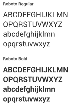
The Android design language relies on traditional typographic tools such as scale, space, rhythm, and alignment with an underlying grid. Successful deployment of these tools is essential to help users quickly understand a screen of information. To support such use of typography, Ice Cream Sandwich introduced a new type family named Roboto, created specifically for the requirements of UI and high-resolution screens. The current TextView framework supports regular, bold, italic, and bold italic weights by default.

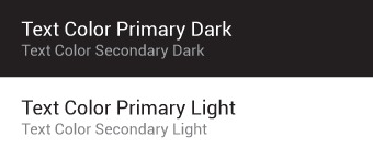
Default type colors
The Android UI uses the following default color styles: textColorPrimary and
textColorSecondary. For light themes use textColorPrimaryInverse and
textColorSecondaryInverse. The framework text color styles also support variants for
touch feedback states when used inside UI elements.

Typographic Scale
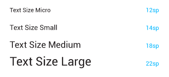
Contrast in type sizes can go a long way to create ordered, understandable layouts. However, too many different sizes in the same UI can be messy. The Android framework uses the following limited set of type sizes:

Users can select a system-wide scaling factor for text in the Settings app. In order to support these accessibility features, type should be specified in scale-independent pixels (sp) wherever possible. Layouts supporting scalable types should be tested against these settings.