This menu is used for actions that affect how the various panes are viewed.
This menu entry brings up a dialog box, describing all the diagrams in the current project under ArgoUML.
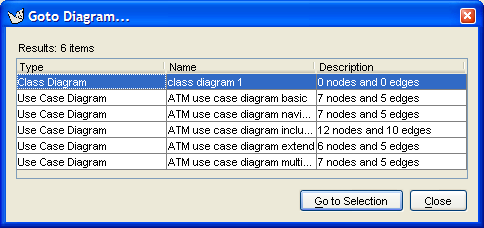
The dialog box contains a table with three columns and one row for each diagram in the current project. A scroll bar gives access if the table is too long for the box. Double button 1 click on any row will select that diagram in the editing pane. The three columns are as follows.
Type. Lists the type of diagram.Name. Lists the name given to the diagram.Description. Shows how many nodes and edges there are on the diagrams. A node is a “2-D” model element and an edge is a connector model element.
This dialog box is not modal, which allows it to remain open while editing the model for easy navigation.
![[Warning]](images/warning.png) | Warning |
|---|---|
The V0.26 implementation of ArgoUML does not immediately update the dialog box with changes made to diagrams: change of name, addition of diagrams, deletion of diagrams. |
This menu entry brings up a non-modal dialog box for the ArgoUML search engine.
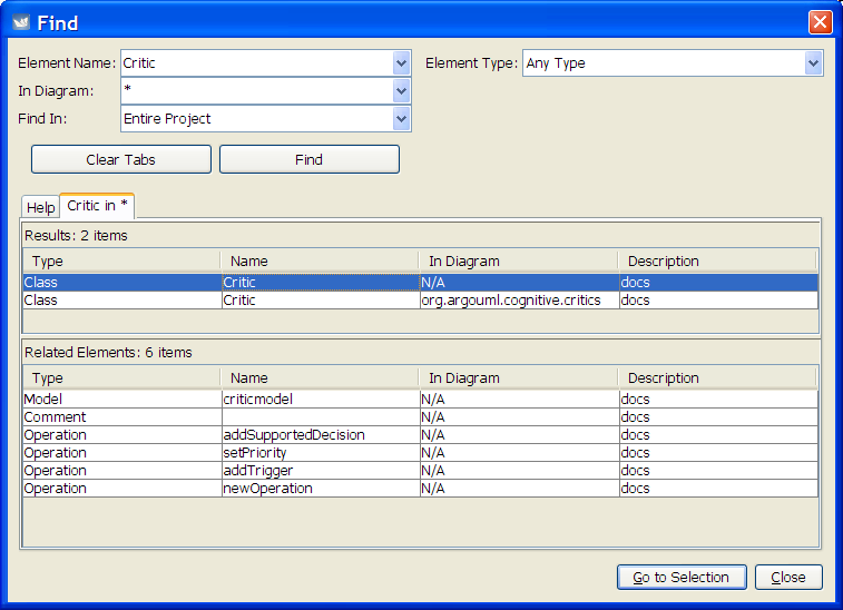
The Name and Location specifies the
search to be made. It contains the following:
A text box labeled
Element Name:specifies the name of the model element to search for. Wild cards (*,?) may be used here. A drop down gives access to find expressions previously used.A text box labeled
In Diagram:specifies which diagrams are to be searched. Again wild cards may be used. Both these two text boxes have a default entry of*, i.e. match anything.To the right of these two text boxes, a selector labeled
Element Type:allows you to specify the UML metaclass for which you are searching.A selector labeled
Find in:allows the search to be made over the entire project (the default) or as a sub-search over the results of a previous search. When opened, a list of all the search result tabs appears.Beneath these boxes is the button
Clear
              Tabs
. This clears the display of tabs with the results from previous searches (see below). This button is downlighted if there are no tabs but theHelptab.And finally, there is the button
Find. This causes the search specified in the text boxes and selectors above to be executed. The results are displayed in a tab taking up the lower two thirds of the page.
The lower two thirds of the dialog comprises an initial
tab (labeled Help) giving summary help,
and further tabs displaying the results of searches. These
search tabs are labeled with a summary of the search
element
in diagram and are
divided horizontally in two halves.
Button 1 double clicking on these tabs removes the tab, and spawns a new window that contains the tab contents, i.e. the search results. This window can be moved and sized at will. This does not work for the help tab.
The top half is labeled Search
Results: followed by a count of the number of items
found. It comprises a table with one row for each
model element and four columns. The width of the columns can be
adjusted.
Type. Lists the type of model element.Name. Lists the name given to the model element.In Diagram. Where the model element is visible on a diagram, this lists the name of the diagram, otherwise it showsN/A.Description. Contains a description of the model element. In ArgoUML V0.18 this seems to be restricted to the single entrydocs.
Button 1 click on any row will give more information on that model element by showing related model elements in the bottom half (see below). Double click on any row describing a model element on a diagram and that item and diagram will be selected.
The bottom half of the tab is a table labeled
Related Elements: and is a table with the same
columns as the top half. When a model element has been
selected in the top half, this table shows the details of any
related elements.
![[Tip]](images/tip.png) | Tip |
|---|---|
Enlarging the dialog vertically shows that the "Related Items" part changes in size, but not the Search results part. However, between them is a divider line and when hovering over this line, the mouse pointer changes into a sizing icon, and the border between these 2 areas can be moved up or down to redistribute the space in the window. |
| Warning |
|---|---|
This dialog box is not modal, which allows it to remain open while editing the model for easy navigation. But the V0.26 implementation of ArgoUML does not immediately update the dialog box with changes made to the found model elements: change of model element name, change of diagram name. Deletion of a diagram does not stop the possibility to navigate to it. |
This entry brings up a sub-entry, which allows scaling the view of all diagrams to a factor of its normal size. This setting is not saved persistently.
The sub-menu items that can be selected are:
Zoom Out. Shortcut (Ctrl-Minus). Gives more overview over the drawing.Zoom Reset. Returns to the default zoom ratio (i.e. 100%).Zoom In. Shortcut (Ctrl-Plus). Makes the items on the drawings bigger.
This allows selection of the grid representation on the screen between the following:
Lines 16: full grid at 16 pixel spacing.Lines 8: full grid at 8 pixel spacing.Dots 16: dots at 16 pixel spacing (the default).Dots 32: dots at 32 pixel spacing.None: no grid of any form.
This allows selection of the spacing of grid snapping between the following:
Snap 4: snap at 4 pixel spacing.Snap 8: snap at 8 pixel spacing (the default).Snap 16: snap at 16 pixel spacing.Snap 32: snap at 32 pixel spacing.
![[Note]](images/note.png) | Note |
|---|---|
There is no option to turn off snap to grid altogether |
| Note |
|---|---|
If you wish to align existing elements to changed
snap boundaries,
you can use the |
This toggles whether page breaks are shown on the diagram (as white dotted lines).
| Warning |
|---|---|
This menu item does not work in ArgoUML V0.26. |
This menu allows the user to hide or show any of the bars at will. By default, all of them are shown.