Table of Contents
By Martin Kleppmann
If you are new to Blender, you should get a good grip on how to work with the user interface before modelling. The concepts behind Blender's interface are non-standard, and different from other 3D software packages. Windows users especially will need to get used to the different way that Blender handles controls, such as button choices and mouse movements. But this difference is in fact one of Blender's great strengths: once you understand how to work the Blender way, you will find that you can work exceedingly quickly and productively.
Furthermore, Blender's interface greatly changed in the transition from version 2.28 to version 2.3, so even experienced users might profit from this chapter.
Relevant to Blender v2.31
The user interface is the vehicle for two way interaction between the user and the program. The user communicates with the program via the keyboard and the mouse, the program gives feedback via the screen and its windowing system.
Blender's interface makes use of three mouse buttons and a wide range of hotkeys (for a complete in-depth discussion refer to Volume II). If your mouse has only two buttons, you can emulate the middle mouse button (the section called “User preferences and Themes” describes how). A mouse wheel can be used, but it is not necessary as there are also appropriate keyboard shortcuts.
This book uses the following conventions to describe user input:
The mouse buttons are called LMB (left mouse button), MMB (middle mouse button) and RMB (right mouse button).
If your mouse has a wheel, MMB refers to clicking the wheel as if it were a button, while MW means rolling the wheel.
Hotkey letters are named by appending KEY to the letter, i.e. GKEY refers to the letter g on the keyboard. Keys may be combined with the modifiers SHIFT, CTRL and/or ALT. For modified keys the KEY suffix is generally dropped, for example CTRL-W or SHIFT-ALT-A.
NUM0 to NUM9, NUM+ and so on refer to the keys on the separate numeric keypad. NumLock should generally be switched on.
Other keys are referred to by their names, such as ESC, TAB, F1 to F12.
Other special keys of note are the arrow keys, UPARROW, DOWNARROW and so on.
Because Blender makes such extensive use of both mouse and keyboard, a "golden rule" has evolved among Blender users: keep one hand on the mouse and the other on the keyboard! If you normally use a keyboard that is significantly different from the English keyboard layout, you may want to think about changing to the English or American layout for your work with Blender. The most frequently used keys are grouped so that they can be reached by the left hand in standard position (index finger on FKEY) on the English keyboard layout. This assumes that you use the mouse with your right hand.
Now it's time to start Blender and begin playing around.
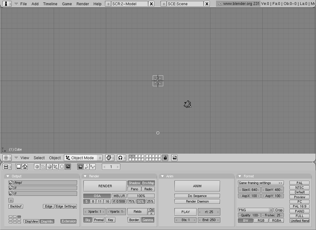
Figure 3.1, “The default Blender scene.” shows the screen you should get after starting Blender (except for the added text and arrows). At default it is separated into three windows: The main menu at the top, the large 3D Window and the Buttons Window at the bottom. Most windows have a header (the strip with a lighter grey background containing icon buttons - for this reason we will also refer to the header as the window ToolBar); if present, the header may be at the top (as with the Buttons window) or the bottom (as with the 3D Window) of a window's area.
If you move the mouse over a window, note that its header changes to a lighter shade of grey. This means that it is "focused;" all hotkeys you press will now affect the contents of this window.
You can easily customize Blender's window system to suit your needs and wishes.
You can create a new window by splitting an existing one in half.
Do so by focusing the window you want to split (move the mouse
into it), clicking the border with MMB or
RMB, and selecting Split Area
(Figure 3.2, “The Split menu for creating new windows.”). You can now set the new
border's position by clicking with LMB, or
cancel your action by pressing ESC. The new window will
start as a clone of the window you split, but can then be
set to a different window type, or to display the scene from a different
point of view.
Interface Items
Labels in the interface buttons, menu entries and, in general,
all text shown on the screen is highlighted in this book
like this.
Create a new vertical border by choosing Split Area from a
horizontal border, and vice versa. You can resize each window by
dragging a border with LMB. To reduce the number
of windows, click a border between two windows with
MMB or RMB and choose Join
Areas. The resulting window receives the properties of the
previously focused window.
To set a header's position click RMB
on the header and choose Top
or Bottom. You can also hide the header by choosing
No Header, but this is
only advisable if you know all the relevant hotkeys. You can show a hidden
header again by clicking the window's border with
MMB or RMB and selecting
Add Header.
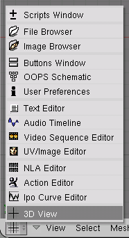
Each window frame may contain different types and sets of information, depending upon what you are working on. These may include 3D models, animation, surface materials, Python scripts, and so on. You can select the type for each window by clicking its header's leftmost button with LMB (Figure 3.3, “The window type selection menu.”).
We'll explain the functions and usage of the respective window types later in this book. For now we only need to concern ourselves with the three window types that are already provided in Blender's default scene:
- 3D Viewport
Provides a graphical view into the scene you are working on. You can view your scene from any angle with a variety of options; see the section called “Navigating in 3D Space” for details. Having several 3D Viewports on the same screen can be useful if you want to watch your changes from different perspectives at the same time.
- Buttons Window
Contains most tools for editing objects, surfaces, textures, Lights, and much more. You will need this window constantly if you don't know all hotkeys by heart. You might indeed want more than one of these windows, each with a different set of tools.
- User preferences (Main menu)
This window is usually hidden, so that only the menu part is visible - see the section called “User preferences and Themes” for details. It's rarely used though, since it contains global configuration settings.
There are several novelties in Blender 2.30. First of all window headers tend to be much cleaner, less cluttered by buttons, and menus are now present in many headers.
Most window headers, immediately next to this first "Window Type" Menu button exhibit a set of menus; this is one of the main new features of the 2.30 interface. Menus now allow you to directly access many of the features and commands which previously were only accessible via hot keys or arcane buttons. Menus can be hidden and showed via the triangular button next to them.
Menu are not only window-sensitive (they change with window type) but also context sensitive (they change with selected object) so they are always very compact, showing only actions which can actually be performed.
All Menu entries shows the relevant hotkey shortcut, if any. Blender Workflow is at his best when hotkeys are used. So the rest of this Book will mostly present you hotkeys, rather than Menu entries. Menus are anyway precious since they give a complete as possible overview of all tools and commands Blender offers.
One feature of windows that sometimes comes in handy for precise
editing is that of maximizing to full screen. If you use the appropriate
View>>Maximize Window Menu entry or the hotkey
CTRL-DOWNARROW, the focused window will
extend to fill the whole screen. To return to normal size, use the
View>>Tile Window
button again or CTRL-UPARROW.
Blender's buttons are more exciting than those in most other user interfaces, and they became even nicer in 2.30. This is largely due to the fact that they are vector-based and drawn in OpenGL, which makes them elegant and zoomable.
Buttons are mostly grouped in the Button Window. As of Blender 2.3 the Button Window shows six main contexts, which can be chosen via the first icon row in the header (Figure 3.4, “Contexts and Sub-Contexts”), each of which might be subdivided into a variable number of sub-contexts, which can be chosen via the second icon row in the header (Figure 3.4, “Contexts and Sub-Contexts”):
Logic - shortcut F4
Script - no shortcut
Shading - shortcut F5
Lamp - no shortcut
Material - no shortcut
Texture - shortcut F6
Radio - no shortcut
World - shortcut F8
Object - shortcut F7
Editing - shortcut F9
Scene - shortcut F10
Rendering - no shortcut
Anim/Playback - no shortcut
Sound - no shortcut
Once the Context is selected by the user, the sub-context is usually determined by Blender on the basis of the active Object. For example, with the "Shading" context, if a Lamp Object is selected then sub-context shows Lamp Buttons, if a Mesh or other renderable Object is selected, then Material Buttons is the active sub-context, and if a Camera is selected the active sub-context is World.
The most notable novelty in the interface is probably the presence of Panels to logically group buttons. Each panel is the same size. They can be moved around the Button Window by LMB clicking and dragging on their header. Panels can be aligned by RMB on the Buttons Window and chosing the desired layout from the Menu which appears (Figure 3.5, “Button Window Menu.”).
MW scrolls Panels in their aligned direction, CTRL-MW and CTRL-MMB zooms panels in and out. Single panels can be collapsed/expanded by LMB clicking the triangle on the left of their header.
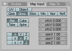
Particularly complex Panels are organized in Tabs. Clicking LMB on a Tab in the Panel header changes the buttons shown (Figure 3.6, “Panel with Tabs.”). Tabs can be "torn out" of a panel to form independent panels by clicking LMB on their header and dragging them out. In a similar way separate Panels can be turned into a single panel with Tabs by dropping one Panel's header into another.
As a last interface item in the chain there are several kind of buttons which are disposed in the Panel's Tabs:
Operation Button. These are buttons that perform an operation when they are clicked (with LMB, as all buttons). They can be identified by their brownish color in the default Blender scheme (Figure 3.7, “An operation button”).
Toggle Button. Toggle buttons come in various sizes and colors (Figure 3.8, “Toggle buttons”). The colors green, violet, and grey do not change functionality, they just help the eye to group the buttons and recognize the contents of the interface more quickly. Clicking this type of button does not perform any operation, but only toggles a state as "on" or "off."
Some buttons also have a third state that is identified by the text turning yellow (the Ref button in Figure 3.8, “Toggle buttons”). Usually the third state means "negative," and the normal "on" state means "positive."
Radio Buttons. Radio buttons are particular groups of mutually exclusive Toggle buttons. No more than one Radio Button in a given group can be "on" at one time.
Num Buttons. Number buttons (Figure 3.10, “Datablock link buttons”) can be identified by their captions, which contain a colon followed by a number. Number buttons are handled in several ways: To increase the value, click LMB on the right of the button, where the small triangle is shown; to decrease it, click on the left of the button, where another triangle is shown. To change the value in a wider range, hold down LMB and drag the mouse to the left or right. If you hold CTRL while doing this, the value is changed in discrete steps; if you hold SHIFT, you'll have finer control over the values. ENTER can be used in place of LMB here.
You can enter a value from the keyboard by holding SHIFT and clicking LMB. Press SHIFT-BACKSPACE to clear the value; SHIFT-LEFTARROW to move the cursor to the beginning; and SHIFT-RIGHTARROW to move the cursor to the end. Press ESC to restore the original value.
Some number buttons contain a slider rather than just a number with side triangles. The same method of operation applies, except that single LMB clicks must be performed on the left or on the right of the slider, while clicking on the label or the number automatically enters keyboard input mode.
Menu Buttons. Use the Menu buttons to choose from dynamically created lists. Menu buttons are principally used to link DataBlocks to each other. (DataBlocks are structures like Meshes, Objects, Materials, Textures, and so on; by linking a Material to an Object, you assign it.) You'll see an example for such a block of buttons in Figure 3.10, “Datablock link buttons”. The first button (with the tiny up and down pointing triangles) opens a menu that lets you select the DataBlock to link to by holding down LMB and releasing it over the requested item. The second button displays the type and name of the linked DataBlock and lets you edit its name after clicking LMB. The "X" button clears the link, the "car" button generates an automatic name for the DataBlock, and the "F" button specifies whether the DataBlock should be saved in the file even if it is unused (unlinked).
Unlinked objects
Unlinked data is not lost until you quit Blender. This is a powerful Undo feature. if you delete an object the material assigned to it becomes unlinked, but is still there! You just have to re-link it to another object or press the "F" button.
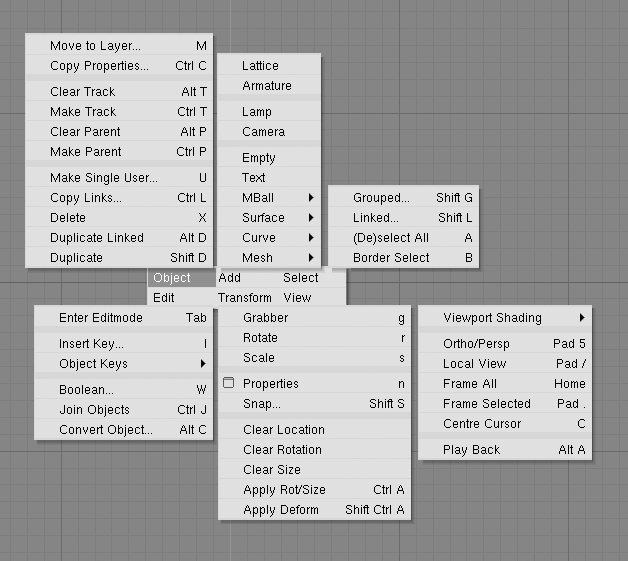
By pressing SPACE in the 3D Viewport, or by holding LMB or RMB with a still mouse for more than half a second opens the Toolbox. This contains 6 main contexts, arranged on two lines, each of which opens menus and submenus.
Three of these contexts open the same three menus present
in the 3D Viewport header, of the other three, Add
allows adding new Objects to the scene while Edit and
Transform shows all possible operations on selected Object(s)
(Figure 3.11, “The Toolbox”).
Blender's flexibility with windows lets you create customized working environments for different tasks, such as modeling, animating, and scripting. It is often useful to quickly switch between different environments within the same file. This is made possible by creating several screens: All changes to windows as described in the section called “The window system” and the section called “Window types” are saved within one screen, so if you change your windows in one screen, other screens won't be affected. But the scene you are working on stays the same in all screens.
Three different default screens are provided with Blender; they are
available via the SCR Menu Buttons in the User Preferences Window header
shown in Figure 3.12, “Screen and Scene selectors”. To change to the
next screen alphabetically, press CTRL-RIGHTARROW;
to change to the previous screen alphabetically, press
CTRL-LEFTARROW.
It is also possible to have several scenes within the same Blender
file. The scenes may use one another's objects or be completely separate
from one another. You can select and create scenes with the SCE Menu Button
buttons in the User Preferences Window header
(Figure 3.12, “Screen and Scene selectors”).
When you create a new scene, you can choose between four options to control its contents:
Emptycreates an empty scene.Link Objectscreates the new scene with the same contents as the currently selected scene. Changes in one scene will also modify the other.Link ObDatacreates the new scene based on the currently selected scene, with links to the same meshes, materials, and so on. This means that you can change objects' positions and related properties, but modifications to the meshes, materials, and so on will also affect other scenes unless you manually make single-user copies.Full Copycreates a fully independent scene with copies of the currently selected scene's contents.


