 React Native
Button #
A basic button component that should render nicely on any platform. Supports a minimal level of customization.
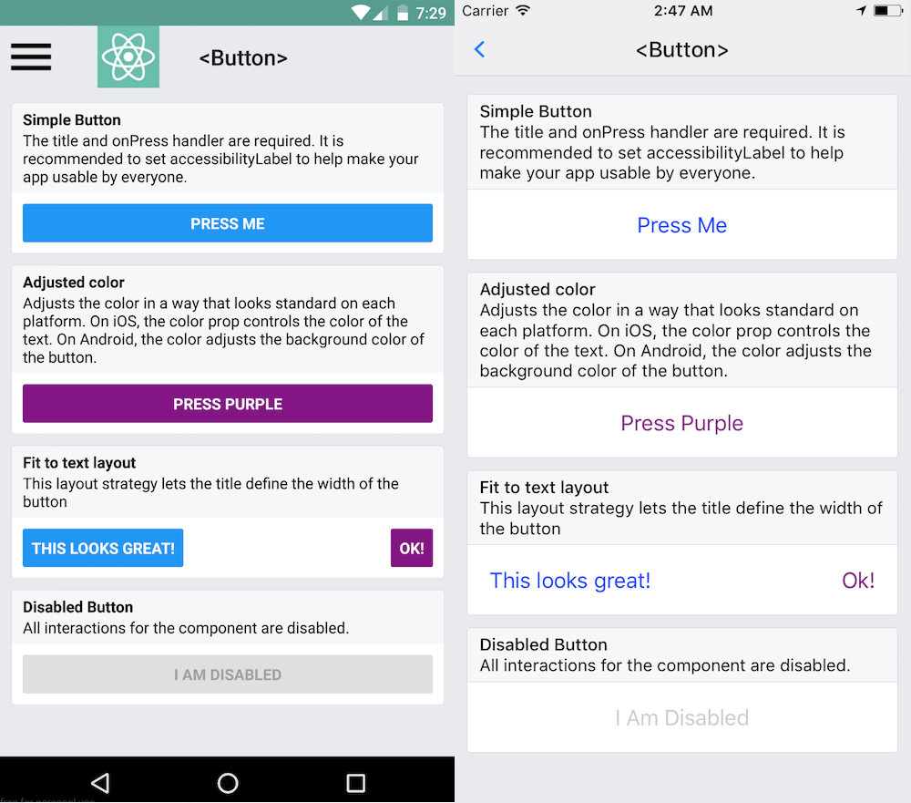
If this button doesn't look right for your app, you can build your own button using TouchableOpacity or TouchableNativeFeedback. For inspiration, look at the source code for this button component. Or, take a look at the wide variety of button components built by the community.
Example usage:
<Button
onPress={onPressLearnMore}
title="Learn More"
color="#841584"
accessibilityLabel="Learn more about this purple button"
/>
Props #
accessibilityLabel?: ?string #
Text to display for blindness accessibility features
color?: ?string #
Color of the text (iOS), or background color of the button (Android)
disabled?: ?boolean #
If true, disable all interactions for this component.
onPress: () => any #
Handler to be called when the user taps the button
testID?: ?string #
Used to locate this view in end-to-end tests.
title: string #
Text to display inside the button
Improve this page by sending a pull request!