|
|
|
|
|
|
ICEfaces Component Suite
The ICEfaces Component Suite includes enhanced implementations of the JSF standard components and additional custom components that fully leverage the ICEfaces Direct-to-DOM rendering technology and provide additional ICEfaces-specific features, such as automated partial submit, incremental page updates, and easily configurable component look-and-feel.
The following are descriptions of the common attributes that apply to the ICEfaces components.
renderedOnUserRole The visibleOnUserRole attribute has been re-named to renderedOnUserRole. If user is in given role, this component will be rendered normally. If not, nothing is rendered and the body of this tag will be skipped.
enabledOnUserRole If user is in given role, this component will be rendered normally. If not, then the component will be rendered in the disabled state.
visible The visible attribute has been added to all the relevant standard extended components. Used to render the visibility style attribute on the root element. Visible values: true || false.
Note: If the visible attribute is not defined, the default is visible.
disabled The disabled attribute is a Flag indicating that this element must never receive focus or be included in a subsequent submit. Unlike the readOnly which is included in a submit but cannot receive focus.
partialSubmit The partialSubmit attribute enables a component to perform a partial submit in the appropriate event for the component. The partialSubmit attribute only applies to custom and extended components.
Table 5, ICEfaces Component Attributes shows which attributes are applicable to each ICEfaces component.
Table 5The standard JSF components have been enhanced to support ICEfaces partial page rendering, partialSubmit of editable components, and the ability to enable or disable and show or hide components based on user role.
The enhanced standard components included in the ICEfaces Component Suite are:
- commandButton
- commandLink
- dataTable
- form
- graphicImage
- inputHidden
- inputSecret
- inputText
- inputTextarea
- message
- messages
- outputFormat
- outputLabel
- outputLink
- outputMedia
- outputText
- panelGrid
- panelGroup
- selectBooleanCheckbox
- selectManyCheckbox
- selectManyListbox
- selectManyMenu
- selectOneListbox
- selectOneMenu
- selectOneRadio
The ICEfaces Component Suite also includes a set of custom components that fully leverage the ICEfaces Direct-to-DOM rendering technology.
The following custom components are provided:
- dataExporter
- dataTable
- effect
- gMap
- inputFile
- inputRichText
- loadBundle
- menuBar
- menuPopup
- outputBody
- outputChart
- outputConnectionStatus
- outputDeclaration
- outputFormat
- outputHead
- outputHtml
- outputProgress
- outputResource
- outputStyle
- panelBorder
- panelCollapsible
- panelConfirmation
- panelDivider
- panelGroup
- panelPositioned
- panelPopup
- panelSeries
- panelStack
- panelTabSet
- panelTooltip
- portlet
- selectInputDate
- selectInputText
- setEventPhase
- tree
For more information about the ICEfaces Component Suite, see the following resources:
- ICEfaces Component Showcase demo
- ICEfaces Component Suite TLD (taglib)
The ICEfaces Component Suite fully supports consistent component styling via a set of predefined CSS style classes and associated images. Changing the component styles for a web application developed with the ICEfaces Component Suite is as simple as changing the CSS used.
A set of predefined style sheets are available to be used as-is, or customized to meet the specific requirements of the application. There are four predefined ICEfaces style sheets included:
These style sheets provide definitions for all style classes used in the ICEfaces Component Suite. The ICEfaces Component Suite renderers will render default style class attributes based on the style classes defined in the active style sheets. In order to use these style classes, page developers must specify a style sheet in their page.
Developers may also create their own custom style sheet based on a predefined ICEfaces style sheet. If the style class names match those defined in the ICEfaces style sheets, the ICEfaces components will use the specified styles by default, without the need to specify the style class names explicitly on each component.
Note: The default CSS class names associated with each component are listed in the component's TLD (taglib) description.
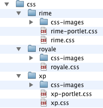
The three predefined themes included with ICEfaces each consist of a stylesheet and an image directory. In addition, the Rime and XP themes also include alternate stylesheets (rime-portlet.css and xp-portlet.css) for use when developing ICEfaces portlets.
Figure 11 shows an example of the CSS directory structure.
To use a predefined theme style sheet with an ICEfaces application, all the page developer needs to do is add the desired CSS link to the page. This can be accomplished in one of two ways:
<ice:outputStyle href="./xmlhttp/css/rime/rime.css"/><ice:outputStyle href="./xmlhttp/css/xp/xp.css"/> <ice:outputStyle href="./xmlhttp/css/royale/royale.css"><link rel="stylesheet" type="text/css" href="./xmlhttp/css/rime/rime.css" /><link rel="stylesheet" type="text/css" href="./xmlhttp/css/xp/xp.css" /> <link rel="stylesheet" type="text/css" href="./xmlhttp/css/royale/royale.css" />The ice:outputStyle component has the following advantages over the HTML link tag:
- Automatically includes browser-specific variants of the main style sheet in the page to adapt the theme styling to account for differences in each browser's CSS support. See the TLD (taglib) documentation for the ice:outputStyle component for details.
- Provides the ability to dynamically change the theme style sheet at runtime via a value binding on the component's href attribute.
<ice:outputStyle href="#{styleBean.activeTheme}" />Note: In the examples above, the ./xmlhttp/css/xp/ path specifies the location of the predefined theme resources in the icefaces.jar file. If you wish to use a custom theme, simply specify an alternative location for the theme .css file in the href attribute.
The resource files for the theme styles can be found in the "resources" directory of the ICEfaces bundle.
ICEfaces provides two mechanisms for programatically setting the focus to a specific component on a page:
- value-binding on the ice:outputBody component, and
- component-binding using the ICEfaces Focus Management API.
The ice:outputBody component provides a focus attribute which can be used to statically or dynamically set the client focus on a specific component. Setting the focus attribute value to the id or the clientId of the component to give focus will move the client browser focus to that component in the page during the next render immediately following the setting of the focus attribute value. Using this mechanism avoids the need for component binding, and provides a straightforward means of setting application focus as required.
Note: The focus is only set on the client during the render directly following a value change on the focus attribute.
Note: To set the initial focus on the page, the component to be focused must be rendered during the first render call.
To use the ICEfaces Focus Management API in your application, you must use component bindings in your application's web pages.
The ICEfaces Focus Management API consists of a single method, requestFocus(). This method is used to communicate a component focus request from the application to the client browser.
All focusable ICEfaces Component Suite components support the requestFocus() method.
In the following examples, the ice:inputText is bound to an HtmlInputText instance named westText in the application backing bean.
    <ice:inputText value="West"

        binding="#{focusBean.westText}"

    />
Example application backing bean:
    import com.icesoft.faces.component.ext.HtmlInputText;


    private HtmlInputText westText = null;


    public HtmlInputText getWestText() {

        return westText;

    }


    public void setWestText(HtmlInputText westText) {

        this.westText = westText;

    }
In the following examples, the requestFocus calls are made in a valueChangeListener which is also implemented in the application's backing bean.
		<ice:selectOneRadio value="#{focusBean.selectedText}"

				styleClass="selectOneMenu"

				valueChangeListener="#{focusBean.selectedTextChanged}"

				partialSubmit="true">

						<f:selectItem itemValue="#{focusBean.NORTH}"   itemLabel="North" />

						<f:selectItem itemValue="#{focusBean.WEST}"   itemLabel="West" />

						<f:selectItem itemValue="#{focusBean.CENTER}"   itemLabel="Center" />

						<f:selectItem itemValue="#{focusBean.EAST}"   itemLabel="East" />

						<f:selectItem itemValue="#{focusBean.SOUTH}"   itemLabel="South" />

		</ice:selectOneRadio>
Example application backing bean:
    public void selectedTextChanged(ValueChangeEvent event) {

        selectedText = event.getNewValue().toString();


        if (selectedText.equalsIgnoreCase(NORTH)) {

            this.northText.requestFocus();

        } else if (selectedText.equalsIgnoreCase(WEST)){

            this.westText.requestFocus();

        } else if (selectedText.equalsIgnoreCase(CENTER)) {

            this.centerText.requestFocus();

        } else if (selectedText.equalsIgnoreCase(EAST)){

            this.eastText.requestFocus();

        } else if (selectedText.equalsIgnoreCase(SOUTH)) {

            this.southText.requestFocus();

        }


    }

|
Copyright 2005-2009. ICEsoft Technologies, Inc. |
| |
|
|
|