Advanced features
Go back to the documentation index
Apache Ant integration
IzPack can be easily integrated inside an Ant build process. To do so you first need to tell Ant that you would like to use IzPack:
<!-- Allows us to use the IzPack Ant task -->
<taskdef name="IzPack" classpath="${basedir}/lib/compiler.jar"
         classname="com.izforge.izpack.ant.IzPackTask"/>
If you want to use the standalone compiler (and therefore don't need an IzPack installation for building), the task needs to be defined as follows:
<!-- Allows us to use the IzPack Ant task -->
<taskdef name="IzPack" classpath="${basedir}/lib/standalone-compiler.jar"
         classname="com.izforge.izpack.ant.IzPackTask"/>
Don't forget to add compiler.jar or standalone-compiler.jar to the classpath of the Ant process.
Then you can invoke IzPack with the IzPack task which takes the following parameters:
- 'input': the XML installation file. The installation can be specified as an external file, or embedded using a config child element (see section 3.2).
- 'output': the output jar installer file
- 'installerType': optional. standard or web. If web, the <webdir> attribute must be specified in the input file (see section 3.7). Used to force creation of a standard installer when the <webdir> attribute has been used.
- 'baseDir': the base directory to resolve the relative paths
- 'IzPackDir': the IzPack home directory. Only necessary if you do not use the standalone compiler.
Here is a sample of the task invocation:
<!-- We call IzPack -->
<echo message="Makes the installer using IzPack"/>
<IzPack input="${dist.dir}/IzPack-install.xml"
        output="${dist.dir}/IzPack-install.jar"
        installerType="standard"
        basedir="${dist.dir}"
        IzPackDir="${dist.dir}/"/>
Embedding the installation file using a config element
Instead of using the 'install' attribute to specify an external installation document, you can embed the installation config as a child of the IzPack task using a config child element with a CDATA section. For example:
<property name="jboss.home.url" value="http://www.jboss.com/" />
...

<!-- Call IzPack with an embedded install using the config element -->
<IzPack output="${dist.dir}/IzPack-install.jar"
        installerType="standard"
        basedir="${dist.dir}"
        IzPackDir="${dist.dir}/">
        <config><![CDATA[
<installation version="1.0">
   <info>
      <appname>JBossAS</appname>
      <appversion>4.0.2</appversion>
      <appsubpath>jboss-4.0.2</appsubpath>
      <authors>
         <author name="JBoss Inc." email="sales@jboss.com"/>
      </authors>
      <url>@{jboss.home.url}</url>
      <javaversion>1.4</javaversion>
   </info>
...
        ]]></config>
</IzPack>
Property references of the form
@{x}
are replaced by the associated x ant property if it is defined.
System properties as variables
All system properties are available as '$SYSTEM_<variable>' where '<variable>' is the actual name but with all separators replaced by '_'. Properties with null values are never stored.
Examples:
'$SYSTEM_java_version' or '$SYSTEM_os_name'
Automated Installers
When you conclude your installation with a FinishPanel, the user can save the data for an automatic installation. With this data, he will be able to run the same installation on another similar machine. In an environment where many computers need to be supported this can save a lot of time.
So run once the installation on a machine and save your automatic installation data in auto-install.xml (that's just a sample). Then put this file in the same directory as the installer on another machine. Run it with:
java -jar installer.jar auto-install.xml
It has reproduced the same installation :-)
Picture on the Language Selection Dialog
You can add a picture on the language selection dialog by adding the following resource : 'installer.langsel.img'. GIF, JPEG and PNG pictures are supported starting from J2SE 1.3.
Picture in the installer
It is possible to specify an optional picture to display on the left side of the installer. To do this, you just have to define a resource whose id is 'Installer.image'. For instance
<res id="Installer.image" src="nice-image.png" />
will do that. If the resource isn't specified, no picture will be displayed at all. GIF, JPEG and PNG pictures are supported starting from J2SE 1.3.
You can also give a specific picture for a specific panel by using the 'Installer.image.n' resource names where is the panel index. For instance if you want a specific picture for the third panel, use 'Installer.image.2' since the indexes start from 0.
Modifying the GUI
There are some options to modify the graphic user interface. Most of them are managed with key/value pairs of the element '<modifier>' which will be located in the element '<guiprefs>' in the installation description file.
Modifying Language Selection Dialog
Additional to the picture in the language selection dialog it is possible to modify flags and the type of showing the language name. Following different views (without an images to reduce space).
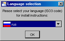
Standard language selection dialog
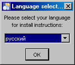
Alternative language selection dialog
- 'useFlags': possible are "yes" or "no". Default is "yes". If it is set to "no", no flag will be displayed in the language selection dialog. For "no" it is recommended to define also 'langDisplayType' other then "iso3".
- 'langDisplayType': possible are "iso3", "native" and "default". Default is "iso3". With "iso3" the text for a language will be displayed as ISO 639-2:1998 code. With "native" the notation of the language will be used if possible, else the notation of the default locale. Using "default" will be presented the language in the notation of the default locale of the VM.
Modifying IzPack Panels
There are some graphic elements and behavior which are preferred by some people and deprecate by other. The following keys are related to the whole installation (all panels).
- 'useButtonIcons': possible are "yes" or "no". Default is "yes". If it is set to "no", all buttons which are created via the ButtonFactory contains no icon also a icon id was submitted. Directly created buttons are not affected.
- 'useLabelIcons': possible are "yes" or "no". Default is "yes". If it is set to "no", all labels which are created via the LabelFactory contains no icon also a icon id was submitted. Directly created labels are not affected.
- 'layoutAnchor':layout anchor for IzPanels. Valid are "NORTH", "NORTHWEST", "SOUTHWEST", "SOUTH" and "CENTER". Only panels which are using the layout helper of IzPanels are supported. These are not all standard panels. At developing custom panels it is recommended to use the layout helper with an IzPanelLayout. Note: The anchor definition will be used for all panels!
- Gaps: there are defined different gaps between different components of a IzPanel if using IzPanelLayout. The gaps can be set also via the element '<modifier>' of '<guiprefs>'. It is possible to declare different values for X and Y axis. This will be determined in the key word name. X Gaps are insert after Y gaps under the control for which the gap was declared. Following key words are defined:
- 'labelXGap | labelYGap': gap in pixel between two labels in X or Y direction.
- 'textXGap | textYGap': gap in pixel between two text fields.
- 'controlXGap | controlYGap': gap in pixel between two controls other than label or textfield.
- 'paragraphYGap': gap in pixel for a paragraph. A paragraph will be created in the panel source for controls which should be separated. paragraphXGap is declared, but not used.
- 'labelToTextXGap | labelToTextYGap': gap in pixel between a label (left or top) and a text field (right or bottom).
- 'labelToControlXGap | labelToControlYGap': gap in pixel between a label (left or top) and a control other than a label or a textfield.
- 'textToLabelXGap | textToLabelYGap': gap in pixel between a text field (left or top) and a label.
- 'controlToLabelXGap | controlToLabelYGap': gap in pixel between a control other than a label or a text field and a label.
- 'controlToTextXGap | controlToTextYGap': gap in pixel between a control other than a label or a text field and a text field.
- 'textToControlXGap | textToControlYGap': gap in pixel between a text field and a control other than a label or a text field .
- 'firstYGap': gap in pixel between the top border and the first control.
- 'filler[N]XGap | filler[N]YGap': gap in pixel created by the layout manager. Filler are used by some panels. [N] is a number between 1 and 5 to allow to use different filler e.g. filler3XGap or filler1YGap.
- 'allXGap | allYGap': gap in pixel between all controls in X or Y direction. If this is declared all gaps for which no own declaration exists gets this value. If a gap has an own declaration this will be used instead.
- 'layoutYStretchType | layoutXStretchType': the IzPanelLayout manager allows to declare stretch factors for controls. This means, that a control will be stretched if there is place in the line. The amount of stretching will be determined by the stretch factor. But what to do if the hole stretch factor for a line or column is not 1.0? To determine this these settings are exist. Valid values are "RELATIVE", "ABSOLUTE" and "NO". With "NO" no stretch will be performed. with "RELATIVE" the values are normalized, with "ABSOLUTE" the values will be used as they are (may be a part will be clipped if the sum is greater than 1.0).
- 'layoutFullLineStretch | layoutFullColumnStretch': as described there are controls which should be stretched. Beside fixed values there are the symbolic values FULL_LINE_STRETCH and FULL_COLUMN_STRETCH which are computed at layout. E.g. MultiLineLabels has this stretch factor for x direction. But what to do if a centered layout is chosen? With a control like this the lines will be stretch to the hole size. With this settings it can be changed. E.g. a factor of 0.7 creates a nice centered layout. The default is 1.0, valid are 0.0 up to 1.0.
It is possible to use an alternatively frame title. Normally the title has the aspect "IzPack - Installation of " + '$APP_NAME'. If the langpack key 'installer.reversetitle' is defined, the value of that key will be used instead of the key 'installer.title'. There is no string added, but it is possible to use IzPack variables. The third heading example contains such a alternatively frame title. It is only possible to use predefined variables like '$APP_NAME' because the title will be created before the frame will be shown. It is common to use the name of the installation toolkit in the frame title.
Using a Separated Heading Panel
Some standard panels have headings (e.g. ShortcutPanel). These headings are integrated in the IzPanel. In opposite to this following heading will be displayed in a separated panel potential for all panels with the same design. There is no need to modify existent java classes else declaration of some key/value pairs are enough.
There can be one real head and zero or more info lines. The headline will be written bold, the font size can be changed. Info lines will be indented and written with the normal used font. The heading message has to be written into the langpack (or custom langpack) file with the key '<panel class name>.headline'. Examples can be seen in eng.xml. May be the entries for standard panels are not present in other languages. Messages for info lines have the key '<panel class name>.headinfo<info line number>'. First info line has number zero. If no or empty headline messages will be declared in the chosen language no heading panel will be shown. This behavior can be used to suppress heading for special panels.
It is also possible to declare head and info lines additional dependent on the 'panelid'. The result is, that it is possible to declare different messages for panels which are shown more than one time (e.g. the UserInputPanel. In this case the key for heading is
<panel class name>.headline.<panelid>
and for info lines
<panel class name>.headinfo<info line number>.<panelid>
Panelids are declared in 'ELEMENT %lt;panel>'. See The Panels Element '<panels>' . The standard strings are declared in the standard langpack file. For customized panels it is common to write the string into the custom langpack (see The Internationalization of custom panels. If (as example) in install.xml was following written:
<panels>
    ...
    <panel classname="UserInputPanel" id="one"/>
    <panel classname="UserInputPanel"id="two"/>
    ...
</panels>
Then the messages can be declared in 'CustomLangpack.xml_eng' like
<langpack>
    ...
    <str id="UserInputPanel.headline.one" txt="User Data one"/>
    <str id="UserInputPanel.headline.two" txt="User Data two"/>
    <str id="UserInputPanel.headinfo0.one" txt="Info 1 one"/>
    <str id="UserInputPanel.headinfo1.one" txt="Info 2 one"/>
    <str id="UserInputPanel.headinfo0.two" txt="Info 1 two"/>
    <str id="UserInputPanel.headinfo1.two" txt="Info 2 two"/>
    ...
<langpack>
It is possible to place an icon on the right side of the heading (see below to display on left side). To do this a simple resource entry will be needed:
<resources>
  ...
  <res id="Heading.image" src="[my path in the source tree]"/>
  ...
</resources>
There are some guiprefs modifier keys to use and modify heading (see above). Additionally it is possible to count the general not hidden panels in the heading or navigation panel.
- 'useHeadingPanel': General switch for heading. If this key does not exist or does not have the value "yes" no heading panel will be shown.
- 'headingImageOnLeft': Option to allow displaying the heading image on the left of the header instead of the default (right side). Only valid if heading panel is used.
- 'useHeadingForSummary': In the language files there are entries for the heading text ('[Panel name].headline') and the summary caption ('[Panel name].summaryCaption'). If this modifier is set to "yes", the text of the heading will be also used for the summary caption.
- 'headingLineCount': Number of heading lines. If no info lines should be shown the value should be one (not zero).
- 'headingFontSize': A float value used as multiplier for the standard font size.
- 'headingBackgroundColor': Background color of the heading panel as integer. Often used is 0x00ffffff (white).
- 'headingForegroundColor': Font color of the heading panel as integer. Often used is 0x00ffffff (white).
- 'headingPanelCounter': Draw a panel counting. Possible values are "text" or "progressbar". inHeading the progressbar will be not the best choice.
- 'headingPanelCounterPos': Declares where the counter will be shown. Possible are "inHeading" or "inNavigationPanel". If "inNavigationPanel" is chosen, the panel counter can be used also no heading was selected.
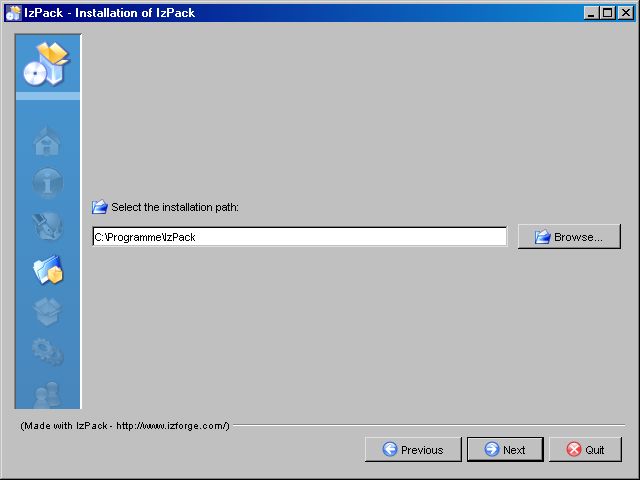
Normal look of an IzPack frame (TargetPanel)
Key/value pairs to create IzPack installation with heading, no button and label icons and a panel text counter in the heading panel.
<guiprefs width="600" height="480" resizable="no">
  <modifier key="useButtonIcons" value="no"/>
  <modifier key="useLabelIcons" value="no"/>
  <modifier key="labelGap" value="2"/>
  <modifier key="layoutAnchor" value="NORTHWEST"/>
  <modifier key="useHeadingPanel" value="yes"/>
  <modifier key="headingImageOnLeft" value="yes"/>
  <modifier key="headingLineCount" value="1"/>
  <modifier key="headingFontSize" value="1.5"/>
  <modifier key="headingBackgroundColor" value="0x00ffffff"/>
  <modifier key="headingPanelCounter" value="text"/>
  <modifier key="headingPanelCounterPos" value="inHeading"/>
</guiprefs>
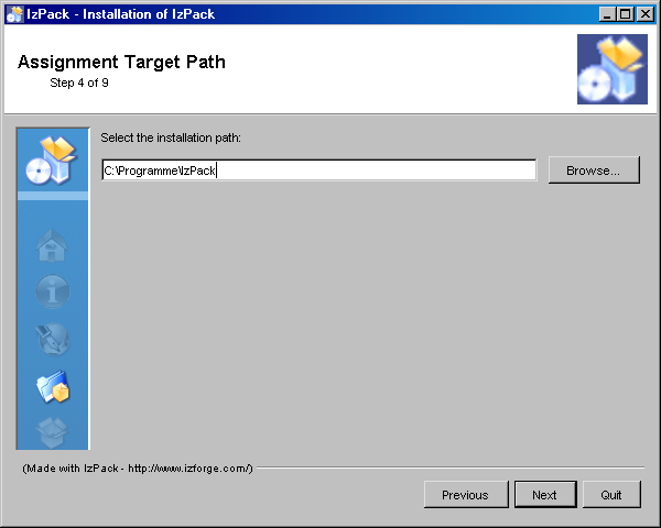
IzPack frame (TargetPanel) with heading panel and a text counter in the heading panel with panel image.
Changed resources and langpack keys to create IzPack installation with alternatively frame title, heading, no button and label icons and a text counter in the heading panel.
In install.xml
<installation version="1.0">
  ...
  <resources>
    ...
    <res src="border4.png" id="Installer.image.3"/> REMOVED
    ...
  </resources>
</installation>
Add in '<ISO3>.xml' or 'CustomLangpack.xml_<ISO3>'
<langpack>
  ...
  <str id="installer.reversetitle" txt="$APP_NAME $APP_VER - IzPack Wizard "/>
  ...
</langpack>
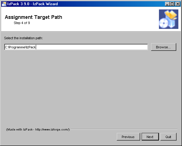
IzPack frame (TargetPanel) with heading panel and a text counter in the heading panel with alternative frame title, no panel image.
Changed key/value pairs to create IzPack installation with heading, no button and label icons and a panel progressbar counter in the navigation panel.
Key/value pairs for modifying IzPack GUI (references for panel images removed):
<guiprefs width="640" height="480" resizable="no">
  <modifier key="useButtonIcons" value="no"/>
  <modifier key="useLabelIcons" value="no"/>
  <modifier key="layoutAnchor" value="NORTHWEST"/>
  <modifier key="labelGap" value="2"/>
  <modifier key="useHeadingPanel" value="yes"/>
  <modifier key="headingLineCount" value="1"/>
  <modifier key="headingFontSize" value="1.5"/>
  <modifier key="headingBackgroundColor" value="0x00ffffff"/>
  <modifier key="headingPanelCounter" value="progressbar"/>
  <modifier key="headingPanelCounterPos" value="inNavigationPanel"/>
</guiprefs>
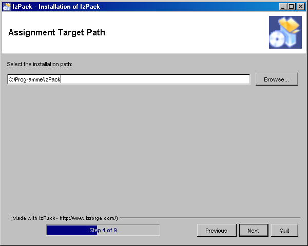
IzPack frame (TargetPanel) with heading panel and a progressbar counter in the navigation panel without panel image.
Alternative Cancel Dialog
The cancel dialog will be shown if the cancel button or the close button of the frame was pushed. In the standard dialog the title contains the question and the message an affirmation. In other dialogs often the title is a common heading and the question will be called in the dialog as message. The standard behavior will be modified if the messages 'installer.quit.reversemessage' and 'installer.quit.reversetitleare' declared.
Add in '<ISO3>.xml' or 'CustomLangpack.xml_<ISO3>'
<langpack>
  ...
  <str id="installer.quit.reversemessage" txt="Are you sure you want to cancel installation?"/>
  <str id="installer.quit.reversetitle" txt="$APP_NAME $APP_VER"/>
  ...
</langpack>
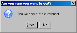
Standard cancel dialog.
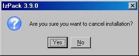
Alternative cancel dialog.
Logging the Installation
Logging was made as co-product at implementing other features. There was no common design for it. Therefor there is no one way to made logging of any kind else for each group a different logging stuff exist. Not nice, but reality.
Debug Information
There is a rudimentary debug capability in IzPack. The class 'com.izforge.IzPack.util.Debug' is used by some other classes to write debug information on 'stdout'. The class can be used by custom panels or actions or other custom classes. To activate it, add '-DTRACE=TRUE' in front of '-jar' of the installer call.
Summary of Panels
There is a summary panel which shows some information of previous shown panels. The same contents can be written to a summary log file.
Logging of Installed File Set
The files which are installed are logged into the uninstaller jar file to be used at uninstallation. The contents can be also duplicated into a logfile.
Logging of the Process Panel
The process panel logs information of each performed process in a scrollable text area. The contents can be duplicated into a logfile where the used directory can be selected (but not the logfile name).
Logging of Ant Actions
It is possible to perform ant actions with the 'AntActionInstallerListener'. The grade of logging and the path of a logfile can by determined.
Web Installers
The web installers allow your users to download a small installer that does not contain the files to install. These files will be downloaded from an HTTP server such as Apache HTTPD. If you have many optional packs, this can save people's resources. Its very easy: people download a small Jar file containing the installer, they launch it and choose their packages. Then the installer will get the required packages from individual Jar files located on a server, only downloading those required. It's that simple.
To create a web installer, add the '<webdir>' element to the <info> element. The text must be a valid, fully qualified URL for a directory on the web server.
<info>
  <appname>Super extractor</appname>
  <appversion>2.1 beta 6</appversion>
  <url>http://www.superextractor.com/</url>
  <webdir>http://www.superextractor.com/download</url>
</info>
You can force creation of a standard installer even if 'webdir' is specified, by specifically creating a standard installer from the command line invocation or ant task.
When installing, if the user is behind a firewall, attempting download the jar files may fail. If this happens, the user will be prompted to enter the name host name and port of their firewall.
You may password protect the files using mechanisms provided by your web server, IzPack will prompt for a password at install time, when required.
More Internationalization
Special resources
IzPack is available in several languages. However you might want to internationalize some additional parts of your installer. In particular you might want this for the 'InfoPanel' and 'LicencePanel'. This is actually pretty easy to do. You just have to add one resource per localization, suffixed with the ISO3 language code. At runtime these panels will try to load a localized version.
For instance let's suppose that we use a 'HtmlInfoPanel'. Suppose that we have it in English, French and German. We want to have a French text for french users. Here we add a resource pointing to the French text whose name is 'HtmlInfoPanel.info_fra'. And that's it! English and German users (or anywhere other than in France) will get the default text (denoted by 'HtmlInfoPanel.info') and the French users will get the French version. Same thing for the other Licence and Info panels.
To sum up: add '_<iso3 code>' to the resource name for 'InfoPanel', 'HtmlInfoPanel', 'LicencePanel' and 'HtmlLicencePanel'.
Packs
Thanks to Thorsten Kamann, it is possible to translate the packs names and descriptions. To do that, you have to define a special identifier in the elements of the XML installation file and add the related entries in the suitable langpacks. For instance if you have the following XML snippet:
<pack name="core" id="core.package" ...>
  <description/>
</pack>
then the related entries of the langpacks will look like this:
<str id="core.package" txt="Core Package"/>
<str id="core.package.description" txt="The core package provides
Go back to the documentation index