Nodes Demo
This section introduces the Nodes demo to illustrate particular features of JavaFX, including declarative syntax, building graphical scene, data binding and adding dynamic behavior to graphical objects. You can find the entire code for this demo in Nodes.fx. For more details on API, see the API Reference.
If you want to compile and run the Nodes demo follow the instructions provided in README file.
The following figure shows the Nodes demo after startup.
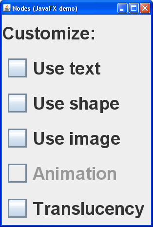
Figure 1: The Nodes demo after startup |
Initially the application window looks like a typical GUI application with a frame and several check boxes. You can see that JavaFX allows the developer to implement Swing widgets. The first three check boxes control the visibility of nodes. The Animation check box switches the animated behavior of nodes on and off, and the Translucency check box makes the panel translucent. This demo shows how Swing widgets and JavaFX entities are used together to provide new capacities in graphical applications.
The next figure shows the Nodes demo with graphical nodes displayed.
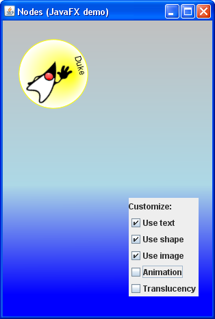
Figure 2: The Nodes demo with visible nodes |
Declarative Syntax
JavaFX uses declarative syntax to define the user interface so that the developer's code looks simple, consistent and matches the actual layout of the GUI.
Look at the following code sample.
SwingFrame {
  title: "Nodes (JavaFX demo)"
  content: Canvas {
    content: Nodes {}
  }
  visible: true
}
This code creates an instance of the SwingFrame class, assigns the value Nodes (JavaFX demo) to the title attribute, and adds contents to the frame. Note the JavaFX notation: each attribute is followed by a colon.
Building A Graphical Scene
You can build a graphical scene with nodes. However, there is no way to add nodes directly to the frame. Only Swing widgets can be added to the frame. In this demo, a Canvas object is added. The Canvas is a container for graphical nodes.
The following figure will help you to understand the hierachy of objects in this demo.
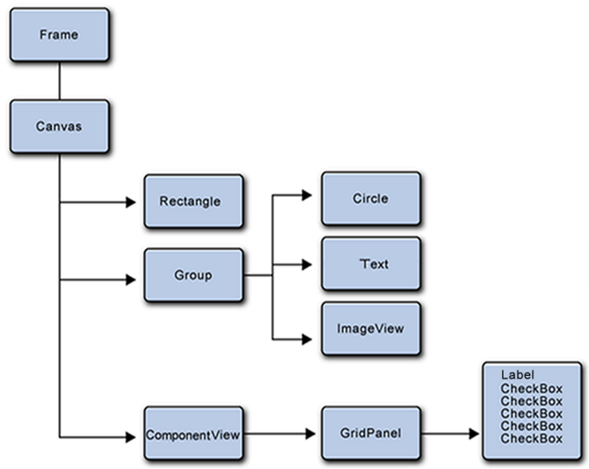
Figure 3: GUI objects hierachy in the Nodes demo |
The Canvas represents the graphical scene to which a custom node, called Nodes, is added. To create your own nodes, extend the CustomNode class and implement its create() function.
Note the importance of the ComponentView node. This is the only node that allows the developer to add Swing widgets to the Canvas.
The demo has four nodes. The Rectangle node provides the background color for the frame. Three other nodes render a circle, text, and an image. The logic of the application requires you to provide a common behavior for the three nodes. The best solution is to group the nodes together and define the required behavior for the whole group.
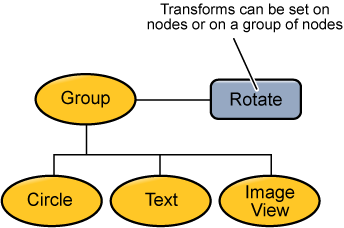
Figure 4: Grouping nodes and applying transforms |
The following code puts three objects in a single group and defines a transformation for this group.
Group {
   transform: bind Transform.rotate(angle, 50, 50)
   translateX: bind x
   translateY: bind y
   content: [
      Circle {
        opacity: bind shape.value
        centerX: 50   centerY: 50   radius: 50
        stroke: Color.YELLOW
        fill: RadialGradient {
           centerX: 50   centerY: 50   radius: 50
           focusX: 70   focusY: 30
           proportional: false
           stops: [
              Stop {offset: 0   color: Color.YELLOW},
              Stop {offset: 1   color: Color.WHITE}
           ]
         }
      },
      },
      Text {
        transform: bind Transform.rotate(33, 10, 100)
        opacity: bind text.value
        content: "Duke"
      },
      ImageView {
        transform: bind Transform.translate(31, 27)
        opacity: bind image.value
        image: Image {url: this.getClass().getResource("duke.png").toString()}
      },
   ]
}
Note the importance of the order in which you add objects to the group. The Z-order defines how objects of the group are laid out. If you add the circle in the last turn, then the circle will be drawn over the two other objects which will not be seen.
Look at the code for filling the rectangle area with a linear gradient color pattern. Note the simplicity achieved by using the declarative syntax. You only need to specify two or more gradient colors and provide a set of stops. The LinearGradient class will then provide an interpolation between colors and paint the area.
Rectangle {
  width:  bind 3 * panel.width
  height: bind 3 * panel.height
  fill: LinearGradient {
    endY: 400
    proportional: false
    stops: [
      Stop {offset: 0     color: Color.SILVER},
      Stop {offset: 0.6   color: Color.LIGHTBLUE},
      Stop {offset: 1     color: Color.BLUE}
    ]
  }
}
The code sample below illustrates the painting solution for the Circle node.
Circle {
  opacity: bind shape.value
  centerX: 50   centerY: 50   radius: 50
  stroke: Color.YELLOW
  fill: RadialGradient {
    centerX: 50   centerY: 50   radius: 50
    focusX: 70   focusY: 30
    proportional: false
    stops: [
      Stop {offset: 0   color: Color.YELLOW},
      Stop {offset: 1   color: Color.WHITE}
    ]
  }
}
The stroke attribute defines the color of the circle line. To paint the inner part of the Circle, the RadialGradient class is applied, which turns the color from yellow to white. Moreover, the center of this filling is shifted from the center of the initial circle.
Data Binding
Data binding is one of many beneficial features of JavaFX. The Nodes demo extensively uses data binding to render its visual objects. For example, the gradual appearance and hiding of nodes is implemented by a data binding mechanism.
The following line of code adds the Use shape check box to the panel:
CheckBox {text: "Use shape" action: update selected: bind shape.selected with inverse}
The "with inverse" keyword here provides the following behavior: whenever the user checks the Use shape check box, the selected attribute is updated in the shape model and thus triggers a change of the shape.value attribute. Refer to the SmoothSwitch class implementation to see how the value attribute is being changed by a linear interpolator.
The Circle's opacity attribute is in its turn bound to the shape.value:
opacity: bind shape.value
As the shape.value gradually increases, the circle gradually appears on the screen.
Data binding allows you to easily provide automatic synchronization of GUI elements and application data.
Animation
This demo provides animated behavior for the group of three nodes.
The following code defines a transformation for the group.
transform: bind Transform.rotate(angle, 50, 50)
translateX: bind x
translateY: bind y
To change the position of the group over time, two timelines are applied. The first timeline changes the X coordinate and an angle using the linear interpolator.
Timeline {
  var max = bind 3 * panel.width - 100;
  repeatCount: Timeline.INDEFINITE
  autoReverse: true
  keyFrames: [
    KeyFrame {time: 0s   values: [
      x     => 0.0,
      angle => 0.0,
    ]},
    KeyFrame {time: 6s   values: [
      x     => max tween Interpolator.LINEAR,
      angle => 360 tween Interpolator.LINEAR,
    ]}
  ]
}
The second timeline changes the Y coordinate using a spline interpolator:
Timeline {
  var max = bind 3 * panel.height - 100;
  repeatCount: Timeline.INDEFINITE
  keyFrames: [
    KeyFrame {time:   0s   values: y => 0.0},
    KeyFrame {time: 2.2s   values: y => max tween Interpolator.SPLINE(0, 0, .9, 0)},
    KeyFrame {time: 2.3s   values: y => max},
    KeyFrame {time: 4.5s   values: y => 0.0 tween Interpolator.SPLINE(0, 0, 0, .9)}
  ]
}
The SmoothSwitch class employs animation classes to implement gradual appearance and hiding of visual objects on the screen.
Summary
This section describes a demo that uses the scene graph features in JavaFX to render graphical objects. The Nodes demo shows you how to add nodes to the scene, how to group nodes and how to create an animated behavior. JavaFX offers new capacities in graphical applications and thus contrubutes to leveraging the Java platform.