JBoss.orgCommunity Documentation
The component implements a modal window that blocks user interaction with the main application while active.

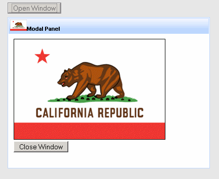
Figure 6.74. The <rich:modalPanel> is opened in "closest" to an observer layer.
Other layers are dimmed by blocking <div> (gray on the picture).
Easy positionable on thе screen
Resizable by end user
Supports drag operations
Restores it's state including position after submitting and reloading
Has customizable look and feel
To work properly, the <rich:modalPanel> should always be placed outside the original <h:form>. For performing submits from within the <rich:modalPanel> it must include its own <h:form>.
In order to avoid a bug in IE, the root node of the dialog is moved on the top of a DOM tree.
Position the <rich:modalPanel> on the screen by specifying coordinates of it's top-left corner. Set values for "top" and "left" attributes in pixels for Y and X coordinates correspondingly. By default the component is autopositionable.
The modal window can be moved and resized by the end user.
To disable those features (which are enabled by default) set "moveable"
and "resizeable" attributes to false.
Resizing may be limited by specifying window's minimal sizes with the "minWidth" and "minHeight" attributes.
To open and close the <rich:modalPanel> use one of three JS API functions (offset to the "Reference Data" below in this chapter):
<a onclick="Richfaces.showModalPanel('pnl');" href="#">Show ModalPanel</a>

<a4j:form>

      <rich:modalPanel id="pnl" >

            <a onclick="Richfaces.hideModalPanel('pnl');" href="#">Hide ModalPanel</a>

      </rich:modalPanel>

</a4j:form>
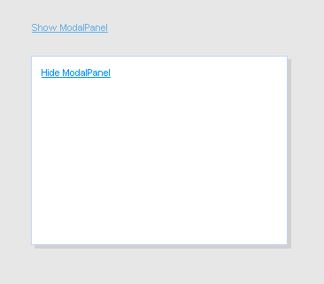
The result:

Figure 6.75. The panel is opened with "Richfaces.showModalPanel();" JS API function. Clicking 'Hide ModalPanel' will call "Richfaces.hideModalPanel();" function.
Besides client ID it is possible to pass other parameters while opening and closing the <rich:modalPanel> with the JS API function. For example, you can pass top and left indents or panel size:
<a onclick="Richfaces.showModalPanel('pnl', {top:'10px', left:'10px', height:'400px'});">Show ModalPanel</a>
Also the <rich:modalPanel> allows to handle its own opening and closing events on the client side. Custom parameters passed with JS API are also obtained in this case:
<rich:modalPanel onshow="alert(event.parameters.param1)">

      ...

</rich:modalPanel>
The component can restore it's previous state (including position on the screen) after submitting and reloading.
Set "keepVisualState" to true to submit and pass <rich:modalPanel> current parameters to a new page.
The "showWhenRendered" bolean attribute is used in cases when component should be rendered after first page loading.
To understand sence of the "domElementAttachment" attribute it is necessary to understand
what is stacking context and how it works in the HTML makeup.
Since each positioned or z-indexed element (CSS position:absolute or relative and z-index:*any integer different from 0*)
form their own stacking context the <rich:modalPanel> rendered as a child of such element may be overlapped with an element
that appears later in HTML hierarchy or assimilated with <body> stacking context (basic for HTML page).
Not so fast!
To make the <rich:modalPanel> rendered in "closest" to an observer layer and avoid such overlapping,
the component was designed in way when it is always being automatically assimilated with <body> with a very high rendering layer (z-index).
But our panel should be assimilated with <body> not always, because of some side effects that take place in this case.
The "domElementAttachment" attribute helps to reassign the panel to it parent or form element.
If form is used and no parent form is available the panel is functioning as if it is assimilated with <body>.
If the "domElementAttachment" value is not body then some overlapping may occur.
To avoid overlapping by an embed object (inserted with HTML <embed> tag)
set the "overlapEmbedObjects" to true.
The "label" attribute is a generic one.
It provides an association between a component and message the component produces.
This attribute defines parameters of localized error and informational messages that occur as a result of conversion, validation or other application actions during the request processing lifecycle.
With this attribute you can replace the last parameter substitution token shown in the message.
For example, DoubleRangeValidator.MAXIMUM or ShortConverter.SHORT.
The <rich:modalPanel> supports two facets.
The header facet defines header and text label on it:
...

<rich:modalPanel id="pnl">

      <f:facet name="header">

            <h:outputText value="I'm panel header" />

      </f:facet>

      <p>The <rich:modalPanel> accepts different types of information: from simple text to iterative components such as <rich:dataTable>, etc.

      </p>

      <a onclick="Richfaces.hideModalPanel('pnl');" href="#">Hide ModalPanel</a>

</rich:modalPanel>

...
The result:
The controls facet places any control on a header, defines image, style and function for it. For example, "Close" control:
<rich:modalPanel id="pnl">

      ...

      <f:facet name="controls">

            <h:graphicImage value="/pages/close.png" style="cursor:pointer" onclick="Richfaces.hideModalPanel('pnl')" />

      </f:facet>

        ...

</rich:modalPanel>
The result:
An example of using <h:commandButton> within the <rich: modalPanel>:
<a4j:form>

      <rich:modalPanel>

            <h:form>

                  <h:commandButton value="Test" action="#{TESTCONTROLLER.test}" />

            </h:form>

      </rich:modalPanel>

</a4j:form>
Table of <rich:modalPanel> attributes.
Table 6.104. Component Identification Parameters
| Name | Value |
|---|---|
| component-type | org.richfaces.ModalPanel |
| component-class | org.richfaces.component.html.HtmlModalPanel |
| component-family | org.richfaces.ModalPanel |
| renderer-type | org.richfaces.ModalPanelRenderer |
| tag-class | org.richfaces.taglib.ModalPanelTag |
Table 6.105. JavaScript API functions
| Function | Description |
|---|---|
| Richfaces.showModalPanel('ID'); | Opens the modal panel with specified ID |
| Richfaces.hideModalPanel('ID'); | Closes the modal panel with specified ID |
| Richfaces.hideTopModalPanel('ID'); | Closes the current top visible modal panel with specified ID |
Table 6.106. Facets
| Facet | Description |
|---|---|
| header | Defines header content |
| controls | Defines a control on the header |
Table 6.107. Style classes (selectors) and mapped skin parameters
| Class name | Description | Skin Parameter | CSS property |
|---|---|---|---|
| .rich-mpnl-body | Defines styles for modalPanel content | generalSizeFont | font-size |
| generalFamilyFont | font-family | ||
| generalTextColor | color | ||
| .rich-mpnl-content | Defines style for modalPanel content area | generalBackgroundColor | background-color |
| panelBorderColor | border-color | ||
| .rich-mpnl-header | Defines styles for modalPanel header | headerBackgroundColor | background-color |
| headerBackgroundColor | border-color | ||
| .rich-mpnl-shadow | Defines styles for a modalPanel shadow | shadowBackgroundColor | background-color |
| .rich-mpnl-text | Defines styles for a wrapper <div> element of a header text | headerSizeFont | font-size |
| headerWeightFont | font-weight | ||
| headerFamilyFont | font-family | ||
| headerTextColor | color |
Table 6.108. Internal style classes (selectors)
| Class name (selector) | Description |
|---|---|
| .rich-modalpanel | Defines styles for a wrapper <div> element of a modalPanel |
| .rich-mpnl-body | Defines styles for modalPanel content |
| .rich-mpnl-button | Defines styles for modalPanel button |
| .rich-mpnl-controls | Defines styles for a wrapper <div> element of a modalPanel control |
| .rich-mpnl-header-cell | Defines styles for a header cell |
| .rich-mpnl-header | Defines styles for modalPanel header |
| .rich-mpnl-iframe | Defines styles for modalPanel <iframe> container |
| .rich-mpnl-mask-div | Defines styles for blocking <div> element |
| .rich-mpnl-mask-div-opaque | Defines opacity for blocking <div> element |
| .rich-mpnl-mask-div-transparent | Defines transparency for blocking <div> element |
| .rich-mpnl-ovf-hd | Defines style for block element content |
| .rich-mpnl-panel | Defines styles for a modalPanel |
| .rich-mpnl-trim | Defines styles for a modalPanel |
| .rich-mpnl-resizer | Defines styles for a wrapper <div> where cursor changes it state for resizing |
| .rich-mpnl-shadow | Defines styles for a modalPanel shadow |
You can find all necessary information about style classes redefinition in Definition of Custom Style Classes section.
Visit ModalPanel page at RichFaces Livedemo for examples of component usage and their sources.
Useful articles:
"ModalPanelWizards" describes how to create a wizard using <rich:modalPanel> (the same in the RichFaces FAQ "section");
"An Introduction To JBoss RichFaces" by Max Katz describes the way the <rich:modalPanel> edits and saves changes for table entries;
"How to do a detail view modalPanel in a table" describes how to load an information from a table to the modal panel;
"ModalPanelValidation" gives examples of validation in the <rich:modalPanel> (the same in the RichFaces UsersForum topic);
"RichFacesPleaseWaitBox" describes how to show "Please wait" box and block the input while an Ajax request is being processed using the combination of <a4j:status> and <rich:modalPanel>;
If you have any questions or ideas regarding the <rich:modalPanel> tell about them at the RichFaces Users Forum.