Create new RichFaces Documentation Jira issue

This will launch the RichFaces Jira page - to complete your feedback please login if needed, and submit the Jira.
JBoss.orgCommunity Documentation
A wrapper component with named facets, where every facet is shown after activation of the corresponding toggleControl (the other is hidden).
Support for any content inside
Three modes of facets switching
Server
Client
Ajax
Controls for togglePanel can be everywhere in layout
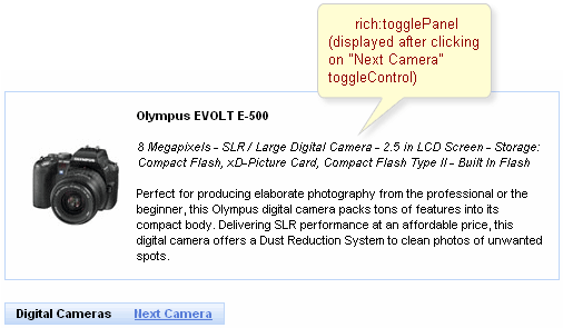
As it was mentioned above, togglePanel splits content into named facets that become rendered and processed when a click performed on controls linked to this togglePanel (either switched on the client or send requests on the server for switching).
The initial component state is defined with "initialState" attribute, where a facet name that is shown at first is defined.
It's also possible to define an "empty" facet to implement the functionality as drop-down panels have and make the facet active when no content is required to be rendered.
Switching mode could be defined with the "switchType" attribute with three possible parameters:
Server (DEFAULT)
The common submission is performed around togglePanel and a page is completely rendered on a called panel. Only one at a time the panel is uploaded onto the client side.
Ajax
AJAX form submission is performed around the panel, content of the called panel is uploaded on an Ajax request . Only one at a time the panel is uploaded on the client side.
Client
All panels are uploaded on the client side. The switching from the active to the hidden panel is performed with client JavaScript.
"Facets" switching order could be defined on the side of <rich:toggleControl> component or on the panel. On the side of the togglePanel it's possible to define facets switching order with the "stateOrder" attribute. The facets names are enumerated in such an order that they are rendered when a control is clicked, as it's not defined where to switch beforehand.
Example:
...

<rich:togglePanel id="panel" initialState="panelB" switchType="client"

                        stateOrder="panelA,panelB,panelC">

        <f:facet name="panelA">

                ...

        </f:facet>

        <f:facet name="panelB">

                ...

        </f:facet>

        <f:facet name="panelC">

                ...

        </f:facet>

</rich:togglePanel>

<rich:toggleControl for="panel" value="Switch"/>

...
The example shows a togglePanel initial state when
the second facet (panelB) is rendered and successive
switching from the first to the second happens.
The
"label"
attribute is a generic attribute. The
"label"
attribute provides an association between a component, and
the message that the component (indirectly) produced. This attribute
defines the parameters of localized error and informational messages
that occur as a result of conversion, validation, or other application
actions during the request processing lifecycle. With the help of this
attribute you can replace the last parameter substitution token shown
in the messages. For example, {1} for
"DoubleRangeValidator.MAXIMUM",
{2} for "ShortConverter.SHORT".
Table of <rich:togglePanel> attributes.
Table 6.150. Component Identification Parameters
| Name | Value |
|---|---|
| component-type | org.richfaces.TogglePanel |
| component-class | org.richfaces.component.html.HtmlTogglePanel |
| component-family | org.richfaces.TogglePanel |
| renderer-type | org.richfaces.TogglePanelRenderer |
| tag-class | org.richfaces.Taglib.togglePanelTag |
Table 6.151. Classes names that define a component appearance
| Class name | Description |
|---|---|
| rich-toggle-panel | Defines styles for all component |
| rich-tglctrl | Defines styles for a toggle control |
On the component LiveDemo page you can see the example of <rich:togglePanel> usage and sources for the given example.