xTuple ERPs contain a number of fundamental features designed to simplify your use of the software. In this section, we describe those fundamentals in an effort to familiarize you with their use.
Let's look first at a sample Bill of Materials screen, as shown below. We will use this Bill of Materials screen to illustrate several of the application fundamentals to be found throughout the application—across multiple screens and modules.
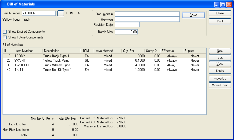
Next to the "Item Number" field in the sample Bill of Materials screen is a square box with an ellipsis in the center of it. That square box is called a "browse button," and it looks like this:

Whenever you see a browse button in the application, you have the ability to locate information in an efficient manner. Using this feature saves time because rather than having to remember detailed strings of numbers or codes, you can look them up—browse for them—using the browse button tool.
In the case of our Bill of Materials example, the browse button is located next to the "Item Number" field. Obviously, you need to link an Item to a Bill of Materials. If that Item happens to be a "Boys 27 Speed Mountain Bike," you might not know the Item Number off the top of your head. Simply select the browse button, and you will automatically be brought to a searchable master list of Items. The master list shows not only Item Numbers but also Item descriptions. The list is displayed in ascending order by Item Number. If your master list of Items is extensive, you can scroll through the list using the scroll bar to the right of the screen. Or, simply begin typing the first letters or numbers of the Item Number in the "Search" field. The list will automatically begin scrolling toward your Item in sequential order.
As noted above, the application contains numerous screens where browse buttons are available. Browse buttons can be used to look up Item Numbers—as in the Bill of Materials example—or use them to look up a wide range of other references. The following list indicates a small sampling of references you can access using the browse button:
Item Numbers
Item Aliases
Component Parts
Sites
Sales Orders
Customers
Purchase Orders
Vendors
And more....
Going back to our Bill of Materials example, let's look at another fundamental feature involving the right-click button on your computer mouse. For a complete list of all the right-click menu options used in xTuple ERP, please see Section 5, “Right-Click Menu Options”.
Note
For Macintosh users who don"t have a dual button mouse, use the CTRL key on your keyboard when clicking on a record to reveal the right-click options.
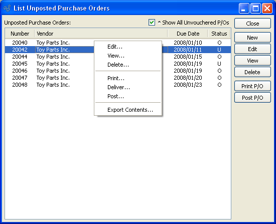
xTuple ERP is full of displays similar to our sample Bill of Materials example. Display screens feature parameter settings at the top of the screen—and a main display area located toward the bottom of the screen. Whenever you encounter a display like this, you can right-click on a line in the display to reveal a host of additional options, as shown in the following screen:
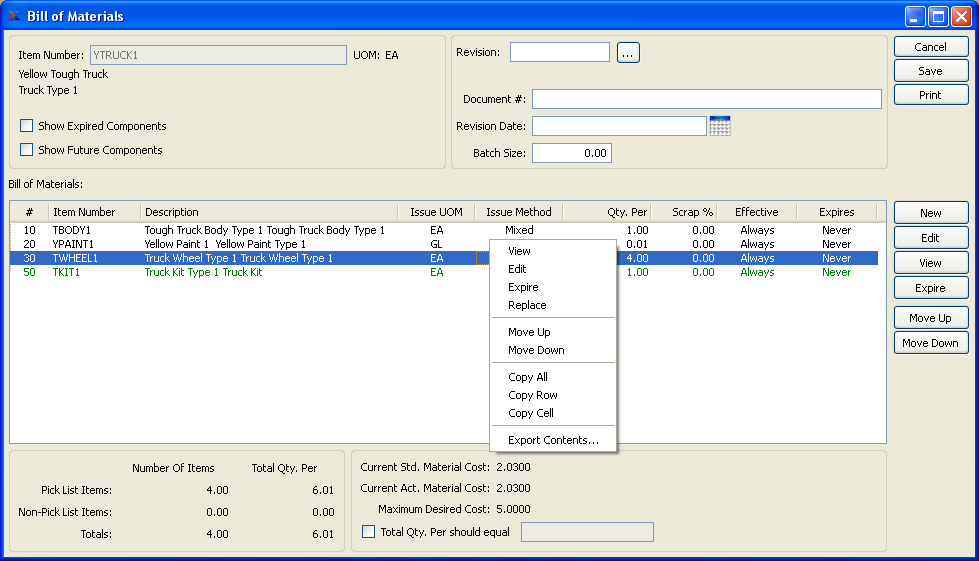
As you can see, right-clicking on a component Item in the Bill of Materials screen gives you access to the following options:
View: Gives you a read-only view of the Item.
Edit: Enables you to edit the Item.
Delete: Deletes the Item.
Replace: Replaces one Item with another Item.
Move Up: Moves the Item up the Bill of Materials sequence.
Move Down: Moves the Item down the Bill of Materials sequence.
Copy All: Copies the header and all visible columns and rows to the clipboard in plain-text, TAB-separated format with a carriage return after each row.
Copy Row: Copies all visible columns in the selected rows to the clipboard in plain-text, TAB-separated format without the header information.
Copy Cell: Copies all visible information in the selected cell to the clipboard in plain-text, TAB-separated format without the header information.
Export Contents: Export the data displayed on the screen into your choice of plain-text, CSV, ODF (e.g., Open Office), or HTML file formats. The plain text and CSV files may subsequently be opened in a spreadsheet or other text-editing tool.
Right-click options will vary from screen to screen―and from edition to edition. In our sample Bill of Materials example, the right-click options basically mirror the functionality of buttons already available within the screen. This will not always be the case, though. Often, the right-click feature reveals important and useful functionality not to be found on the main display screen.
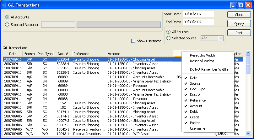
The system gives you the ability to customize the column layout of screens—and once customized, the columns will remember your preferences the next time you visit. To customize the column layout of a screen which supports this feature, simply right-click on any column header, as shown below:
Note
The column configuration options will vary depending on the current status of the screen. And of course, individual column names will differ from screen to screen.
When right-clicking on a column header to configure the column settings, you are presented with the following options:
- Reset this Width
Select this option to reset the selected column to its default, system-defined width. You will only see this option if the width of column has been changed (i.e., made wider or narrower).
- Reset all Widths
Select this option to reset all columns on the screen to the default settings.
- Do Not Remember Widths
Select this option if you do not want the screen to remember column width changes made during active sessions.
- Remember Widths
Select this option if you want the screen to remember column width changes made during active sessions.
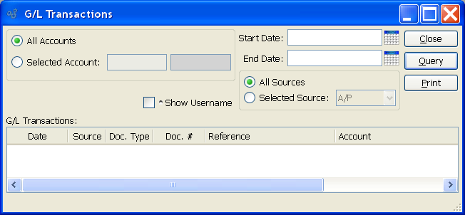
Beneath the column width options, you will see a list of all the column names in the screen. As a further customization, you may choose to show or hide as many columns as you want. For example, if you do not need the username in the G/L Transactions screen, simply de-select the "Username" option in the list. The screen will only display columns which have a check mark next to them in the column configuration list.
Another feature of lists is the ability to sort the list by any column simply by clicking on the column header. The first click on the column header will sort the list in ascending order by the contents of the selected column. The second click will sort the list in descending order. Plus, once you've sorted the columns the way you want them, the screen will remember your sort preference the next time you visit the screen.
On many screens where there are check box options (i.e., parameters used for filtering data displayed on a screen), the system will remember your preferred settings. An example of this functionality is shown in the following screen:
A shaded bullet symbol indicates whether a check box supports the memory feature. In our example, the "Show All Unvouchered P/Os" check box has a shaded bullet next to it. When you see a shaded bullet next to a check box it means your preferences will be remembered by the system. If you select the check box, then it will remain selected the next time you open the screen. Conversely, if you don't select the check box, it won't be selected when the screen is next used.
Tip
The Check Box memory feature can be de-activated by de-selecting the "Remember Check Box Settings" option on the user Preferences screen. Turning this setting off will hide the shaded bullet symbols from view.
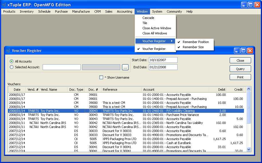
The system gives you the ability to specify a default screen size and position on a screen-by-screen basis. This feature applies to all Window screens, but not to Dialog screens. A Dialog screen is a screen which holds the focus when it is open and prevents you from working on other screens at the same time. The controls for the screen position and size memory are located under the Windows menu, as shown in the following screen:
Note
Unless you specify otherwise, the system will always remember the size of all Window screens—and also the position where the screen was located—when you last used it.
When opening the Windows menu to set your screen position or size, you are presented with the following options:
- Remember Position
Select to have the system remember the position of the specified screen. If selected, the system will remember the position of the screen where it was last located. Un-selecting this option means the screen position will not be remembered—and the default position will be used instead.
- Remember Size
Select to have the system remember the size of the specified screen. If selected, the system will remember the size of the screen where it was last located. Un-selecting this option means the screen size will not be remembered—and the default size will be used instead.
The application supports drag-and-drop functionality for screens which use the Item Number widget. Using this functionality, you have the ability to drag an Item Number from one screen to another screen.
For example, let's say you have two xTuple ERP screens open on your desktop at the same time: The Bill of Materials (BOM) for Item XYZ and also the Quantity on Hand (QOH) by Item display. In this example, the QOH display does not have an Item Number entered in it yet.
To drag Item Number XYZ from the BOM screen to the QOH display, simply click your mouse on the Item Number in the BOM—and then drag the Item Number over to the Item Number field on the QOH display. You may now QUERY the display to get QOH information on Item XYZ.
Many people prefer to use keyboard shortcuts—instead of a mouse—when navigating within a software application. xTuple ERP features a number of keyboard shortcuts designed just for this purpose.
The TAB key on your keyboard may be used to move the cursor from one field to the next within any given data-entry screen. Simply place the cursor in the first field you want to enter data into—and when you"re done entering data, hit the TAB key to move the cursor to the next field.
Also use the TAB key as a shortcut for converting date field entries to the proper format for your system. For example, in a "Start Date" field you might enter the numbers "022503". Then, with the cursor still blinking in the field, hit the TAB key. The date will be converted to "02/25/03"—or whatever the proper date format is for your system. For more information on keyboard shortcuts related to dates, see the Section 2.7.4, “ Date Shortcuts”.
Note
Date formats are controlled by Locale settings.
Three keyboard shortcuts are available at several points throughout the application when you place the cursor in an "Item Number" field. You saw the "Item Number" field in the Bill of Materials example above. The "Item Number" field appears frequently throughout the application. Use the CTRL key—usually located on the bottom left-hand corner of your keyboard—in combination with either "L", "A", or "S" to reach the three screens shown in the following examples:
Tip
Macintosh users should substitute the APPLE key for the CTRL key to achieve the results described in this section.
- List (CTRL + L)
This is the same Item lookup you would reach if you clicked your mouse on the browse button located next to the "Item Number" field.
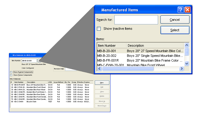
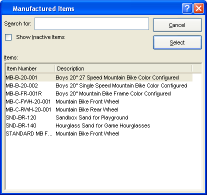
- Search (CTRL + S)
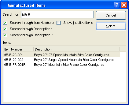
Search for Items using a variety of search criteria. This shortcut enables you to look up Manufactured Items using partial values. In the above example, the user selected all available search options—except for the "Show Inactive Items" option—to search for a match for "MB-B." In this case, the application will search the master list of Items for any Item containing "MB-B" in either the Item Number, the first line of the Item description, and/or the second line of the Item description.
You can also search for matches using any one or a combination of these search options. For example, let's say you are looking for any Manufactured Item containing the word "Bike" in the first line of the Item description. To perform this search, simply enter the word "Bike" in the "Search For" field, then select the "Search through Description 1" option. Leave the other options unchecked. Any Item containing the word "Bike" in the first line of its Item description will display in the results.
You will notice throughout the application that several characters—or individual letters within words—are underlined. In the sample Bill of Materials screen, for example, the SAVE button has the first letter, "S", underlined. The first letter, "C", in the CANCEL button is also underlined. Alternately, notice that the MOVE DOWN button has the "W" underlined. The list could go on.
If you depress the ALT key on your keyboard in combination with any of these underlined letters, the effect is the same as if you had used the mouse to select that button or field. For example, the following combination of keys will activate the PRINT button: ALT + P. The following keyboard shortcut will cancel or close a screen: ALT + C. Or, move a component Item down a notch in a Bill of Materials display with the following shortcut: ALT + W.
xTuple ERP supports a number of keyboard shortcuts for dates. These shortcuts are designed to save you time when entering dates in date fields. Keep in mind, you are required to hit the TAB key after entering a shortcut value in a date field. The TAB key is required to complete all date shortcut entries. The following table describes these date shortcuts in more detail:
Note
xTuple ERP accepts a number of different "input" formats for dates. Any of the following date formats will be accepted by the application:
MM/DD/YY
MM/DD/YYYY
M or MM / D or DD / YY or YYYY
While date input formats may vary, the "output" format (i.e., how dates display on screen) is defined by your Locale settings.
Table 1. Date Shortcuts
0+TAB Key | Entering the number "0" followed by the TAB key in an empty date field will automatically enter today's date in the date field. |
+num | The "+" symbol followed by a whole number will enter the date occurring num number of days after today's date: Example: Entering "+1" would give you tomorrow's date, "+2" would give you the day-after-tomorrow, etc. |
-num | The "-" symbol followed by a whole number will enter the date occurring num number of days before today's date: Example: Entering "-1" would give you yesterday's date, "-2" would give you the day-before-yesterday, etc. |
num | A standalone number will enter the day of the current month represented by that number. Examples: Entering "12" in the month of March, 2003 would give you March 12, 2003. Similarly, the number "23" would give you March 23, 2003, etc. Any number from 1 to 99 may be entered. If the number entered is greater than the last day of the current month, the date will automatically default to the last day of the month. In other words, entering the numbers "99" or "75" or "32" would automatically enter the last day of the current month. |
#num | The "#" symbol followed by a whole number will enter the day of the current Julian calendar year represented by that number. Examples: Entering "#1" in the year 2003 would give you January 1, 2003. Similarly, "#100" would give you April 10, 2003. Entering "#365" would give you December 31, 2003. |
Tip
Some date fields support time-periods represented by words—such as "Earliest" and "Latest". Keep in mind that these words are case-sensitive. They will not work unless the first letter of the word is capitalized.
In addition to the keyboard shortcuts for dates, you also have the option of selecting the calendar button located to the far right of every date field in the application. The calendar buttons are shown in the following screen shot next to the Start Date and End Date fields:
The calendar functionality is simple to use. All you do is open the calendar, then select the date you want to be entered into the field. To change a date, simply reopen the calendar and select a new date. You can easily navigate between months—and even between years.
Tip
The calendar can be used interchangeably with manually entered dates and date shortcuts. You don't have to use one or the other.
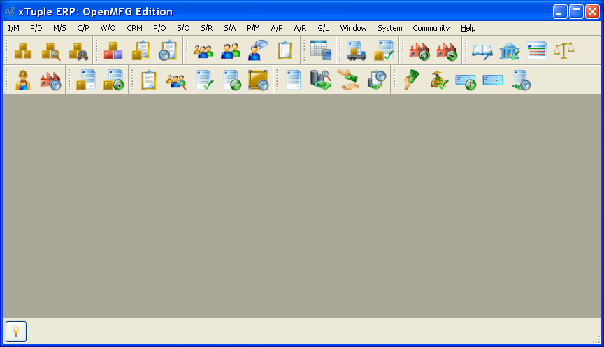
For users who prefer using buttons instead of drop-down menus, the application offers a variety of toolbar button options. The following screen shows the application desktop with all available toolbar buttons turned on:
Note
You can control the display of toolbar buttons on your desktop. Turn them on or off on a module-by-module basis, using the settings available in the User Preferences section of the System module. In addition, you may drag-and-drop toolbar buttons, allowing them to float or attach to alternate locations on the application desktop.
To access the function described by a button, simply select the button using your mouse. Toolbar buttons function in the same way drop-down menu selections do—they simply provide a convenient shortcut. The complete list of available toolbar buttons is shown in the following table:
Table 2. Toolbar Buttons Master List
Image | Function | Module |
|---|---|---|
 | List Item Sites | I/M |
 | Inventory Availability by Planner Code | I/M |
 | Item Availability Workbench | I/M |
 | List Items | P/D |
 | List BOMs | P/D |
 | List BOOs | P/D |
 | Run MRP by Planner Code | M/S |
 | Planned Orders by Planner Code | M/S |
 | Shop Floor Workbench | W/O |
 | W/O Schedule by Planner Code | W/O |
 | List Unposted P/Os | P/O |
 | Purchase Requests by Planner Code | P/O |
 | Customer Information Workbench | S/O |
 | List Open Sales Orders | S/O |
 | Uninvoiced Shipments | S/O |
 | Billing Selections | S/O |
 | Summarized Backlog by Site | S/O |
 | Issue Stock to Shipping | S/R |
 | UnPosted Receipts | S/R |
 | List Accounts | CRM |
 | List Contacts | CRM |
 | Incident Workbench | CRM |
 | List To-Do"s | CRM |
 | List Projects | P/M |
 | List Unposted Vouchers | A/P |
 | Select Payments | A/P |
 | Prepare Check Run | A/P |
 | View Check Run | A/P |
 | A/P Aging | A/P |
 | List Unposted Invoices | A/R |
 | A/R Workbench | A/R |
 | Cash Receipt Edit List | A/R |
 | A/R Aging | A/R |
 | List Unposted Journal Entries | G/L |
 | Reconcile Bank Account | G/L |
 | View Financial Report | G/L |
 | View Trial Balances | G/L |
 | Event Notification | System |
 | Database Error Notification | System |
Tip
If you hover your mouse above a toolbar button, the name of the function associated with the button will appear. Use this technique to quickly learn the identity of the toolbar buttons.
A set of common buttons appear throughout xTuple ERP. They are usually located to the far right side of the screen. They can be activated by a single mouse click, or by the use of associated keyboard shortcuts. The following descriptions explain some of the more common application buttons found within xTuple ERP:
- CLOSE
Closes the screen you are currently working on, without saving any information you may have entered. Returns you to the previous screen.
- CANCEL
Works the same way as the CLOSE button.
- SELECT
Inserts a highlighted list item into a requesting field. The use of the SELECT button is illustrated in the example. In this Bill of Materials example, you would highlight an Item in the searchable master list of Items and then hit SELECT. The Item would then be automatically entered into the "Item Number" field on the Bill of Materials screen. You may bypass the SELECT button by double-clicking on a highlighted list item.
- EDIT
Allows editing of information displayed on screen.
- VIEW
Opens a read-only view of information displayed on screen.
- SAVE
Saves any information you have entered and stores it in the xTuple Database.
Sends the contents of a screen or report to your default printer, assuming you have a default printer assigned to your work station.