TabView QML Type
A control that allows the user to select one of multiple stacked items. More...
| Import Statement: | import QtQuick.Controls 1.3 |
| Since: | Qt 5.1 |
| Inherits: |
Properties
- contentItem : Item
- count : int
- currentIndex : int
- frameVisible : bool
- tabPosition : int
- tabsVisible : bool
Methods
- addTab( title, component)
- getTab( index)
- insertTab( index, title, component)
- moveTab( from, to)
- removeTab( index)
Detailed Description

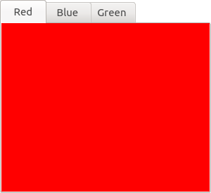
TabView provides tab-based navigation model for your application. For example, the following snippet uses tabs to present rectangles of different color on each tab page:
TabView {
    Tab {
        title: "Red"
        Rectangle { color: "red" }
    }
    Tab {
        title: "Blue"
        Rectangle { color: "blue" }
    }
    Tab {
        title: "Green"
        Rectangle { color: "green" }
    }
}
Note: You can create a custom appearance for a TabView by assigning a TabViewStyle.
Tab represents the content of a tab in a TabView.
Property Documentation
read-onlycontentItem : Item |
Method Documentation
Adds a new tab page with title with and optional Component. Returns the newly added tab.
Returns the Tab item at index.
Inserts a new tab with title at index, with an optional Component. Returns the newly added tab.
© 2015 The Qt Company Ltd. Documentation contributions included herein are the copyrights of their respective owners. The documentation provided herein is licensed under the terms of the GNU Free Documentation License version 1.3 as published by the Free Software Foundation. Qt and respective logos are trademarks of The Qt Company Ltd in Finland and/or other countries worldwide. All other trademarks are property of their respective owners.
