Dial QML Type
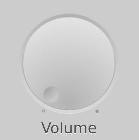
A circular dial that is rotated to set a value. More...
| Import Statement: | import QtQuick.Extras 1.4 |
| Since: | Qt 5.5 |
| Inherits: |
Properties
- activeFocusOnPress : bool
- hovered : real
- maximumValue : real
- minimumValue : real
- pressed : bool
- stepSize : real
- style : Component
- tickmarksVisible : bool
- value : real
Detailed Description

The Dial is similar to a traditional dial knob that is found on devices such as stereos or industrial equipment. It allows the user to specify a value within a range.
Like CircularGauge, Dial can display tickmarks to give an indication of the current value. When a suitable stepSize is combined with tickmarkStepSize, the dial "snaps" to each tickmark.
You can create a custom appearance for a Dial by assigning a DialStyle.
Property Documentation
This property specifies whether the dial should gain active focus when pressed.
The default value is false.
See also pressed.
Returns true if the dial is pressed.
See also activeFocusOnPress.
style : Component |
The style Component for this control.
See also Qt Quick Controls Styles QML Types.
This property determines whether or not the dial displays tickmarks, minor tickmarks, and labels.
For more fine-grained control over what is displayed, the following style components of DialStyle can be used:
The default value is true.
The angle of the handle along the dial, in the range of 0.0 to 1.0.
The default value is 0.0.
© 2017 The Qt Company Ltd. Documentation contributions included herein are the copyrights of their respective owners. The documentation provided herein is licensed under the terms of the GNU Free Documentation License version 1.3 as published by the Free Software Foundation. Qt and respective logos are trademarks of The Qt Company Ltd. in Finland and/or other countries worldwide. All other trademarks are property of their respective owners.
