Toolbar
The toolbar offers quick access to some of the key functions in the application view. All of the functions must also be found from the Options menu.
A tooltip is an information pop-up containing information regarding each button must be shown.
Following toolbar button types can be used:
Command button offering direct action (functions/view access) like Send or New contact with a button press feedback. Related tooltip indicates the function of the button. Command button may have a long press functionality included such as Fast forward.
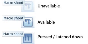
ON/OFF button can be used for active/inactive type of functions such as Loudspeaker or Font italics. Button has related latched down effect. Button icon graphic and tooltip indicate the function of the button, and they stay the same regardless of the button state. No long tap allowed.
Mode toggle button can be used for switching between several modes as in Flash. Button icon graphic and tooltip change and should indicate the current status.
Toolbar buttons are view specific, thus within one application some views may have toolbar and some do not. It is recommended though to keep the toolbars as consistent as possible within an application. Changing toolbar buttons within one view is not allowed, but button can be dimmed in case function is not available, for example, depending on focused item in the view or currently available services. Application may change the buttons according to product concept.
The order of the toolbar buttons in different orientations is according to the reading direction the first item is placed topmost when the toolbar is vertical and leftmost when the toolbar is horizontal in western languages. The appearance of functions in Toolbar should follow the order presented below.
| Function type | Description |
|---|---|
| Call | Call initiation related functions |
| Reply | Replying to a message |
| Send | For sending the content in focus |
| Create new | For creating a new message, note, folder, contact or some other item |
| View switching | For functions such as Go-to or View mode switching |
| Editing | For switching to editing mode |
| Opening extension | For opening the toolbar extension in case all the functions within the extension are a collection of options of similar type and can be grouped under one command, for example, Insert -extension for inserting image, video, presentation and so on. |
| Delete | Deleting the item in focus |
| More -extension | For opening the toolbar extension “More” in case the functions within the extension are various kinds and cannot be grouped. |
Application specific commands that do not fit into any function type described above are to be placed between Create new and Opening the extension in the order list.
The application may decide the initial state of ON/OFF and Mode toggle button in application launch. They can also be reset or resumed from the previous session.
Floating toolbar
Floating toolbar is a component for showing the key functions on top of the Main pane or full screen content. It can be used in non-touch UI, but also in touch UI.
Floating toolbar owns the focus, and thus it can be used only if other content in the view does not need the focus. It means that floating toolbar cannot be used with lists and grids.
Opening and closing the floating toolbar can be done with the Show toolbar / Hide toolbar command via the Options menu. In this case the toolbar is open by default.
Floating toolbar can also be designed to be opened via MSK labeled as Toolbar. For closing the toolbar, there has to be then a Hide button or the toolbar is closed after selecting a function. Navigation keys can be used as a shortcut for opening and closing the toolbar, when not used for anything else in the view. Time-out can be used for closing the toolbar.
There can be 3-6 buttons in the floating toolbar depending on used resolution. Thus the most important functions must be designed to be the first ones in the toolbar; so that they are visible, for example, in case only three buttons fit the layout.
When the toolbar is open, it owns the Selection key for selecting the focused toolbar button. Toolbar does not own the right and left softkeys. The user can move the focus over the toolbar buttons with the Arrow keys (left and right). The focus loops, and the toolbar itself does not scroll.
Floating toolbar extension
Toolbar button can be reserved for opening a toolbar extension, where more options can be found. Placement of the extension button within toolbar can be found from the appearance order in the table Appearance order of toolbar functions. The button has a default graphic, which the application can change if needed.
Toolbar extension buttons are for similar actions as buttons in toolbar, which means the same types and rules apply for toolbar extension buttons. Extension should be used for accessing a set of logically similar options, for example, when selecting content to be inserted to a message or for adjusting imaging session related values in camera.
Extension can have 2 – 12 buttons (3x4 in landscape and 4x3 in portrait). The filling order follows the grid filling rules, thus for example most important one should be placed as first. In floating toolbar extension, the last extension button is reserved for closing the toolbar.
Toolbar component in touch UI
In touch UI the toolbar is either fixed in the layout, or a floating component. Both toolbars cannot exist in one view.
Toolbars are view specific, thus all views of an application do not have to have a toolbar.
Selection in touch toolbars is done with a single tap, and related tooltip is shown with stylus down.
Floating toolbar in touch UI
The number of floating toolbar buttons in the nHD (640 x 360 pixels) layout is three. In case floating toolbar is used in full screen, there can be four buttons.
Floating toolbar owns the focus also in touch UI, and thus cannot be used in views that have focus for main pane content.
Floating toolbar can be opened and closed as in non-touch UI via the Options menu or with the Selection key, or it can be opened by tapping the main pane area. In this case closing is done by tapping the main pane area again, with time-out or by selecting a function.
Fixed toolbar in touch UI
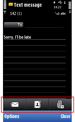
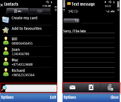
The number of fixed toolbar buttons in the nHD (640 x 360 pixels) layout is three. It reserves own space from the layout and does not cover the content of main pane area.
Fixed toolbar does not have a highlight, and thus it can be used in all views (whether main pane needs the highlight or not).
Fixed toolbar cannot be opened or closed, but it is always visible. Toolbar can be hidden in case other controls are also hidden (in full screen views).
Toolbar extension in touch UI
As in non-touch UI, toolbars can have extensions also in touch UI. For floating toolbar in touch UI, the same rules apply as defined for floating toolbar extension in general. In touch UI, the toolbar extension can always be closed with the same toolbar button as it was opened, or by tapping outside the extension area.
In addition to general extension rules, the toolbar extension for fixed toolbar has certain specific guidelines. Besides buttons, the extension of fixed toolbar can include editor fields, for example, for entering an URL or for the Find function in the browser. The most important editor field is to be the topmost and has the cursor by default.
Using toolbars in applications
The APIs to use for creating a toolbar are the Toolbar API for the toolbar itself and the Generic button API for the buttons in the toolbar.
For implementation information, see Enabling quick access to functions with a toolbar.


