Grids API Specification
Changes in Grids API documentation
Changes in Grids API
Purpose
Grids are used extensively to represent a compact view
of the data structure using graphics and/or text. This document introduces
readers to grid use.
Items from the data structure are represented by cells in the grid view.
A cell can be further divided into sub-cells, which contain graphics or text.
Depending on the screen size, cell size, and number of items in the data structure,
all or some of the cells are visible concurrently. Grid controls provide users
with a mechanism to navigate between the cells. Grids are also scrollable,
thus enabling access to all items in the data structure.
Classification and release information
Grids API is an SDK API.
API description
Like other user interface components, grids follow
the Model-View-Controller (MVC) design pattern.
Using listboxes is another common way to represent a set of items on the
symbian platform. While grids share a great deal of functionality with listboxes,
the fundamental difference is that a grid may contain more than one item per
line, thus providing a more compact view over the data. This compactness comes
at a cost: the amount of information per item in a grid is more limited than
in a listbox. Therefore grids are more suitable for displaying easily distinguishable
items, such as applications or available commands in one application, or items
that are naturally represented as a grid, such as a monthly calendar view.
There are many different types of grids available on the symbian platform.
These types are designed to fulfill the requirements of different kinds of
data structures and use cases related to representing a set of items in a
compact way.
This document covers the menu grid, the selection grid, and the markable
grid. The menu grid provides users with a collection of available actions
and allows them to proceed with one. The selection grid provides a view where
users can navigate between items and then select one or more. The markable
grid allows users to navigate and select items, and then execute a command
to each of them. Code samples throughout this document demonstrate how to
create the different types of grids.
In addition to having different types of grids, the grid layout itself
can be altered. The number of visible rows and columns can be altered, along
with the presentation and composition of cells. These options are explained
thoroughly with code samples.
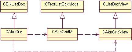
Grid architecture
Grid controls and listboxes have a great deal in common, thus it is natural
that the base class for the grid controls (
CAknGrid
) inherits
the base class for listboxes
CEikListBox
. For details in
listboxes, please see the
Lists API documentation
. Because
grid controls follow the MVC design pattern, the grid control architecture
is divided into three classes: class
CAknGrid
implements
the controller, class
CAknGridView
implements the view, and
class
CAknGridM
implements the model component of the grid
control.
The model class
CAknGridM
is an abstract class specifying
the interface to the data. The model does not contain any information about
the visual presentation of the data in grid control. It should be noted that
the model class is a C-type class, so, for example, multiple inheritance of
the grid control model is more limited than in the case of listboxes.
The view class
CAknGridView
is responsible for the visual
appearance of the grid control. It handles rendering of cells and the cursor.
It also performs the mapping of data items to their grid cells.
The controller class
CAknGrid
acts as the actual user
interface component, communicating with both the model and the view components.
Related APIs
-
CAknGrid
-
CAknGridM
-
CAknGridView
-
CEikListBox
Grid types
Grids are divided into the following types based on their functionality.
Menu grid
The menu grid is a grid control embedded in a pop-up dialog. It can be
used to provide users with a list of alternatives for performing a desired
operation. Only one item can be selected, and after selection the grid control
is destroyed along with the dialog.
Control of the grid is delegated to the pop-up dialog, and its use is similar
to other dialogs on the symbian platform.
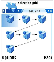
Selection grid
The selection grid allows users to select one of the available items. It
is typically used as a navigational component of the user interface, thus
serving a purpose similar to that of selection lists.
Markable grid
The markable grid allows users to select multiple items in the grid. Typically
it is used to perform one operation to each one of the selected items (for
example, to delete messages from a folder in a messaging application).
The grid control for the markable grid automatically handles setting and
resetting the marker field in the data structure.
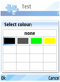
Color selection grid
Color selection grid can be used when an application offers to user the
possibility to choose a color in a dialog. There is also a possibility to
select nothing.
GMS style grid
This type of grid can be used to create a photoalbum-like picture grid.
This is a markable grid with two columns displaying a bitmap. The grid is
implemented by the class
CAknGMSStyleGrid
.
Related APIs
Grid format and layout
The grid format is defined much the same way as for listboxes. There are,
however, additional formatting options due to cell composition. The following
section describes the options available for grid layout and cell formatting.
Grid layout
Grids are laid out as a two-dimensional matrix composed of horizontal rows
and vertical columns. The number of rows and columns in a grid control can
be freely specified to suit the needs of different applications. The size
of a cell in a grid can also be freely specified (considering the limitations
of the device’s screen resolution) and is the same for all of the cells. Horizontal
and vertical gaps between cells of the grid can also be specified.
As there is no one obvious way to order the cells in a grid, this can be
customized as well. The ordering of cells can be done by selecting either
a horizontal or vertical axis as the primary axis. This axis then determines
the orientation of the grid. The order can be further specified by defining
the ordering (left-right, top-down) in both axes. This combination then defines
the exact ordering of data items in the grid.
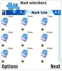
The scrolling behavior of the grid can also be altered. There are three
types for scrolling behavior at the edge of a grid:
-
Stop. The cursor cannot be moved beyond the edge of grid and thus is stopped
at the edge.
-
Loop. The cursor is moved to the opposite side of the grid. When trying
to move beyond the rightmost item, the cursor is moved to the leftmost item
in the same row.
-
Snake. The behavior is similar to loop, but the cursor is moved to the
next/previous row (or column), if applicable. The snaking scrolling order
is shown in Figure 6.
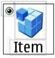
Cell structure
As mentioned before, cells are composed of one or more sub-cells. These
sub-cells may contain either text or graphics, and can be positioned independently
within the cell. All cells in same grid share the same cell structure. There
are typically one to three sub-cells in one cell.
Figure 7 shows the typical components of a grid cell:
-
Sub-cell A contains graphics.
-
Sub-cell B contains text.
-
Sub-cell C contains a marker indicating whether the cell is selected or
not.
The format strings used in conjunction with cell formatting are similar
to those used with listboxes. The strings in the data structure are composed
of tab-delimited fields. These fields are then used to render the sub-cell,
either by using the numeric value of the field as an index to the icon array
to select the graphical icon to be drawn, or by using the Unicode string itself
as the content of the text sub-cell.
The format string for item data for the cell in Figure 6 is “
2\tItem\t0
”:
the first field contains an index to the icon array, the second field contains
the text to be displayed, and the third field is a placeholder for the marker
information.
Sub-cells can be located freely within the cell. For different views, some
of the fields present in data can be omitted as well, for example to provide
a text-only view of the grid. The cell structure can be changed dynamically
at run time without the need to modify the model data or to construct the
grid control from scratch.
Related APIs
Use cases
The main use cases of Grids API are:
-
Defining a grid in resource file
-
Setting up the grid cell structure
-
Setting up sub-cell that contains graphics
-
Setting up sub-cell that contains text
-
Creating a selection grid from resource
-
Creating a selection grid with icons runtime
-
Getting the selected cell of a selection grid
-
Selecting a cell in a grid
-
Creating a menu grid
-
Creating a markable grid with icons runtime
-
Mark and unmark an item in a markable grid
-
Getting the marked items of a markable grid
-
Creating a color selection grid
-
Adding a cell to grid
-
Removing a cell from grid
-
Getting the number of cells of grid
-
Offering key events to grid
-
Handling resource events
-
Creating animated highlight
API class structure
This diagram shows the general structure of Grids API.
Using Grids API
Defining a grid in resource file
Grid resources are described with the
GRID
structure,
as defined in the
avkon.rh
file:
              STRUCT GRID


                   {


                   BYTE version = 0;


                   WORD flags = 0;


                   WORD height = 5;  // in items


                   WORD width = 10;  // in chars


                   LLINK array_id = 0;


                   LTEXT emptytext = "";


                   LLINK style = 0;


                   }
Important members of this structure are:
-
flags
, which describes the type of the grid control to
be created.
-
style
, which is a reference to the
GRID_STYLE
structure
described later.
-
array_id
, which is a reference to an
ARRAY
of
strings describing the data items.
-
emptytext
, which contains the text to be shown when there
are no items in the grid.
The grid type is specified in
GRID
structure member
flags
,
which may contain one of the following predefined values:
-
EAknListBoxMenuGrid
, for menu grid type
-
EAknListBoxSelectionGrid
, for selection grid type
-
EAknListBoxMarkableGrid
, for multiple selection/markable
grid type
The grid style is described with the
GRID_STYLE
structure,
defined in
avkon.rh
:
              STRUCT GRID_STYLE


                   {


                   WORD layoutflags = 0;


                   WORD primaryscroll = 0;


                   WORD secondaryscroll = 0;


                   WORD itemsinprimaryorient = 0;


                   WORD itemsinsecondaryorient = 0;


                   WORD height = 0;


                   WORD width = 0;


                   WORD gapwidth = 0;


                   WORD gapheight = 0;


                   }
Members in the GRID_STYLE structure can be used as described below.
-
layoutflags
: A set of flags describing the orientation
of the grid and the ordering of cells within the axis. Possible values for
orientation are
EAknGridHorizontalOrientation
or
EAknGridVerticalOrientation
.
The ordering of cells in the vertical axis is defined by either
EAknGridTopToBottom
or
EAknGridBottomToTop
and
in the horizontal axis by either
EAknGridLeftToRight
or
EAknGridRightToLeft
.
The symbain platform also provides flag
EAknGridLanguageSpecificHorizontalDirection
to
provide horizontal ordering based on the language's writing direction.
-
primaryscroll
and
secondaryscroll
: Scrolling
behavior within the primary and secondary axes of the grid. The following
values are defined for use with these fields:
|
|
|
|
EScrollFollowsItemsAndStops
|
Snakes. Stops when scrolling beyond the first or last cell.
|
|
EScrollFollowsItemsAndLoops
|
Snakes. Loops to the first cell when scrolling beyond the last cell
and vice versa.
|
|
EScrollFollowsGrid
|
Loops.
|
|
EScrollStops
|
Stops.
|
-
itemsinprimaryorient
and
itemsinsecondaryorient
:
Number of cells in primary and secondary axes.
-
width
and
height
: Size of cell in pixels.
-
gapwidth
and
gapheight
: Size of gap
between cells in pixels.
Note, that resource based definition of grid style is not recommended as
S60 on symbian platform supports multiple resolutions.
Items contained in the grid can also be specified in the resource file.
The
array_id
member of the
GRID
structure
is a reference to an
ARRAY
that contains items of type
LBUF
.
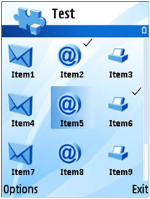
The following resource definition defines a selection grid and its contents.
The resulting grid will be similar to the one shown in Figure 3.
              RESOURCE GRID r_selectiongrid


                  {


                  array_id = r_selectiongrid_items;


                  flags = EAknListBoxSelectionGrid;


                  style = r_selectiongrid_style;


                  }


              RESOURCE GRID_STYLE r_selectiongrid_style


                  {


                  layoutflags = EAknGridHorizontalOrientation |


                                EAknGridLeftToRight |


                                EAknGridTopToBottom;


                  primaryscroll = EAknGridFollowsItemsAndLoops;


                  secondaryscroll = EAknGridFollowsItemsAndLoops;


                  itemsinprimaryorient = 3;


                  itemsinsecondaryorient = 3;


                  gapwidth = 5;


                  gapheight = 5;


                  width = 60;


                  height = 60;


                  }


              RESOURCE ARRAY r_selectiongrid_items


                  {


                  items =


                      {


                      LBUF { txt = "Item0"; },


                      LBUF { txt = "Item1"; },


                      LBUF { txt = "Item2"; },


                      LBUF { txt = "Item3"; },


                      LBUF { txt = "Item4"; }


                      };


                  }
Related APIs
-
ARRAY
-
EAknGridBottomToTop
-
EAknGridHorizontalOrientation
-
EAknGridLanguageSpecificHorizontalDirection
-
EAknGridLeftToRight
-
EAknGridRightToLeft
-
EAknGridTopToBottom
-
EAknGridVerticalOrientation
-
EAknListBoxMarkableGrid
-
EAknListBoxMenuGrid
-
EAknListBoxSelectionGrid
-
EScrollFollowsGrid
-
EScrollFollowsItemsAndLoops
-
EScrollFollowsItemsAndStops
-
EScrollStops
-
GRID
-
GRID_STYLE
-
LBUF
-
array_id
-
emptytext
-
flags
-
gapheight
-
gapwidth
-
height
-
itemsinprimaryorient
-
itemsinsecondaryorient
-
layoutflags
-
primaryscroll
-
secondaryscroll
-
style
-
width
Setting up the grid cell structure
As mentioned before, the cells of a grid are composed of one or more sub-cells.
This sub-cell structure must be set up before the grid control can be used.
As per the MVC design pattern, the view component of the grid control is responsible
for providing the visual presentation of the cells. Therefore the low-level
manipulation of cell structure can be made with the item drawer class. However,
the symbian platform also provides utility class
AknListBoxLayouts
to
simplify the setup of the cell structure for grid controls. Class
AknListBoxLayouts
provides
a few static methods for grids.
AknListBoxLayouts::SetupStandardGrid()
sets up the background
and foreground color settings to their default values.
Setting up sub-cell that contains graphics
AknListBoxLayouts::SetupFormGfxCell()
is used to set up
the sub-cell that contains graphics.
               AknListBoxLayouts::SetupFormGfxCell(*iGrid, // Reference to grid control


                                                   iGrid->ItemDrawer(),  // Pointer to the item drawer


                                                   0, // Column index


                                                   0, // Left position


                                                   0, // Top position


                                                   0, // Right – unused


                                                   0, // Bottom – unused


                                                   50, // Width


                                                   32, // Height


                                                   TPoint(0,0), // Start position


                                                   TPoint(32, 32));  // End position
The following parameters must be provided when setting up a graphics sub-cell:
-
Reference to the grid itself and pointer to the grid's item drawer.
-
Column index – The field number in a tab-delimited data string to be used
to get the index to graphics.
-
Left and top positions – The number of pixels relative to the left-hand
and top sides of the cell.
-
The width and height of the graphic in pixels.
-
Start and end positions – The coordinates describing the area of the bitmap
to be drawn.
Related APIs
-
AknListBoxLayouts::SetupFormGfxCell()
Setting up sub-cell that contains text
AknListBoxLayouts::SetupFormTextCell()
is used to set
up the sub-cell that contains text.
               AknListBoxLayouts::SetupFormTextCell(*iGrid, // Reference to grid


                                                    iGrid->ItemDrawer(),// Pointer to the item drawer


                                                       1, // Column index


                                                       LatinBold12(), // Font


                                                       215, // Color (215 = black)


                                                       0, // Left margin


                                                       0, // Right margin – unused


                                                       50 - 3, // Baseline


                                                       50, // Text width


                                                       CGraphicsContext::ECenter, // Text alignment


                                                       TPoint(0, 32), // Start position


                                                       TPoint(50, 50)); // End position
The following parameters must be provided when setting up a text sub-cell:
-
Reference to the grid itself and a pointer to the grid's item drawer.
-
Column index. The field number in a tab-delimited data string to be used
to get the index to graphics.
-
Font used to render the text.
-
Color of the text. Index to an 8-bit palette used for the user interface
(entries 0-215 are known as Web-safe colors.
-
Left margin position. Position in pixels relative to the left-hand side
of the cell.
-
Baseline position.
-
Width of the text.
-
Alignment of the text.
-
Start and end position. The coordinates describing the text area.
Related APIs
-
AknListBoxLayouts::SetupFormTextCell()
Related APIs
-
AknListBoxLayouts
-
AknListBoxLayouts::SetupStandardGrid()
Creating a selection grid from resource
Grid controls can be easily created from resource definitions. The resource
file used to create the grid should have both the resource definition for
the grid and the definition of the grid item array. In this example a simple
grid is created which cells have only text items. The grid is created from
resource defined in
Defining a grid in resource file
.
Note, that
AknListBoxLayouts::SetupFormTextCell()
must be
called to define the layout of the text in the cell. For details on cell layout
please see
Setting up the grid cell structure
.
To create a selection grid with text from code, follow these steps:
-
Create a grid instance.
-
Set the grid's container window. Since the grid is a non window-owning
control, its parent control is passed as a parameter, providing a window for
the listbox to draw to.
-
Construct the selection grid using its resource identifier.
-
Set the text layout of grid sub-cell using
AknListBoxLayouts::SetupFormTextCell()
method.
-
Activate the grid.
              class MyContainer : public CCoeControl


                   {


                   CAknGrid* iGrid;


                   }


              void MyContainer::ConstructL()


                   {


                   // Create grid


                   iGrid = new( ELeave ) CAknGrid;


                   iGrid->SetContainerWindowL( *this );


                   TResourceReader rr;


                   // initialize resource reader, passing resource id as parameter


                   iEikonEnv->CreateResourceReaderLC( rr, R_SELECTIONGRID );


                   // Construct grid from resource


                   iGrid->ConstructFromResourceL( rr );


                   CleanupStack::PopAndDestroy();  // rr


                   // Setup the layout of the text in the cell.


                   AknListBoxLayouts::SetupFormTextCell( *iGrid, iGrid->ItemDrawer(),


                                                        0, LatinBold16(), 0, 0, 0, 30,


                                                        0, CGraphicsContext::ECenter,


                                                        TPoint(0,0), TPoint(0,0) );


                   // Activate grid


                   iGrid->SetRect( Rect() );


                   iGrid->ActivateL();


                   }
Related APIs
-
AknListBoxLayouts::SetupFormTextCell()
Creating a selection grid with icons runtime
Creating grids without a resource file is not much more complicated than
creating them with a resource file. Most of the steps used to create grid
control are same in both cases. In this example a 3x3 grid is created each
grid contains an icon and a text.
To create a selection grid with icons and text from code, follow these
steps:
-
Create a grid instance an a grid model instance. Set the grid's model
with the created model.
-
Use flag
EAknListBoxSelectionGrid
to construct a selection
grid.
-
Set the grid's container window. Since the grid is a non window-owning
control, its parent control is passed as a parameter, providing a window for
the listbox to draw to.
-
Set the grid layout using
CAknGrid::SetLayoutL()
.
-
Add cell item strings and icons to grid. Cell item string must be formatted
to contain the indexes of the icons in the icon array.
-
Set the layout of text and icon in the grid sub-cell using
AknListBoxLayouts::SetupFormGfxCell()
and
AknListBoxLayouts::SetupFormTextCell()
methods.
-
Activate the grid.
Note that the order of the icons in the icon array (local variable
iconArray
of
the method
AddGridIconsL()
) defines their indexes in the
cell item string (
0\tItem1
). In this example, the first icon
added to the icon list will be indexed as zero (
0
), and the
next item, as one (
1
). The first column in the cell item
string defines the index of the icon to be displayed for the specific cell
item, the second column defines the text of the cell.
The cell icons are loaded from a AVKON's bitmap file and appended to the
icon array and added to grid.
              class MyContainer : public CCoeControl


                  {


                  CAknGrid*  iGrid;


                  CAknGridM* iGridModel;


                  }


              void MyContainer::ConstructL()


                  {


                  …


                  CreateWindowL();


                  // Create grid


                  iGrid = new( ELeave ) CAknGrid;


                  // Create grid model


                  iGridModel = new( ELeave ) CAknGridM;


                  // Construct grid


                  iGrid->SetContainerWindowL( *this );


                  iGrid->SetModel( iGridModel );


                  iGrid->ConstructL( this, EAknListBoxSelectionGrid );


                  // Set grid layout, and scrolling


                  iGrid->SetLayoutL( EFalse, ETrue, ETrue, 3/*rows*/ , 3/*columns*/, TSize( 70, 70 )/*cellsize*/, 10/*wspace*/, 10/*hspace*/ );


                  iGrid->SetPrimaryScrollingType( CAknGridView::EScrollIncrementLineAndLoops );


                  iGrid->SetSecondaryScrollingType( CAknGridView::EScrollIncrementLineAndLoops );


                  AknListBoxLayouts::SetupStandardGrid( *iGrid );


                  // Accesses grid model`s item array


                  CDesCArray *gridItemArray = static_cast<CDesCArray*>( iGridModel->ItemTextArray() );


                  // Adds formatted cell item strings to grid including the indexes of icons in icon array.


                  gridItemArray->AppendL( _L("0\tItem1") );


                  gridItemArray->AppendL( _L("1\tItem2") );


                  gridItemArray->AppendL( _L("2\tItem3") );


                  gridItemArray->AppendL( _L("0\tItem4") );


                  gridItemArray->AppendL( _L("1\tItem5") );


                  gridItemArray->AppendL( _L("2\tItem6") );


                  gridItemArray->AppendL( _L("0\tItem7") );


                  gridItemArray->AppendL( _L("1\tItem8") );


                  gridItemArray->AppendL( _L("2\tItem9") );


                  gridItemArray->AppendL( _L("0\tItem10") );


                  iGrid->HandleItemAdditionL();


                  // Adds ICONS from AVKON`s bitmap file


                  AddGridIconsL();


                  // Set the  layout of icon in grid cell


                  AknListBoxLayouts::SetupFormGfxCell( *iGrid, iGrid->ItemDrawer(), 0 /*Column index*/,


                                                       10 /*Left pos*/, 10 /*Top pos*/,


                                                       0 /*unused*/, 0 /*unused*/,


                                                       40 /*Icon width*/, 40 /*Icon height*/,


                                                       TPoint(0,0) /*Start pos*/,


                                                       TPoint(0,0) /*End pos*/ );


                  // Set the  layout of text in grid cell


                  AknListBoxLayouts::SetupFormTextCell( *iGrid, iGrid->ItemDrawer(), 1 /*Column index*/,


                                                        LatinBold16() /*Font type*/,


                                                        0 /*color*/,


                                                        0 /*Left margin*/, 0 /*unused*/,


                                                        65 /*Baseline*/, 0 /*Text width*/,


                                                        CGraphicsContext::ECenter /*Text alignment*/,


                                                        TPoint(0,0) /*Start pos*/,


                                                        TPoint(0,0) /*End pos*/);


                  // Activate grid


                  iGrid->SetRect( Rect() );


                  iGrid->ActivateL();


                  …


                  }


              void MyContainer::AddGridIconsL()


                  {


                  CArrayPtr<CGulIcon*> iconArray = new( ELeave ) CAknIconArray( 1 );


                  CleanupStack::PushL( iconArray );


                  CFbsBitmap* addressIcon = NULL;


                  CFbsBitmap* addressIconMask = NULL;


                  CFbsBitmap* emailIcon = NULL;


                  CFbsBitmap* emailIconMask = NULL;


                  CFbsBitmap* faxIcon = NULL;


                  CFbsBitmap* faxIconMask = NULL;


                  AknIconUtils::CreateIconLC( addressIcon,


                                             addressIconMask,


                                             KAvkonBitmapFile,


                                             EMbmAvkonQgn_prop_nrtyp_address,


                                             EMbmAvkonQgn_prop_nrtyp_address_mask );


                  CGulIcon* addressListIcon = CGulIcon::NewL( addressIcon, addressIconMask );


                  CleanupStack::Pop( 2 ); // addressIcon, addressIconMask


                  CleanupStack::PushL( addressListIcon );


                  iconArray->AppendL( addressListIcon );


                  AknIconUtils::CreateIconLC( emailIcon,


                                             emailIconMask,


                                             KAvkonBitmapFile,


                                             EMbmAvkonQgn_prop_nrtyp_email,


                                             EMbmAvkonQgn_prop_nrtyp_email_mask );


                  CGulIcon* emailListIcon = CGulIcon::NewL( emailIcon, emailIconMask );


                  CleanupStack::Pop( 2 ); // emailIcon, emailIconMask


                  CleanupStack::PushL( emailListIcon );


                  iconArray->AppendL( emailListIcon );


                  AknIconUtils::CreateIconLC( faxIcon,


                                             faxIconMask,


                                             KAvkonBitmapFile,


                                             EMbmAvkonQgn_prop_nrtyp_fax,


                                             EMbmAvkonQgn_prop_nrtyp_fax_mask );


                  CGulIcon* faxListIcon = CGulIcon::NewL( faxIcon, faxIconMask );


                  CleanupStack::Pop( 2 ); // emailIcon, emailIconMask


                  CleanupStack::PushL( faxListIcon );


                  iconArray->AppendL( faxListIcon );


                  iGrid->ItemDrawer()->ColumnData()->SetIconArray( iconArray );


                  // faxListIcon, emailListIcon, addressListIcon, iconArray


                  CleanupStack::Pop( 4 );


                  iGrid->HandleItemAdditionL();


                  }
Related APIs
-
0
-
0\tItem1
-
1
-
AddGridIconsL()
-
AknListBoxLayouts::SetupFormGfxCell()
-
AknListBoxLayouts::SetupFormTextCell()
-
CAknGrid::SetLayoutL()
-
EAknListBoxSelectionGrid
-
iconArray
Getting the selected cell of a selection grid
The menu and selection grids allow selection of one cell on the grid. The
grid instance contains the index of its currently selected cell. The index
of the currently selected cell on the menu and selection grids can be retrieved
by the following code:
TInt currentIndex = iGrid->CurrentDataIndex();
Selecting a cell in a grid
Grid cells can be also selected, so the selected grid is highlighted. In
this example, the second item is selected, and highlighted in the grid.
iGrid->SetCurrentItemIndex( 1 );
Creating a menu grid
The menu grid is a grid control that is embedded in a pop-up dialog. This
adds a few more steps to the process of creating and using the menu grid control.
Before calling the
ConstructL()
method of the grid control,
the pop-up dialog must be instantiated. In this example a grid with small
icon is put into the popup dialog.
To create a menu grid with small icon, follow these steps:
-
Create a grid instance an a grid model instance. Set the grid's model
with the created model.
-
Create a
CAknPopupList
dialog instance, passing the created
grid instance as a parameter.
-
Construct the grid, passing the dialog instance as a parent control.
-
Set the grid layout using
CAknGrid::SetLayoutL()
.
-
Add cell icons to grid. Cell item string must be formatted to contain
the indexes of the icons in the icon array.
-
Set the layout of icon in the grid sub-cell using
AknListBoxLayouts::SetupFormGfxCell()
methods.
-
Execute the dialog.
Note that the order of the icons in the icon array (local variable
iconArray
of
method
AddGridIconsL()
) will define their indexes in the
cell item string (
0\t
). In this example, the first icon added
to the icon list will be indexed as zero (
0
), and the next
item, as one (
1
). The first column in the cell item string
defines the index of the icon to be displayed for the specific cell item.
The cell icons are loaded from a AVKON's bitmap file and appended to the
icon array and added to grid.
              class MyContainer : public CCoeControl


                  {


                  …


                  CAknGrid*  iGrid;


                  CAknGridM* iGridModel;


                  …


                  }


              void MyContainer::ConstructL()


                  {


                  …


                  // Create grid


                  iGrid = new( ELeave ) CAknGrid;


                  // Create grid model


                  iGridModel = new( ELeave ) CAknGridM;


                      // Create popup dialog


                  CAknPopupList* popupList = CAknPopupList::NewL( iGrid, R_AVKON_SOFTKEYS_SELECT_BACK );


                  CleanupStack::PushL( popupList );


                  // Set title of dialog


                  popupList->SetTitleL( _L("Menu grid") );


                  // Construct grid


                  iGrid->SetModel( iGridModel );


                  iGrid->ConstructL( popupList, EAknListBoxMenuGrid );


                  // Set grid layout, and scrolling


                  iGrid->SetLayoutL( EFalse, ETrue, ETrue, 5/*rows*/ , 3/*columns*/, TSize( 30, 30 )/*cellsize*/, 10/*wspace*/, 10/*hspace*/ );


                  iGrid->SetPrimaryScrollingType( CAknGridView::EScrollIncrementLineAndLoops );


                  iGrid->SetSecondaryScrollingType( CAknGridView::EScrollIncrementLineAndLoops );


                  // Accesses grid model`s item array


                  CDesCArray *gridItemArray = static_cast<CDesCArray*>( iGridModel->ItemTextArray() );


                  // Adds formatted items to grid.


                  gridItemArray->AppendL( _L("0\t") );


                  gridItemArray->AppendL( _L("1\t") );


                  gridItemArray->AppendL( _L("2\t") );


                  gridItemArray->AppendL( _L("0\t") );


                  gridItemArray->AppendL( _L("1\t") );


                  gridItemArray->AppendL( _L("2\t") );


                  gridItemArray->AppendL( _L("0\t") );


                  gridItemArray->AppendL( _L("1\t") );


                  gridItemArray->AppendL( _L("2\t") );


                  gridItemArray->AppendL( _L("0\t") );


                  iGrid->HandleItemAdditionL();


                  // Adds icons from AVKON`s image file


                  AddGridIconsL();


                  // Set the  layout of icon in grid cell


                  AknListBoxLayouts::SetupFormGfxCell( *iGrid, iGrid->ItemDrawer(), 0 /*Column index*/,


                                                       2 /*Left pos*/, 5 /*Top pos*/,


                                                       0 /*unused*/, 0 /*unused*/,


                                                       20 /*Icon width*/, 20 /*Icon height*/,


                                                       TPoint(0,0) /*Start pos*/,


                                                       TPoint(0,0) /*End pos*/ );


                  // Execute dialog


                  TInt popupOk = popupList->ExecuteLD();


                  CleanupStack::Pop(); // popupList


                  …


                  }


              void MyContainer::AddGridIconsL()


                  {


                  CArrayPtr<CGulIcon*> iconArray = new( ELeave ) CAknIconArray( 1 );


                  CleanupStack::PushL( iconArray );


                  CFbsBitmap* addressIcon = NULL;


                  CFbsBitmap* addressIconMask = NULL;


                  CFbsBitmap* emailIcon = NULL;


                  CFbsBitmap* emailIconMask = NULL;


                  CFbsBitmap* faxIcon = NULL;


                  CFbsBitmap* faxIconMask = NULL;


                  AknIconUtils::CreateIconLC( addressIcon,


                                             addressIconMask,


                                             KAvkonBitmapFile,


                                             EMbmAvkonQgn_prop_nrtyp_address,


                                             EMbmAvkonQgn_prop_nrtyp_address_mask );


                  CGulIcon* addressListIcon = CGulIcon::NewL( addressIcon, addressIconMask );


                  CleanupStack::Pop( 2 ); // addressIcon, addressIconMask


                  CleanupStack::PushL( addressListIcon );


                  iconArray->AppendL( addressListIcon );


                  AknIconUtils::CreateIconLC( emailIcon,


                                             emailIconMask,


                                             KAvkonBitmapFile,


                                             EMbmAvkonQgn_prop_nrtyp_email,


                                             EMbmAvkonQgn_prop_nrtyp_email_mask );


                  CGulIcon* emailListIcon = CGulIcon::NewL( emailIcon, emailIconMask );


                  CleanupStack::Pop( 2 ); // emailIcon, emailIconMask


                  CleanupStack::PushL( emailListIcon );


                  iconArray->AppendL( emailListIcon );


                  AknIconUtils::CreateIconLC( faxIcon,


                                             faxIconMask,


                                             KAvkonBitmapFile,


                                             EMbmAvkonQgn_prop_nrtyp_fax,


                                             EMbmAvkonQgn_prop_nrtyp_fax_mask );


                  CGulIcon* faxListIcon = CGulIcon::NewL( faxIcon, faxIconMask );


                  CleanupStack::Pop( 2 ); // emailIcon, emailIconMask


                  CleanupStack::PushL( faxListIcon );


                  iconArray->AppendL( faxListIcon );


                  iGrid->ItemDrawer()->ColumnData()->SetIconArray( iconArray );


                  // faxListIcon, emailListIcon, addressListIcon, iconArray


                  CleanupStack::Pop( 4 );


                  iGrid->HandleItemAdditionL();


                  }
Related APIs
-
0
-
0\t
-
1
-
AddGridIconsL()
-
AknListBoxLayouts::SetupFormGfxCell()
-
CAknGrid::SetLayoutL()
-
CAknPopupList
-
ConstructL()
-
iconArray
Creating a markable grid with icons runtime
Creating grids without a resource file is not much more complicated than
creating them with a resource file. Most of the steps used to create grid
control are same in both cases. In this example a 3x3 grid is created each
grid contains an icon and a text, and selected grid cells can be marked.
To create a markable grid with icons and text from code, follow these steps:
-
Create a grid instance and a grid model instance. Set the grid`s model
with the created model.
-
Use flag
EAknListBoxMarkableGrid
to construct a selection
grid.
-
Set the grids's container window. Since the grid is a non window-owning
control, its parent control is passed as a parameter, providing a window for
the listbox to draw to.
-
Set the grid layout using
CAknGrid::SetLayoutL()
.
-
Add cell item strings and icons to grid. Cell item string must be formatted
to contain the indexes of the cell icons, mark icon in the icon array.
-
Set the layout of icon subcell, mark icon subcell and text subcell using
AknListBoxLayouts::SetupFormGfxCell()
and
AknListBoxLayouts::SetupFormTextCell()
methods.
-
Activate the grid.
Note that the order of the icons in the icon array (local variable
iconArray
of
method
AddGridIconsL()
) defines their indexes in the cell
item string (‘
0\t\tItem1
’).
In this example, the first icon added to the icon list is indexed as zero
(
0
), and the next item, as one (
1
). The
first icon in the iconarray is the mark icon for the cell, the other icons
are cell icons.
The first column in the cell item string defines the index of the icon
to be displayed in the cell, the second column defines the index of the mark
icon and the third column defines the text of the cell.
The mark icon index in the cell item string is initially empty (‘
1\t\tItem1
’),
because that column is changed from code to mark a cell, using the mark icon
index of icon array. The method
SetItemMarkPosition()
sets
which column defines the mark icon index in cell item string, and the method
SetItemMarkReplacement()
sets
what index to replace in that column.
In this example the second column defines the mark icon index, and the
mark icon is the first icon in the icon array. So to mark a cell the following
is needed.
              // Set the second column of cell as markable icon index


              iGrid->ItemDrawer()->SetItemMarkPosition(1);


              // Set the item mark replacement string


              iGrid->ItemDrawer()->SetItemMarkReplacement( _L("0") );


              // Don't display all items as marked initially


              iGrid->ItemDrawer()->SetItemMarkReverse( ETrue );
After defining which column defines the mark icon index in cell item string,
if a cell is marked, its cell item string looks like this: ‘
1\t0\tItem1
’.
The mark icons and cell icons are loaded from a AVKON's bitmap file and
appended to the icon array and added to grid.
              class MyContainer : public CCoeControl


                  {


                  …


                  CAknGrid*  iGrid;


                  CAknGridM* iGridModel;


                  …


                  }


              void MyContainer::ConstructL()


                  {


                  …


                  CreateWindowL();


                  // Create grid


                  iGrid = new( ELeave ) CAknGrid;


                  // Create grid model


                  iGridModel = new( ELeave ) CAknGridM;


                  // Construct grid


                  iGrid->SetContainerWindowL( *this );


                  iGrid->SetModel( iGridModel );


                  iGrid->ConstructL( this, EAknListBoxMarkableGrid );


                  // Set grid layout, and scrolling


                  iGrid->SetLayoutL( EFalse, ETrue, ETrue, 3/*rows*/ , 3/*columns*/, TSize( 70, 70 )/*cellsize*/, 10/*wspace*/, 10/*hspace*/ );


                  iGrid->SetPrimaryScrollingType( CAknGridView::EScrollIncrementLineAndLoops );


                  iGrid->SetSecondaryScrollingType( CAknGridView::EScrollIncrementLineAndLoops );


                  AknListBoxLayouts::SetupStandardGrid( *iGrid );


                  // Accesses grid model`s item array


                  CDesCArray *gridItemArray = static_cast<CDesCArray*>( iGridModel->ItemTextArray() );


                  // Adds formatted cell item strings to grid.


                  gridItemArray->AppendL( _L("1\t\tItem1") );


                  gridItemArray->AppendL( _L("2\t\tItem2") );


                  gridItemArray->AppendL( _L("3\t\tItem3") );


                  gridItemArray->AppendL( _L("1\t\tItem4") );


                  gridItemArray->AppendL( _L("2\t\tItem5") );


                  gridItemArray->AppendL( _L("3\t\tItem6") );


                  gridItemArray->AppendL( _L("1\t\tItem7") );


                  gridItemArray->AppendL( _L("2\t\tItem8") );


                  gridItemArray->AppendL( _L("3\t\tItem9") );


                  gridItemArray->AppendL( _L("1\t\tItem10") );


                  iGrid->HandleItemAdditionL();


                  // Adds ICONS from AVKON`s image file


                  AddGridIconsL();


                  // Set the  layout of icon in grid cell


                  AknListBoxLayouts::SetupFormGfxCell( *iGrid, iGrid->ItemDrawer(), 0 /*Column index*/,


                                                       10 /*Left pos*/, 10 /*Top pos*/,


                                                       0 /*unused*/, 0 /*unused*/,


                                                       40 /*Icon width*/, 40 /*Icon height*/,


                                                       TPoint(0,0) /*Start pos*/,


                                                       TPoint(0,0) /*End pos*/ );


                  // Set the layout of mark icon in grid cell


                  AknListBoxLayouts::SetupFormGfxCell( *iGrid, iGrid->ItemDrawer(), 1 /*Column index*/,


                                                       50 /*Left pos*/, 0 /*Top pos*/,


                                                       0 /*unused*/, 0 /*unused*/,


                                                       20 /*Icon width*/, 20 /*Icon height*/,


                                                       TPoint(0,0) /*Start pos*/,


                                                       TPoint(0,0) /*End pos*/ );


                  // Set the  layout of text in grid cell


                  AknListBoxLayouts::SetupFormTextCell( *iGrid, iGrid->ItemDrawer(), 2 /*Column index*/,


                                                        LatinBold16() /*Font type*/,


                                                        0 /*color*/,


                                                        0 /*Left margin*/, 0 /*unused*/,


                                                        65 /*Baseline*/, 0 /*Text width*/,


                                                        CGraphicsContext::ECenter /*Text alignment*/,


                                                        TPoint(0,0) /*Start pos*/,


                                                        TPoint(0,0) /*End pos*/);


                  // Set index of the placeholder field


                  iGrid->ItemDrawer()->SetItemMarkPosition(1);


                  // Set the item mark replacement string


                  iGrid->ItemDrawer()->SetItemMarkReplacement( _L("0") );


                  // Don't display all items as marked initially


                  iGrid->ItemDrawer()->SetItemMarkReverse( ETrue );


                  // Mark the second item in the grid


                  iGrid->View()->SelectItemL( 1 );


                  // Activate grid


                  iGrid->SetRect( Rect() );


                  iGrid->ActivateL();


                  …


                  }


              void MyContainer::AddGridIconsL()


                  {


                  CArrayPtr<CGulIcon*> iconArray = new( ELeave ) CAknIconArray( 1 );


                  CleanupStack::PushL( iconArray );


                  CFbsBitmap* gridMarkIcon = NULL;


                  CFbsBitmap* gridMarkIconMask = NULL;


                  CFbsBitmap* addressIcon = NULL;


                  CFbsBitmap* addressIconMask = NULL;


                  CFbsBitmap* emailIcon = NULL;


                  CFbsBitmap* emailIconMask = NULL;


                  CFbsBitmap* faxIcon = NULL;


                  CFbsBitmap* faxIconMask = NULL;


                  AknIconUtils::CreateIconLC( gridMarkIcon,


                                             gridMarkIconMask,


                                             KAvkonBitmapFile,


                                             EMbmAvkonQgn_indi_marked_grid_add,


                                             EMbmAvkonQgn_indi_marked_grid_add_mask );


                  CGulIcon* markIcon = CGulIcon::NewL( gridMarkIcon, gridMarkIconMask );


                  CleanupStack::Pop( 2 ); // gridMarkIcon, gridMarkIconMask


                  CleanupStack::PushL( markIcon );


                  iconArray->AppendL( markIcon );


                  AknIconUtils::CreateIconLC( addressIcon,


                                             addressIconMask,


                                             KAvkonBitmapFile,


                                             EMbmAvkonQgn_prop_nrtyp_address,


                                             EMbmAvkonQgn_prop_nrtyp_address_mask );


                  CGulIcon* addressListIcon = CGulIcon::NewL( addressIcon, addressIconMask );


                  CleanupStack::Pop( 2 ); // addressIcon, addressIconMask


                  CleanupStack::PushL( addressListIcon );


                  iconArray->AppendL( addressListIcon );


                  AknIconUtils::CreateIconLC( emailIcon,


                                             emailIconMask,


                                             KAvkonBitmapFile,


                                             EMbmAvkonQgn_prop_nrtyp_email,


                                             EMbmAvkonQgn_prop_nrtyp_email_mask );


                  CGulIcon* emailListIcon = CGulIcon::NewL( emailIcon, emailIconMask );


                  CleanupStack::Pop( 2 ); // emailIcon, emailIconMask


                  CleanupStack::PushL( emailListIcon );


                  iconArray->AppendL( emailListIcon );


                  AknIconUtils::CreateIconLC( faxIcon,


                                             faxIconMask,


                                             KAvkonBitmapFile,


                                             EMbmAvkonQgn_prop_nrtyp_fax,


                                             EMbmAvkonQgn_prop_nrtyp_fax_mask );


                  CGulIcon* faxListIcon = CGulIcon::NewL( faxIcon, faxIconMask );


                  CleanupStack::Pop( 2 ); // emailIcon, emailIconMask


                  CleanupStack::PushL( faxListIcon );


                  iconArray->AppendL( faxListIcon );


                  iGrid->ItemDrawer()->ColumnData()->SetIconArray( iconArray );


                  // faxListIcon, emailListIcon, addressListIcon, markIcon, iconArray


                  CleanupStack::Pop( 5 );


                  iGrid->HandleItemAdditionL();


                  }
Related APIs
-
0
-
0\t\tItem1
-
1
-
1\t0\tItem1
-
1\t\tItem1
-
AddGridIconsL()
-
AknListBoxLayouts::SetupFormGfxCell()
-
AknListBoxLayouts::SetupFormTextCell()
-
CAknGrid::SetLayoutL()
-
EAknListBoxMarkableGrid
-
SetItemMarkPosition()
-
SetItemMarkReplacement()
-
iconArray
Mark and unmark an item in a markable grid
This example shows how to change the mark states of a markable grid cell.
              // Marks the second cell of the grid


              iGrid->View()->SelectItemL(1);


              // Unmarks the first cell of the grid


              iGrid->View()->DeselectItem(0);
Getting the marked items of a markable grid
Markable grids allow multiple cells to be selected, as well as one cell
or none at all. An array of the indexes of the selected cells can be requested
from these grids. The indexes are returned by the grid as an array of type
CSelectionIndexArray
,
which is essentially just a typedef of
CArrayFix
. The following
code example demonstrates how to retrieve the array of selected items from
a markable grid:
              // Get the selected item indexes an array


              const CArrayFix<TInt> *selectedIndexes = iGrid->SelectionIndexes();


              // Make sure the array is not null (no items)


              if ( selectedIndexes != NULL )


                  {


                  // Loop through the selected cell indexes


                  for ( TInt index=0; index < selectedIndexes->Count(); index++ )


                      {


                      // Get the index of the selected cell


                      TInt selectedItemIndex = (*selectedIndexes)[index];


                      // now do something with the index


                      }


                  }
Related APIs
-
CArrayFix
-
CSelectionIndexArray
Creating a color selection grid
In this example, a color selection grid is created, with four colors, and
the green color is selected initially.
              …


              TBool noneExist = ETrue;


              TBool noneChosen = EFalse;


              TRgb colour = KRgbGreen; // Select green color initially


              CArrayFixFlat<TRgb*> colours = new( ELeave ) CArrayFixFlat<TRgb*> ( 6 );


              // Adds colors to grid


              colours->AppendL( KRgbBlack );


              colours->AppendL( KRgbDarkGray );


              colours->AppendL( KRgbGreen );


              colours->AppendL( KRgbYellow );


              // Create the color selection dialog


              CAknColourSelectionGrid* dialog = CAknColourSelectionGrid::NewL(


                                                                          colours,


                                                                          noneExist,


                                                                          noneChosen,


                                                                          colour );


              dialog->ExecuteLD();


              // Cleanup


              colours->Reset();


              delete colours;


              …
Adding a cell to grid
New cells are added to the grid by appending a new cell item string to
the grid`s cell item array. First, the grid cell item array is retrieved from
the grid. A new cell item string is then appended to the existing grid cell
item array and the grid is requested to handle the addition of a new cell
item. The
HandleItemAdditionL()
method handles the grid redrawing
and repositions the selection in a sensible state.
The following example code adds a new cell item string to a grid:
              // Get grid cell item array


              MDesCArray* textArray = iGrid->Model()->ItemTextArray();


              CDesCArray* cellItemStringArray = static_cast<CDesCArray>( textArray );


              cellItemStringArray->AppendL(( _L("1\t\tItem11") ) );


              // Update grid


              iGrid->HandleItemAdditionL();
Related APIs
Removing a cell from grid
To remove cells from the grid, first the listbox item array must be get
from the grid. Cells are deleted from the cell list array by specifying the
index of the cell to be deleted and the number of cells to be deleted. The
grid is requested to handle the cell deletion and redraw itself to show the
changes.
The following example code removes the fifth cell from a grid:
              // Get grid cell item array


              MDesCArray* textArray = iGrid->Model()->ItemTextArray();


              CDesCArray* cellItemStringArray = static_cast<CDesCArray*>( textArray );


              // Delete fifth cell


              cellItemStringArray->Delete( 5, 1 );


              // Handle item deletion and reposition grid highlight


              AknListBoxUtils::HandleItemRemovalAndPositionHighlightL( iGrid, 5, ETrue );


              // Redraw grid


              iGrid->DrawNow();
Multiple contiguous items can also be deleted by specifying the count of
the contiguous items to be deleted as the second parameter of the
Delete()
method.
In the example above, only the fifth item is deleted by specifying the count
as one (
1
).
Related APIs
Getting the number of cells of grid
This example shows how to get the number of listbox items.
TInt gridItems = iGrid->Model()->NumberOfItems();
Offering key events to grid
If the grid is a component of a compound control, it is needed to inform
the grid about key events. It is simply forwarding the event to the grid from
the component's
OfferKeyEventL()
method.
              TKeyResponse MyContainer::OfferKeyEventL(const TKeyEvent& aKeyEvent, TEventCode aType)


                  {


                  return iGrid->OfferKeyEventL( aKeyEvent, aType );


                  }
Related APIs
Handling resource events
If a custom grid is created or it is needed to handle situations where
the theme is changed and grid needs to display different icons,
HandleResourceChange()
must
be implemented.
              void MyContainer::HandleResourceChange( TInt aType )


                  {


                  // Call base class first


                  CAknSingleGraphicStyleListBox::HandleResourceChange( aType );


                  if ( aType == KAknsMessageSkinChange )


                      {


                      // Handle skin change here...


                      }


                  }
Related APIs
Creating animated highlight
If the current skin supports animated highlight, it is only visible on
grid if the focus is set to grid. This example shows how to set the focus
on grid.
iGrid
is a pointer to
CAknGrid
.
              void MyContainer::FocusChanged( TDrawNow aDrawNow )


                  {


                  CCoeControl::FocusChanged( aDrawNow );


                      if( iGrid )


                      {


                      iGrid->SetFocus( IsFocused(), aDrawNow );


                      }


                  }
Related APIs
Error handling
Grids uses standard Symbian platform error reporting mechanism. Possible panic
circumstances and panic codes are indicated in class or method descriptions.
Leaves and system wide error codes as function return values are used if
the error is recoverable. A client application can handle these errors similarly
as a normal Symbian platform application.
Exception handling is not needed, except when setting up a layout in the
SizeChanged()
method,
which needs to allocate memory.
Related APIs
Memory overhead
The amount of reserved memory for grid depend on the application, but despite
the application the amount of reserved memory is relatively small.
Limitations of the API
None.
Glossary
Abbreviations
Grids API abbreviations
|
API
|
Application Programming Interface
|
|
AVKON
|
Symbian extensions and modifications to Uikon and other parts of the Symbian
platform application framework.
|
|
MVC
|
Model-View-Controller (design pattern)
|
|