Components: groupbox.
A group box is used to group components together. A border is typically drawn around the components to show that they are related.
The label across the top of the group box can be created by using the caption component. It works much like the HTML legend element.
Unlike windows, a group box is not an owner of the ID space. It cannot be overlapped or popup.
<groupbox width="250px"><caption label="Fruits"/> <radiogroup> <radio label="Apple"/> <radio label="Orange"/> <radio label="Banana"/> </radiogroup> </groupbox>
In addition to the default mold, the group box also supports the 3d mold. If the 3d mold is used, it works similar to a simple-tab tab box. First, you could control whether its content is visible by the open property. Similarly, you could create the content of a group box when the onOpen event is received.
<groupbox mold="3d" open="true" width="250px">
<caption label="fruits"/> 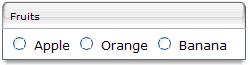 <radiogroup>
<radio label="Apple"/>
<radio label="Orange"/>
<radio label="Banana"/>
</radiogroup>
</groupbox>
<radiogroup>
<radio label="Apple"/>
<radio label="Orange"/>
<radio label="Banana"/>
</radiogroup>
</groupbox>
The contentStyle property is used to specify the CSS style for the content block of the groupbox. Thus, you can make a groupbox scrollable by specify overflow:auto (or overflow:scroll) as follows.
<groupbox mold="3d" width="150px" contentStyle="height:50px;overflow:auto">
<caption label="fruits"/>
<radiogroup onCheck="fruit.value = self.selectedItem.label" orient="vertical">
<radio label="Apple"/> 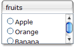 <radio label="Orange"/>
<radio label="Banana"/>
</radiogroup>
</groupbox>
<radio label="Orange"/>
<radio label="Banana"/>
</radiogroup>
</groupbox>
Note: The contentStyle property is ignored if the default mold is used.
The height specified in the contentStyle property means the height of the content block, excluding the caption. Thus, if the groupbox is dismissed (i.e., the content block is not visible), the height of the whole groupbox will be shrinked to contain only the caption. On the other hand, if you specify the height for the whole groupbox (by use of the height property), only the content block disappears and the whole height remains intact, when dismissing the groupbox.