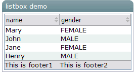
Components: listbox, listitem, listcell, listhead and listheader.
A list box is used to display a number of items in a list. The user may select an item from the list.

<window title="listbox demo" border="normal">
        <listbox id="box" width="250px">
            <listhead sizable="true">
                <listheader label="name" sort="auto"/>
                <listheader label="gender" sort="auto"/>
            </listhead>
            <listitem>
                <listcell label="Mary"/>
                <listcell label="FEMALE"/>
            </listitem>
            <listitem>
                <listcell label="John"/>
                <listcell label="MALE"/>
            </listitem>
            <listitem>
                <listcell label="Jane"/>
                <listcell label="FEMALE"/>
            </listitem>
            <listitem>
                <listcell label="Henry"/>
                <listcell label="MALE"/>
            </listitem>
            <listfoot >
                <listfooter><label value="This is footer1"/></listfooter>
                <listfooter><label value="This is footer2"/></listfooter>
            </listfoot>
                </listbox>
</window>
Listbox has two molds: default and select. If the select mold is used, the HTML's SELECT tag is generated instead.
|
Name |
Event Type |
|---|---|
|
|
|
|
Property |
Description |
Data Type |
Default Value |
|---|---|---|---|
|
|
|
|
|
|
|
|
|
|
|
|
Sets the page size, aka., the number rows per page. Note: Available only the paging mold |
|
|
|
|
|
| |
|
|
|
|
|
|
|
Sets the renderer which is used to render each |
|
|
|
|
the maximal length of each item's label. |
|
|
|
|
Is multiple selections are allowed. |
|
|
|
|
Is the check mark shall be displayed in front of each item. |
|
|
|
|
Is this |
|
|
|
|
To grow and shrink vertical to fit their given space, so called vertial flexibility. |
|
|
|
Name |
Description |
|---|---|
|
| |
|
|
Returns the index of the specified item, or -1 if not found. |
|
|
Clears the selection. |
|
|
Selects the given item, without deselecting any other items that are already selected.. |
|
|
Appends an item. |
|
|
Returns the item at the specified index. |
|
|
Returns the index of the selected item (-1 if no one is selected). |
|
|
Deselects all of the currently selected items and selects the item with the given index. |
|
|
Returns the number of items. |
|
|
Returns |
|
|
Returns |
|
| |
|
|
Returns the child paging controller that is created automatically, or null if mold is not "paging", or the controller is specified externally by setPaginal(org.zkoss.zul.ext.Paginal). |
|
|
Select all items. |
|
| |
|
|
Handles a private event, onInitRender. |
|
|
Called when the onPaging event is received (from getPaginal()). |
|
| |
|
|
Renders all |
|
| |
|
|
Renders the specified Row if not loaded yet, with getRowRenderer(). |
|
|
Renders a set of specified rows. |
|
|
Sets the tab order of this component. Currently, only the "select" mold supports this property. |
|
|
Returns the tab order of this component. Currently, only the "select" mold supports this property. Default: -1 (means the same as browser's default). |
|
|
Sets the renderer by use of a class name. |
|
|
If the specified item is selected, it is deselected. |