A label component represents a piece of text.
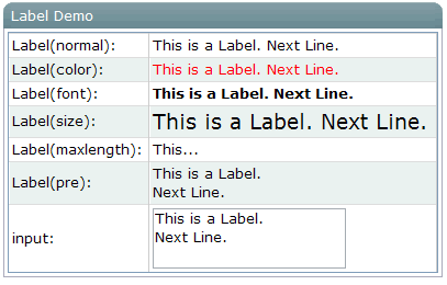
<window title="Label Demo" >
<grid>
<rows>
<row>Label(normal): <label id="lb1"/></row>
<row>Label(color): <label id="lb2" style="color:red"/></row>
<row>Label(font): <label id="lb3" style="font-weight:bold"/></row>
<row>Label(size): <label id="lb4" style="font-size:14pt"/></row>
<row>Label(maxlength): <label id="lb5" maxlength="5"/></row>
<row>Label(pre): <label id="lb6" pre="true"/></row>
<row>input:
<textbox id="txt" rows="2"><attribute name="onChange">
lb1.value=self.value;
lb2.value=self.value;
lb3.value=self.value;
lb4.value=self.value;
lb5.value=self.value;
lb6.value=self.value;
</attribute></textbox>
</row>
</rows>
</grid>
</window>
You can control how a label is displayed with the style, pre and maxlength Properties.
For example, if you specify pre to be true, all white spaces, such as new line, space and tab, are preserved.