组件: borderlayout, north,south,center,west,east
布局组件是嵌套组件。 父组件为borderlayout,子组件包括north,south,center,west,和east。borderlayout子组件的组合是任意的。例如,你想将某一区域分成三个区域(竖直的),则可以试试下面的组合,
<borderlayout height="500px">
   <east>
      The East
   </east>
   <center>
      The Center
   </center>
   <west>
      The West
   </west>
</borderlayout>
或者你可以将区域水平的分为三部分,如下,
<borderlayour height="500px">
   <north>
      The North
   </north>
   <center>
      The Center
   </center>
   <south>
      The South
   </south>
</borderlayour>
并且,你可以根据需求在这些区域内嵌入任何ZK组件。
此外,你可将布局组件嵌入到另一个布局组件中,以划分更多的区域,如下,
<borderlayout height="500px">
<north size="30%">
<borderlayout height="250px">
<west border="normal">
Inner West
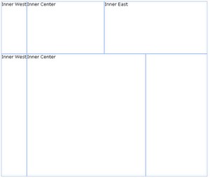 </west>
<center>
Inner Center
</center>
<east size="50%" border="normal">
Inner East
</east>
</borderlayout>
</north>
<center border="normal">
<borderlayout>
<west border="normal">
Inner West
</west>
<center border="normal">
Inner Center
</center>
<east size="30%" border="normal">
</east>
</borderlayout>
</center>
</borderlayout>
</west>
<center>
Inner Center
</center>
<east size="50%" border="normal">
Inner East
</east>
</borderlayout>
</north>
<center border="normal">
<borderlayout>
<west border="normal">
Inner West
</west>
<center border="normal">
Inner Center
</center>
<east size="30%" border="normal">
</east>
</borderlayout>
</center>
</borderlayout>
你可以为下列的自组件(north,south,east,west)指定size属性以决定其大小。但是,size属性的功能依赖于子组件的类型(竖直的或水平的)。对于水平组件(north, 和 south),size属性决定了它们的高度。而对于竖直组件, size属性决定了它们的宽度
border属性决定是否为这些布局组件设置边框,包括borderlayout的所有子组件。下面的表格指出了border属性的值。
|
值 |
描述 |
|---|---|
|
|
无边框 |
|
|
有边框 |
这里有一个例子。
<borderlayout height="500px"><north size="30%" border="normal"> The North </north> <east size="30%" border="normal"> The East </east> <center border="normal"> The Center </center> <west border="normal"> The West </west> <south border="normal"> The South </south> </borderlayout>
若你想使你的布局组件可拆分(splittable),则可以将splittable属性设置为true。
此外,若你想使一个组件可折叠(collapsible),则可以将collapsible属性设置为true。
<borderlayout height="500px"><north size="20%" splittable="true" collapsible="true"/> <east size="20%" splittable="true" collapsible="true"/> <center border="normal"/> <west size="20%" splittable="true" collapsible="true"/> <south size="30%" border="normal" splittable="true" collapsible="true"/> </borderlayout>