This lesson teaches you to:
Now that we have a solid understanding of navigation patterns and screen grouping techniques, it's time to apply them to our screens. Let's take another look at our exhaustive screen map for the example news application from the first lesson, below.
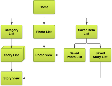
Figure 1. Exhaustive screen map for the example news application.
Our next step is to choose and apply navigation patterns discussed in the previous lessons to this screen map, maximizing navigation speed and minimizing the number of touches to access data, while keeping the interface intuitive and consistent with Android best practices. We also need to make different choices for our different target device form factors. For simplicity, let's focus on tablets and handsets.
Choose Patterns
First, our second-level screens (Story Category List, Photo List, and Saved Item List) can be grouped together using tabs. Note that we don't necessarily have to use horizontally arranged tabs; in some cases a drop-down list UI element can serve as a suitable replacement, especially on devices with narrow screens such as handsets. We can also group the Saved Photo List and Saved Story List screens together using tabs on handsets, or use multiple vertical content panes on tablets.
Finally, let's look at how we present news stories. The first option to simplify navigation across different story categories is to use horizontal paging, with a set of labels above the horizontal swiping surface, indicating the currently visible and adjacently accessible categories. On tablets in the landscape orientation, we can go a step further and present the horizontally-pageable Story List screen as a left pane, and the Story View screen as the primary content pane on the right.
Below are diagrams representing the new screen maps for handsets and tablets after applying these navigation patterns.
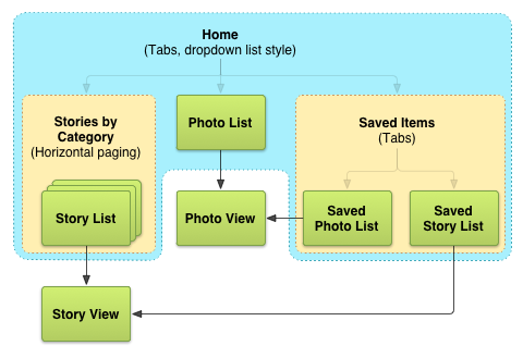
Figure 2. Final screen map for the example news application on handsets.
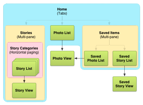
Figure 3. Final screen map for the example news application on tablets, in landscape.
At this point, it's a good idea to think of screen map variations, in case your chosen patterns don't apply well in practice (when you sketch the application's screen layouts). Below is an example screen map variation for tablets that presents story lists for different categories side-by-side, with story view screens remaining independent.
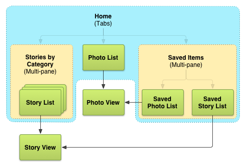
Figure 4. Example alternate screen map for tablets, in landscape.
Sketch and Wireframe
Wireframing is the step in the design process where you begin to lay out your screens. Get creative and begin imagining how to arrange UI elements to allow users to navigate your app. Keep in mind that at this point, pixel-perfect precision (creating high-fidelity mockups) is not important.
The easiest and fastest way to get started is to sketch out your screens by hand using paper and pencils. Once you begin sketching, you may uncover practicality issues in your original screen map or decisions on which patterns to use. In some cases, patterns may apply well to a given design problem in theory, but in practice they may break down and cause visual clutter or interactional issues (for example, if there are two rows of tabs on the screen). If that happens, explore other navigation patterns, or variations on chosen patterns, to arrive at a more optimal set of sketches.
After you're satisfied with initial sketches, it's a good idea to move on to digital wireframing using software such as Adobe® Illustrator, Adobe® Fireworks, OmniGraffle, or any other vector illustration tools. When choosing which tool to use, consider the following features:
- Are interactive wireframes possible? Tools such as Adobe® Fireworks offer this functionality.
- Is there screen 'master' functionality, allowing re-use of visual elements across different screens? For example, Action Bars should be visible on almost every screen in your application.
- What's the learning curve? Professional vector illustration tools may have a steep learning curve, while tools designed for wireframing may offer a smaller set of features that are more relevant to the task.
Lastly, the XML Layout Editor that comes with the Android Development Tools (ADT) plugin for Eclipse can often be used for prototyping. However, you should be careful to focus more on the high-level layout and less on visual design details at this point.
Create Digital Wireframes
After sketching out layouts on paper and choosing a digital wireframing tool that works for you, you can create the digital wireframes that will serve as the starting point for your application's visual design. Below are example wireframes for our news application, corresponding one-to-one with our screen maps from earlier in this lesson.

Figure 5. Example news application wireframes, for handsets in portrait. (Download SVG)

Figure 6. Example news application wireframes, for tablets in landscape. Also includes an alternate layout for presenting story lists. (Download SVG)
(Download SVG for device wireframe art)
Next Steps
Now that you've designed effective and intuitive intra-app navigation for your application, you can begin to spend time refining the user interface for each individual screen. For example, you can choose to use richer widgets in place of simple text labels, images, and buttons when displaying interactive content. You can also begin defining the visual styling of your application, incorporating elements from your brand's visual language in the process.
Lastly, it may be time to begin implementing your designs and writing the code for the application using the Android SDK. To get started, take a look at the following resources:
- Developer's Guide: User Interface: learn how to implement your user interface designs using the Android SDK.
- Action Bar: implement tabs, up navigation, on-screen actions, etc.
- Fragments: implement re-usable, multi-pane layouts
- Support Library: implement horizontal paging (swipe views) using
ViewPager