These design principles were developed by and for the Android User Experience Team to keep users' best interests in mind. For Android developers and designers, they continue to underlie the more detailed design guidelines for different types of devices.
Consider these principles as you apply your own creativity and design thinking. Deviate with purpose.
Enchant Me
Delight me in surprising ways
A beautiful surface, a carefully-placed animation, or a well-timed sound effect is a joy to experience. Subtle effects contribute to a feeling of effortlessness and a sense that a powerful force is at hand.

Real objects are more fun than buttons and menus
Allow people to directly touch and manipulate objects in your app. It reduces the cognitive effort needed to perform a task while making it more emotionally satisfying.
Let me make it mine
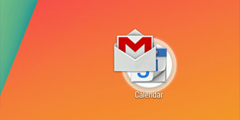
People love to add personal touches because it helps them feel at home and in control. Provide sensible, beautiful defaults, but also consider fun, optional customizations that don't hinder primary tasks.

Get to know me
Learn peoples' preferences over time. Rather than asking them to make the same choices over and over, place previous choices within easy reach.

Simplify My Life
Keep it brief
Use short phrases with simple words. People are likely to skip sentences if they're long.

Pictures are faster than words
Consider using pictures to explain ideas. They get people's attention and can be much more efficient than words.

Decide for me but let me have the final say
Take your best guess and act rather than asking first. Too many choices and decisions make people unhappy. Just in case you get it wrong, allow for 'undo'.
Only show what I need when I need it
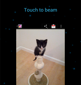
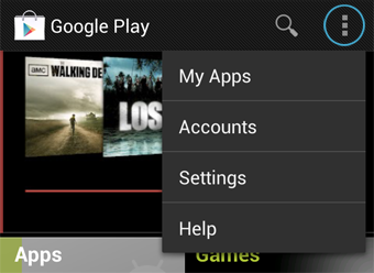
People get overwhelmed when they see too much at once. Break tasks and information into small, digestible chunks. Hide options that aren't essential at the moment, and teach people as they go.
I should always know where I am
Give people confidence that they know their way around. Make places in your app look distinct and use transitions to show relationships among screens. Provide feedback on tasks in progress.
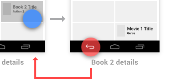
Never lose my stuff
Save what people took time to create and let them access it from anywhere. Remember settings, personal touches, and creations across phones, tablets, and computers. It makes upgrading the easiest thing in the world.
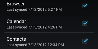
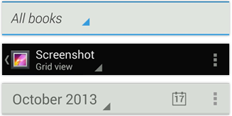
If it looks the same, it should act the same
Help people discern functional differences by making them visually distinct rather than subtle. Avoid modes, which are places that look similar but act differently on the same input.
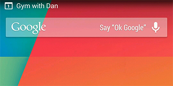
Only interrupt me if it's important
Like a good personal assistant, shield people from unimportant minutiae. People want to stay focused, and unless it's critical and time-sensitive, an interruption can be taxing and frustrating.
Make Me Amazing
Give me tricks that work everywhere
People feel great when they figure things out for themselves. Make your app easier to learn by leveraging visual patterns and muscle memory from other Android apps. For example, the swipe gesture may be a good navigational shortcut.
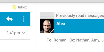
It's not my fault
Be gentle in how you prompt people to make corrections. They want to feel smart when they use your app. If something goes wrong, give clear recovery instructions but spare them the technical details. If you can fix it behind the scenes, even better.
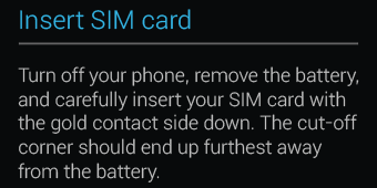
Sprinkle encouragement
Break complex tasks into smaller steps that can be easily accomplished. Give feedback on actions, even if it's just a subtle glow.
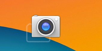
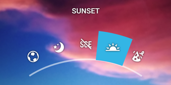
Do the heavy lifting for me
Make novices feel like experts by enabling them to do things they never thought they could. For example, shortcuts that combine multiple photo effects can make amateur photographs look amazing in only a few steps.
Make important things fast
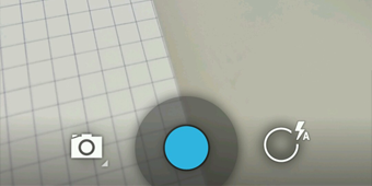
Not all actions are equal. Decide what's most important in your app and make it easy to find and fast to use, like the shutter button in a camera, or the pause button in a music player.
