As a developer of apps for TV, you should follow certain patterns to enable users to quickly understand and operate your app. This section describes recommended design patterns for TV apps.
Navigation, Focus and Selection
Users typically navigate TV devices using a directional pad (D-Pad). This type of controller limits movement to up, down, left, and right. As you design your app for TV, make sure your user interface has clear paths for two-axis navigation by aligning objects in lists and grids.
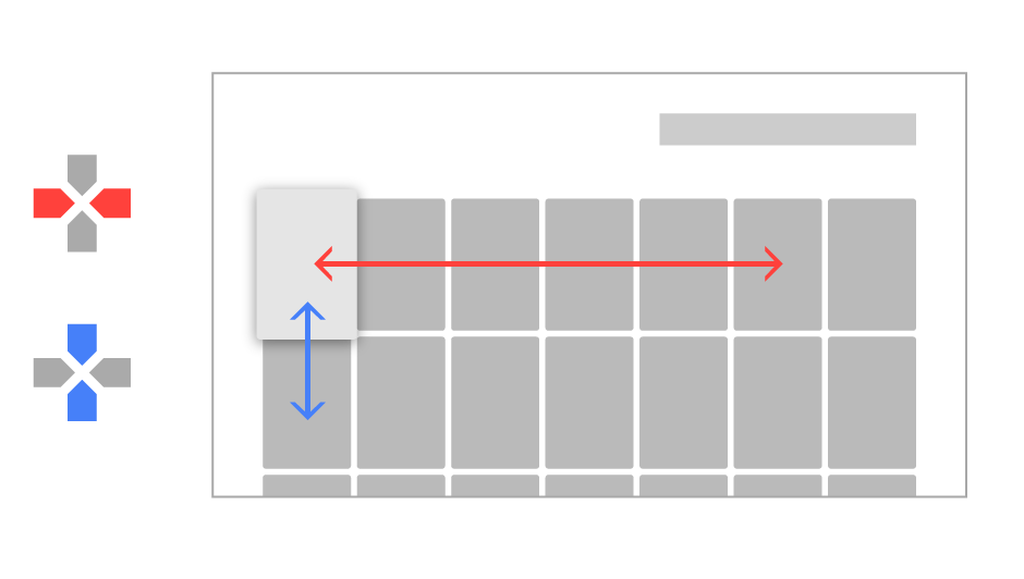
A key aspect of making your application work well with a D-Pad controller is to make sure that there is always an object that is obviously in focus. Your app must clearly indicate what object is focused, so users can easily see what action they can take. Use scale, shadow brightness, opacity, animation or a combination of these attributes to help users see a focused object.
Icons
Apps on TV devices require some additional icon images for presentation in the system user interface, including home screen launcher images (banners) and recommendation icons. The visual specifications for these icons are shown below.
Banners
App Banners represent your app on the home screen of TV devices and serve and as a way for users to launch your app. Here are specific requirements for a banner image:
- Size: 320 x 180 px, xhdpi resource
- Text should be included in the image. If your app is available in more than one language, you must provide versions of the banner image for each supported language.
Recommendation Icons
Recommendation cards include a small icon that is imposed over a colored background. An example and specifications for this icon are shown below:
Here are the requirements for recommendation icons:
- Monocolor: size 16x16dp, white (#fff) icon with transparent background, PNG format
- Graphics should be centered within the icon image
Note: Your app icon image may be desaturated and blended for some card displays.
Background Images
Background images are displayed in the background of your app to provide additional visual interest, information, or branding. The user interface widgets provided in the v17 leanback support library provide specific support for background images and for updating them as items gain and lose focus. The specific requirements for background images on TV devices is that they should be full color and a size of 1920 x 1080 pixels.
Important: Background images must not be transparent. Your must not allow any portion of another app to be seen through your app.
Note: If you background image does not meet the size requirements, it is scaled to fit.
Audio Feedback
Sounds on Android TV bring a cinematic quality to the interaction experience. You should consider adding sounds for user actions or to provide feedback when a user is only partially visually engaged with the screen (e.g., because they are distracted or multitasking). You should also consider using sounds as alternatives to visual messages. For example, use sounds to indicate that a user has reached the end of a list or is trying to navigate to an undefined location.