In this document
The new material theme provides:
- System widgets that let you set their color palette
- Touch feedback animations for the system widgets
- Activity transition animations
You can customize the look of the material theme according to your brand identity with a color palette you control. You can tint the action bar and the status bar using theme attributes, as shown in Figure 1.
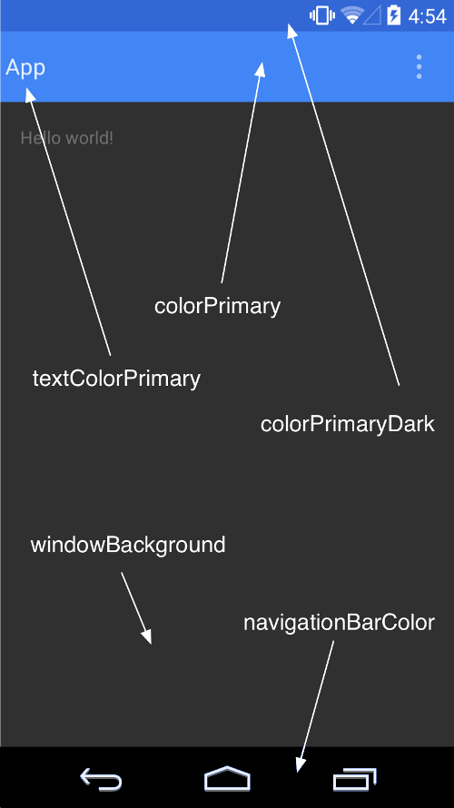
Figure 1. Customizing the material theme.
The system widgets have a new design and touch feedback animations. You can customize the color palette, the touch feedback animations, and the activity transitions for your app.
The material theme is defined as:
@android:style/Theme.Material(dark version)@android:style/Theme.Material.Light(light version)@android:style/Theme.Material.Light.DarkActionBar
For a list of material styles that you can use, see the API reference for
android.R.style.
Note: The material theme is only available in the Android L Developer Preview. For more information, see Compatibility.
Customize the Color Palette
To customize the theme's base colors to fit your brand, define your custom colors using theme attributes when you inherit from the material theme:
<resources>
  <!-- inherit from the material theme -->
  <style name="AppTheme" parent="android:Theme.Material">
    <!-- Main theme colors -->
    <!--   your app's branding color (for the app bar) -->
    <item name="android:colorPrimary">@color/primary</item>
    <!--   darker variant of colorPrimary (for status bar, contextual app bars) -->
    <item name="android:colorPrimaryDark">@color/primary_dark</item>
    <!--   theme UI controls like checkboxes and text fields -->
    <item name="android:colorAccent">@color/accent</item>
  </style>
</resources>
Customize the Status and Navigation Bar
The material theme lets you easily customize the status bar, so you can specify a
color that fits your brand and provides enough contrast to show the white status icons. To
set a custom color for the status bar, use the android:statusBarColor attribute when
you extend the material theme. By default, android:statusBarColor inherits the
value of android:colorPrimaryDark.
To handle the color of the status bar yourself (for example, by adding a gradient in the
background), set the android:statusBarColor attribute to
@android:color/transparent and adjust the window flags as required. You can
also use the Window.setStatusBarColor method for animations or fading.
Note: The status bar should almost always have a clear delineation from the primary toolbar, except for full-bleed imagery cases and when you use a gradient as a protection.
When customizing the navigation and status bars, make them both transparent or modify only the status bar. The navigation bar should remain black in all other cases.
Theme Individual Views
Elements in XML layout definitions can specify the android:theme attribute,
which references a theme resource. This attribute modifies the theme for the element and any
elements inflated below it, which is useful to alter theme color palettes in a specific portion
of an interface.