Design for Notifications
The notification system allows users to keep informed about relevant and timely
events in your app, such as new chat messages from a friend or a calendar event.
Think of notifications as a news channel that alerts the user to important events as
they happen or a log that chronicles events while the user is not paying attention -
and one that is synced as appropriate across all their Android devices.
New in L
In L, notifications receive an important structural visual and functional update:
- Visual changes to notifications as part of material design
- Notifications are now available on the device lockscreen, yet sensitive content can still
be hidden behind it
- A new presentation format called Heads-up for receiving high priority notifications while
using the device
- Cloud-synced notifications - act on a notification on your Android tablet and it is also
dismissed on your phone.
- And starting now (in Android 4.4W, API Level 20, the platform release for Android Wear),
your notifications will bridge to Android Wear devices. You can extend the functionality of
notifications on Wear in two different ways. First, you can add speech input and canned responses
to Actions on Wear, allowing users to complete tasks from their wrists. Second, you can write
Wear apps that hook into your notifications to go even further in terms of creating interactive
experiences for users.
Anatomy of a notification
This section goes over basic parts of a notification and how they can
appear on different types of devices.
Base Layout
At a minimum, all notifications consist of a base layout, including:
- The notification's icon, symbolizing the originating app, and also
potentially the kind of notification if the app has several substantially different sorts of
notifications it can post
- A notification title and additional text
- A timestamp
Notifications created with Notification.Builder for versions of Android earlier
than L will look and work the same in L, with only minor stylistic changes that the system handles
for you.
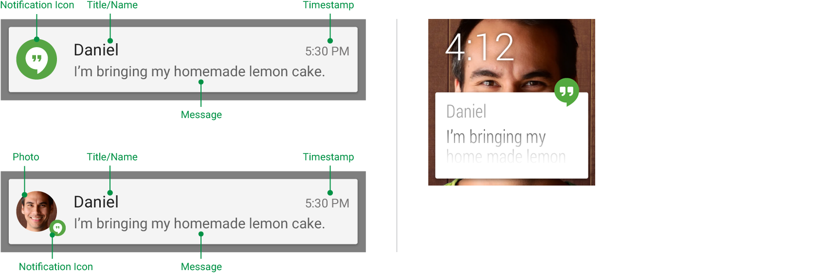
Base layout of a handheld notification and the same notification on Wear,
with a user photo and a notification icon
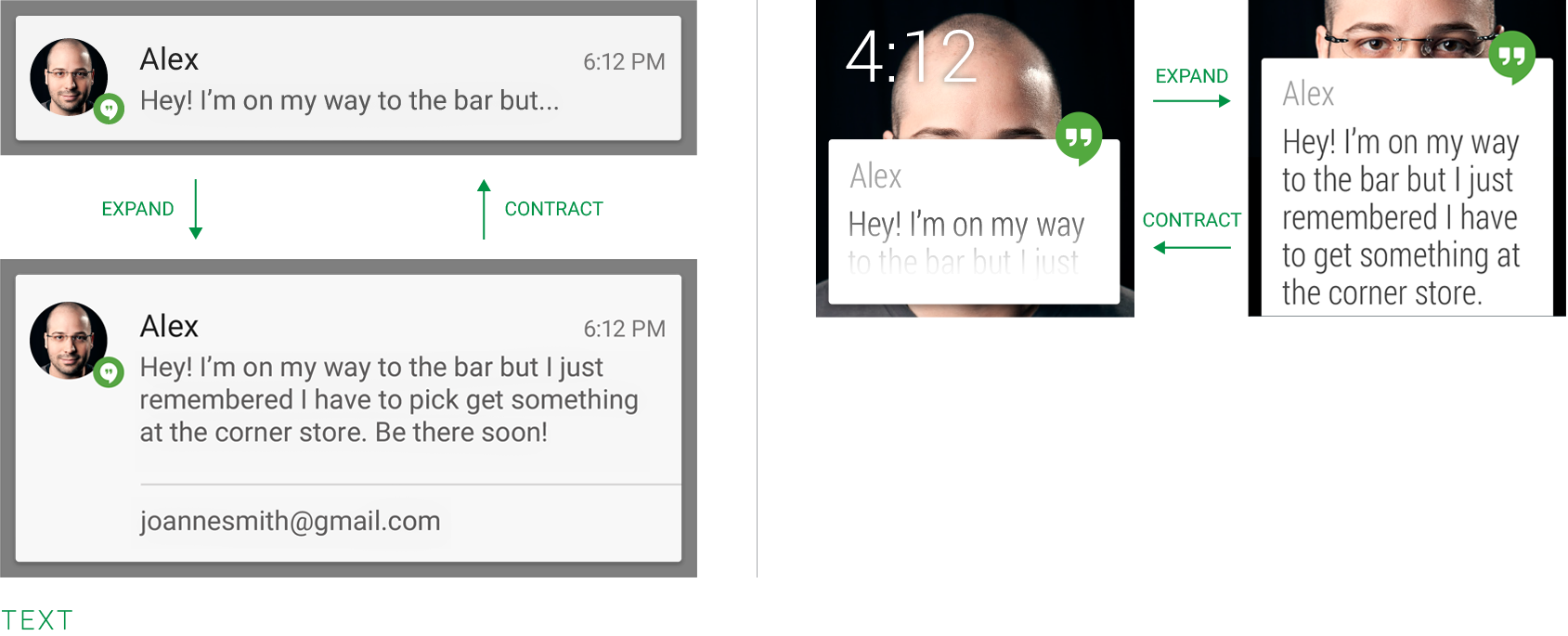
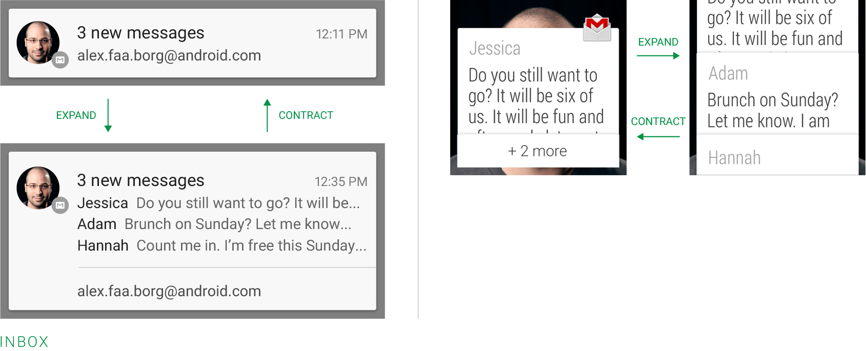
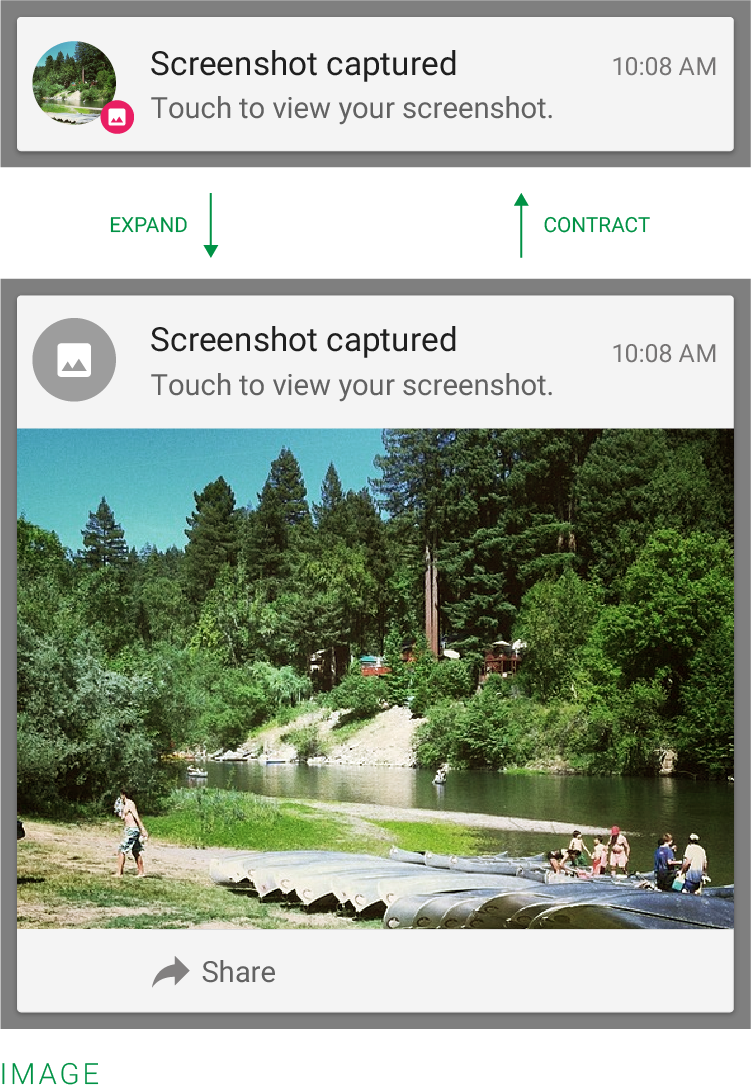
Expanded layouts
You have the option to provide more details on notifications. You can use this to show the first
few lines of a message or show a larger image preview. This provides the user with additional
context, and - in some cases - may allow the user to read a message in its entirety. The user can
pinch-zoom or perform a single-finger glide in order to toggle between compact and expanded layouts.
For single event notifications, Android provides three expanded layout templates (text, inbox, and
image) for you to re-use in your application. The following images show you how they look on
handhelds and wearables.
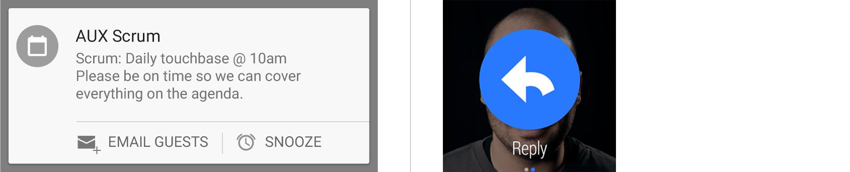
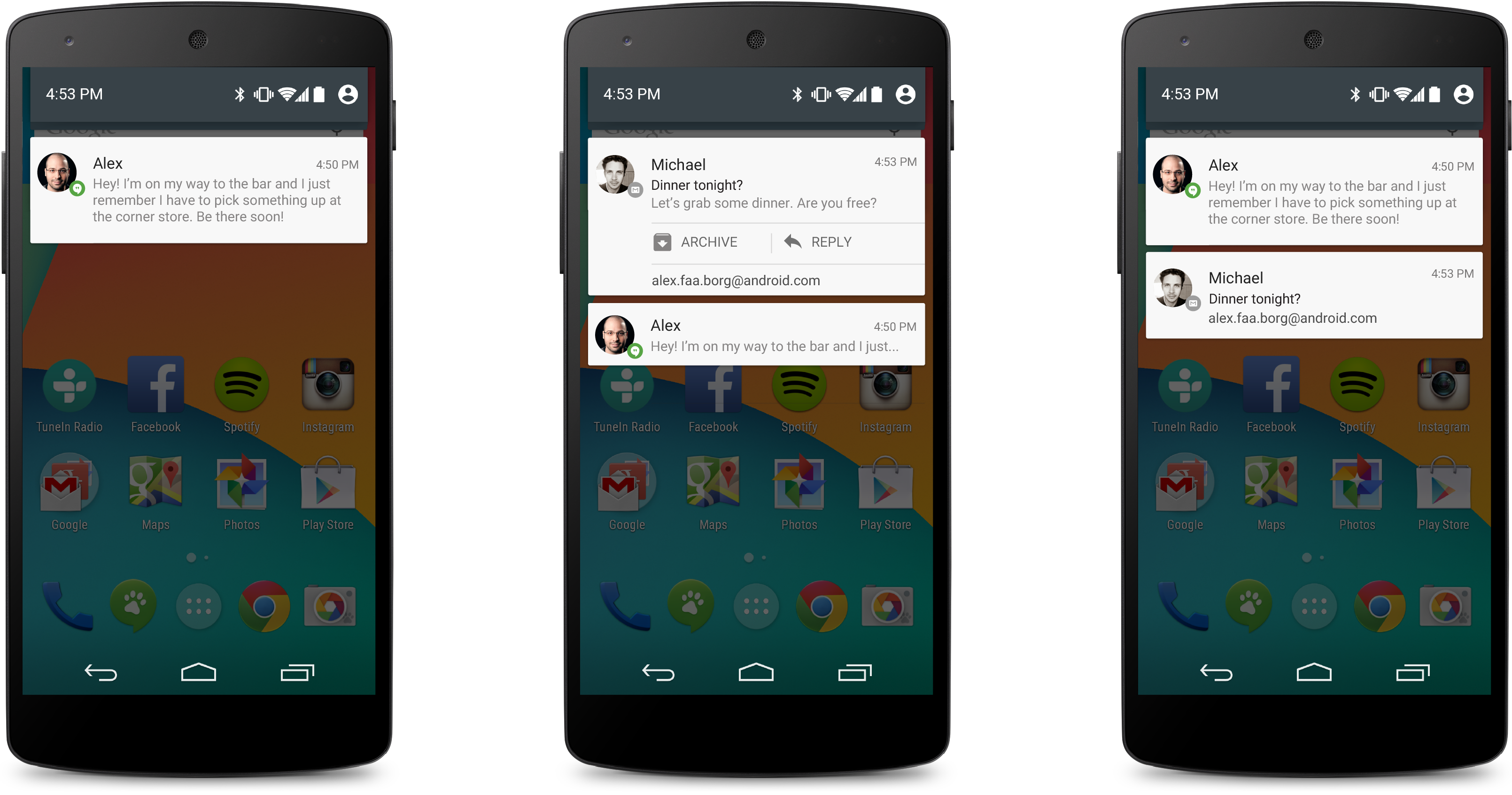
Actions
Android has supported optional actions that are displayed at the bottom of the notification, as
far back as Jelly Bean. With actions, users can handle the most common tasks for a particular
notification from within the notification shade without having to open the originating application.
This speeds up interaction and, in conjunction with "swipe-to-dismiss", helps users to streamline
their notification triaging experience.
Be judicious with how many actions you include with a notification. The more
actions you include, the more cognitive complexity you create. Limit yourself to the fewest number
of actions possible by only including the most imminently important and meaningful ones.
Good candidates for actions on notifications are actions that:
- Are essential, frequent and typical for the content type you're displaying
- Allow the user to accomplish tasks quickly
Avoid actions that are:
- Ambiguous
- Duplicative of the default action of the notification (such as "Read" or "Open")
You can specify a maximum of three actions, each consisting of an action icon and an action name.
Adding actions to a simple base layout will make the notification expandable, even if the
notification doesn't have an expanded layout. Since actions are only shown for expanded
notifications and are otherwise hidden, you must make sure that any action a user can invoke from
a notification is available from within the associated application as well.
Notifications on Android Wear
Additionally, notifications and their actions are bridged over to Wear devices by default.
Developers have control to control which notifications from bridging from the phone to the watch
and vice versa. And developers can control which actions bridge as well. If your app includes
actions that can't be accomplished with a single tap, either hide these actions on your Wear
notification or consider hooking them up to a Wear app to allow the user to finish the action on
their watch.
Bridging notifications
Notifications that should be bridged
Don't bridge
- If a podcasting app has new episodes available for download,
keep this notification on the phone.
Bridging actions
Actions to bridge
- Single tap actions such as +1, Like, Heart
Actions not to bridge
- Actions that map to features that aren't possible on the watch
Unique actions to define for Wear
- Quick lists of canned responses such as "Be right back"
- Open on phone
- A "Comment" or "Reply" action that brings up the speech input screen
- Actions that can launch Wear-specific apps
Heads-up Notification
When notifications with priority set to High (see right) arrives, it is presented to users for a
short period of time on the device with an expanded layout with its actions exposed.
After this period of time, it retreats back to the Notification shade. If a notification is
flagged as High or Max or a full-screen takeover, it gets a HUN in L.
Good examples of Heads-up notifications
- Incoming phone call when using device
- Alarm when using device
- New SMS message
- Low battery
Guidelines
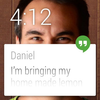
Make it personal
For notifications of items sent by another person (such as a message or status update), include
that person's image using setLargeIcon. Also attach information about the person to the
notification's metadata (see EXTRA_PEOPLE).
Your notification's main icon will still be shown, so the user can associate it with the icon
visible in the status bar.
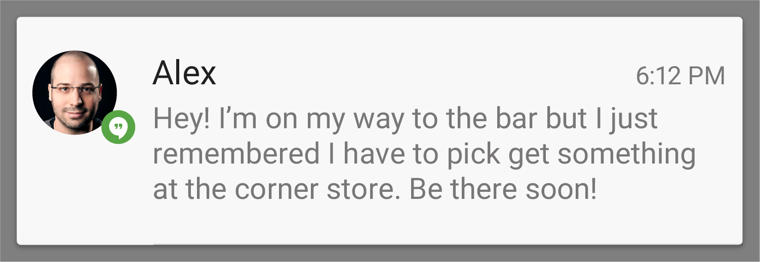
Notification that shows the person who triggered it and the content they are sending you
Navigate to the right place
When the user touches the body of a notification (outside of the action buttons), open your app
to the place where the user can view and act upon the data referenced in the notification. In most
cases this will be the detail view of a single data item such as a message, but it might also be a
summary view if the notification is stacked (see Stacked notifications below) and
references multiple items. If in any of those cases the user is taken to a hierarchy level below
your app's top-level, insert navigation into your app's back stack to allow them to navigate to
your app's top level using the system back button. For more information, see the chapter on
System-to-app navigation in the Navigation
design pattern.
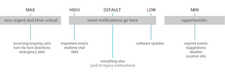
Correctly set and manage notification
priority
Starting with Jelly Bean, Android supported a priority flag for notifications. It allows you to
influence where your notification will appear in comparison to other notifications and help to make
sure that users always see their most important notifications first. You can choose from the
following priority levels when posting a notification:
|
Priority
|
Use
|
|
MAX
|
Use for critical and urgent notifications that alert the user to a condition that is
time-critical or needs to be resolved before they can continue with a particular task.
|
|
HIGH
|
Use high priority notifications primarily for important communication, such as message or chat
events with content that is particularly interesting for the user. High priority notifications will get the Heads-Up Notification display starting in L.
|
|
DEFAULT
|
The default priority. Keep all notifications that don't fall into any of the other categories at
this priority level.
|
|
LOW
|
Use for notifications that you still want the user to be informed about, but that rate low in
urgency. LOW notifications will tend to show up at the bottom of the list, which makes them a good
choice for things like pubic/undirected social updates: the user has asked to be notified about
them, but they should never take precedence over urgent or direct communication.
|
|
MIN
|
Contextual/background information (e.g. weather information, contextual location information).
Minimum priority notifications will not show in the status bar. The user will only discover them
when they expand the notification shade.
|
How to choose an appropriate
priority
Default, High, and Max priority are interruptive priority levels and risk interrupting the user
from what they are doing. This should not be taken lightly, so these levels should be reserved
for notifications that:
- Involve another person
- Are time-sensitive
- Might immediately change the user's behavior in the real world
Notifications set to LOW and MIN can still be very valuable for the
user. Many if not most notifications just don't need to command the user's immediate attention, or
vibrate the user's wrist, yet contain information that they will find valuable when they choose to
look for notifications. Criteria for LOW and MIN priority notifications:
- Don't involve other people
- Aren't time sensitive
- Is content the user might be interested in but could choose to browse at their leisure
Set a notification category
If your notification falls into one of the predefined categories (see below), assign it
accordingly. Aspects of the system UI such as the notification shade (or any other notification
listener) may use this information to make ranking and filtering decisions.
|
Notification.CATEGORY_CALL
|
Incoming call (voice or video) or similar synchronous communication request
|
|
Notification.CATEGORY_MESSAGE
|
Incoming direct message (SMS, instant message, etc.)
|
|
Notification.CATEGORY_EMAIL
|
Asynchronous bulk message (email)
|
|
Notification.CATEGORY_EVENT
|
Calendar event
|
|
Notification.CATEGORY_PROMO
|
Promotion or advertisement
|
|
Notification.CATEGORY_ALARM
|
Alarm or timer
|
|
Notification.CATEGORY_PROGRESS
|
Progress of a long-running background operation
|
|
Notification.CATEGORY_SOCIAL
|
Social network or sharing update
|
|
Notification.CATEGORY_ERROR
|
Error in background operation or authentication status
|
|
Notification.CATEGORY_TRANSPORT
|
Media transport control for playback
|
|
Notification.CATEGORY_SYSTEM
|
System or device status update. Reserved for system use.
|
|
Notification.CATEGORY_SERVICE
|
Indication of running background service
|
|
Notification.CATEGORY_RECOMMENDATION
|
A specific, timely recommendation for a single thing. For example, a news app might want to
recommend a news story it believes the user will want to read next.
|
|
Notification.CATEGORY_STATUS
|
Ongoing information about device or contextual status
|
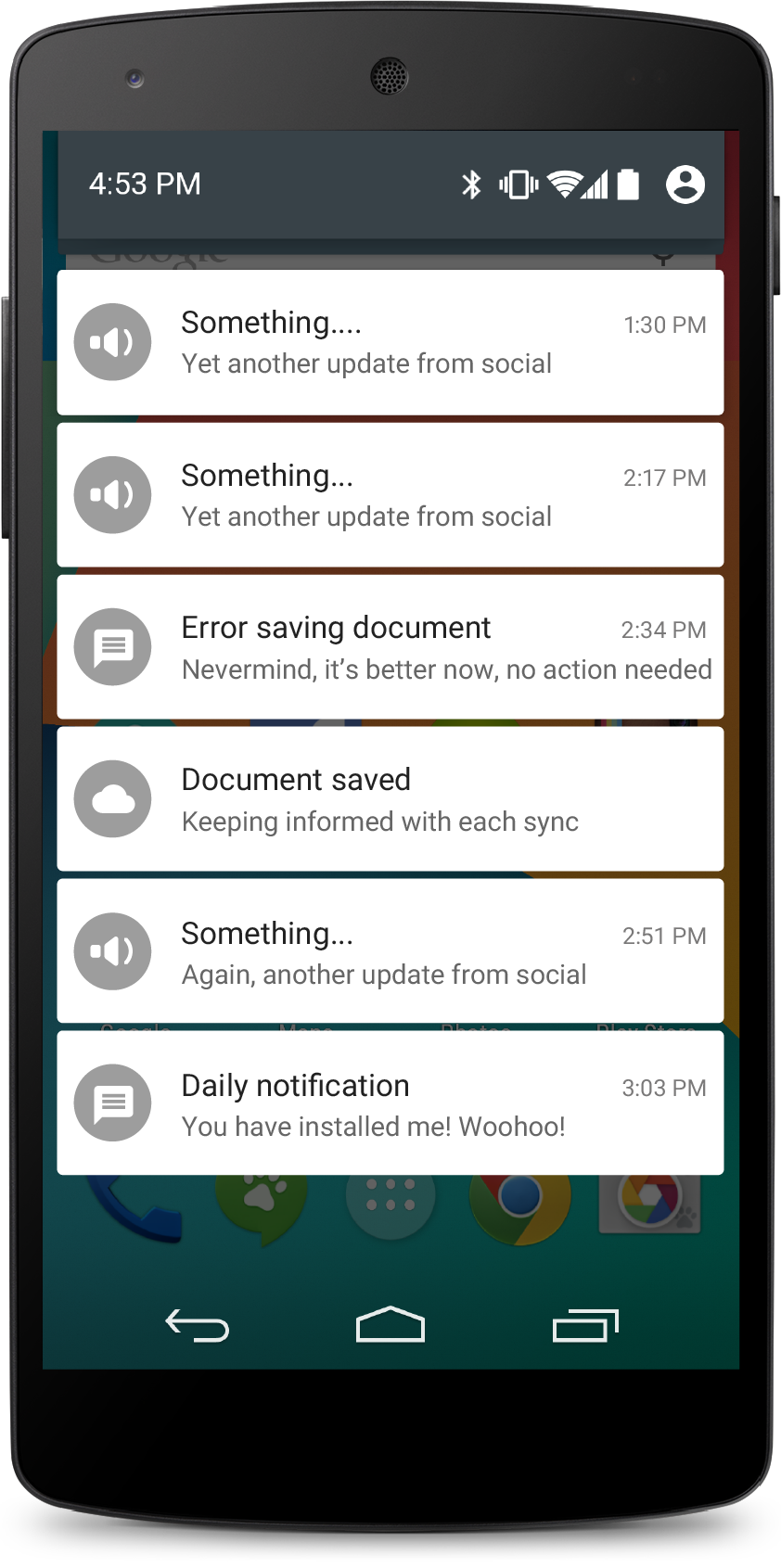
Summarize your notifications
If your app creates a notification while another of the same type is still pending, avoid
creating an altogether new notification object. Instead, turn it into a summary notification for
the app.
A summary notification builds a summary description and allows the user to understand how many
notifications of a particular kind are pending.
Don't
Do
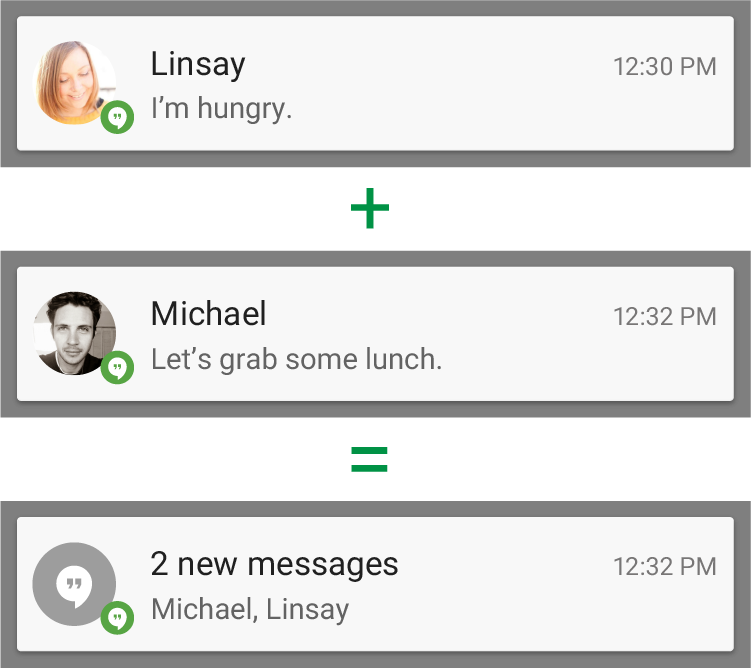
You can provide more detail about the individual notifications that make up a
summary by using the expanded digest layout. This allows users to gain a better sense of which
notifications are pending and if they are interesting enough to be read in detail within the
associated app.
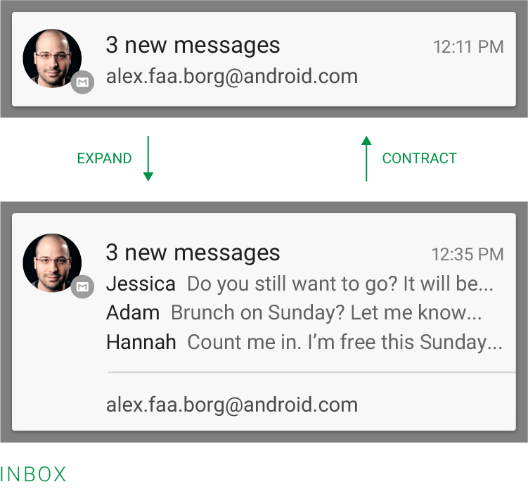
Expanded and contracted notification that is a summary (using InboxStyle)
Make notifications optional
Users should always be in control of notifications. Allow the user to disable your app's
notifications or change their alert properties, such as alert sound and whether to use vibration,
by adding a notification settings item to your application settings.
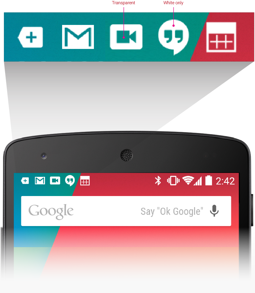
Use distinct icons
By glancing at the notification area, the user should be able to discern what kinds of
notifications are currently pending.
Do
Look at the notification icons Android apps already provide and create notification icons for
your app that are sufficiently distinct in appearance.
Do
Use the proper notification icon
style for small icons, and the Material Light
action bar icon style for your action
icons. Do not place any additional alpha (dimming or fading) into your small icons and action
icons; they can have anti-aliased edges, but because L uses these icons as masks (that is, only
the alpha channel is used), the image should generally be drawn at full opacity.
Do
Keep your icons visually simple and avoid excessive detail that is hard to discern.
Don't
Use color to distinguish your app from others. Notification icons should only be a white-on-transparent background image.
Pulse the notification LED appropriately
Many Android devices contain a notification LED, which is used to keep the user informed about
events while the screen is off. Notifications with a priority level of MAX, HIGH, or DEFAULT should
cause the LED to glow, while those with lower priority (LOW and MIN) should not.
The user's control over notifications should extend to the LED. When you use DEFAULT_LIGHTS, the
LED will glow with a white color. Your notifications shouldn't use a different color unless the
user has explicitly customized it.
Building notifications that users care about
To create an app that users love, it is important to design your notifications carefully.
Notifications embody your app's voice, and contribute to your app's personality. Unwanted or
unimportant notifications can annoy the user or make them resent how much attention the app wants
from them, so use notifications judiciously.
When to display a notification
To create an application that people enjoy using, it's important to recognize that the user's
attention and focus is a resource that must be protected. While Android's notification system has
been designed to minimize the impact of notifications on the user's attention, it is nonetheless
still important to be aware of the fact that notifications are interrupting the user's task flow.
As you plan your notifications, ask yourself if they are important enough to warrant an interruption. If you are unsure, allow the user to opt into a notification using your apps notification settings or adjust
the notifications priority flag to LOW or MIN to avoid distracting the user while they are doing
something else.
Time sensitive notification examples
While well behaved apps generally only speak when spoken to, there are some limited cases where an app actually should interrupt the user with an unprompted notification.
Notifications should be used primarily for time sensitive events, and especially
if these synchronous events involve other people. For instance, an incoming chat
is a real time and synchronous form of communication: there is another user actively waiting on you
to respond. Calendar events are another good example of when to use a notification and grab the
user's attention, because the event is imminent, and calendar events often involve other people.
When not to display a notification
There are however many other cases where notifications should not be used:
- Avoid notifying the user of information that is not directed specifically at them, or
information that is not truly time sensitive. For instance the asynchronous and undirected updates
flowing through a social network generally do not warrant a real time interruption. For the users
that do care about them, allow them to opt-in.
- Don't create a notification if the relevant new information is currently on screen. Instead,
use the UI of the application itself to notify the user of new information directly in context.
For instance, a chat application should not create system notifications while the user is actively chatting with another user.
- Don't interrupt the user for low level technical operations, like saving or syncing information, or updating an application, if it is possible for the system to simply take care of itself without involving the user.
- Don't interrupt the user to inform them of an error if it is possible for the application to recover from the error on its own without the user taking any action.
- Don't create notifications that have no true notification content and merely advertise your
app. A notification should provide useful, timely, new information and should not be used to
merely launch an app.
- Don't create superfluous notifications just to get your brand in front of users.
Such notifications will only frustrate and likely alienate your audience. The best way to provide
the user with a small amount of updated information and to keep them engaged with your
application is to develop a widget that they can choose to place on their home screen.
Interacting With Notifications
Notifications are indicated by icons in the status bar and can be accessed by opening the
notification drawer.
Touching a notification opens the associated app to detailed content matching the notification.
Swiping left or right on a notification removes it from the list.
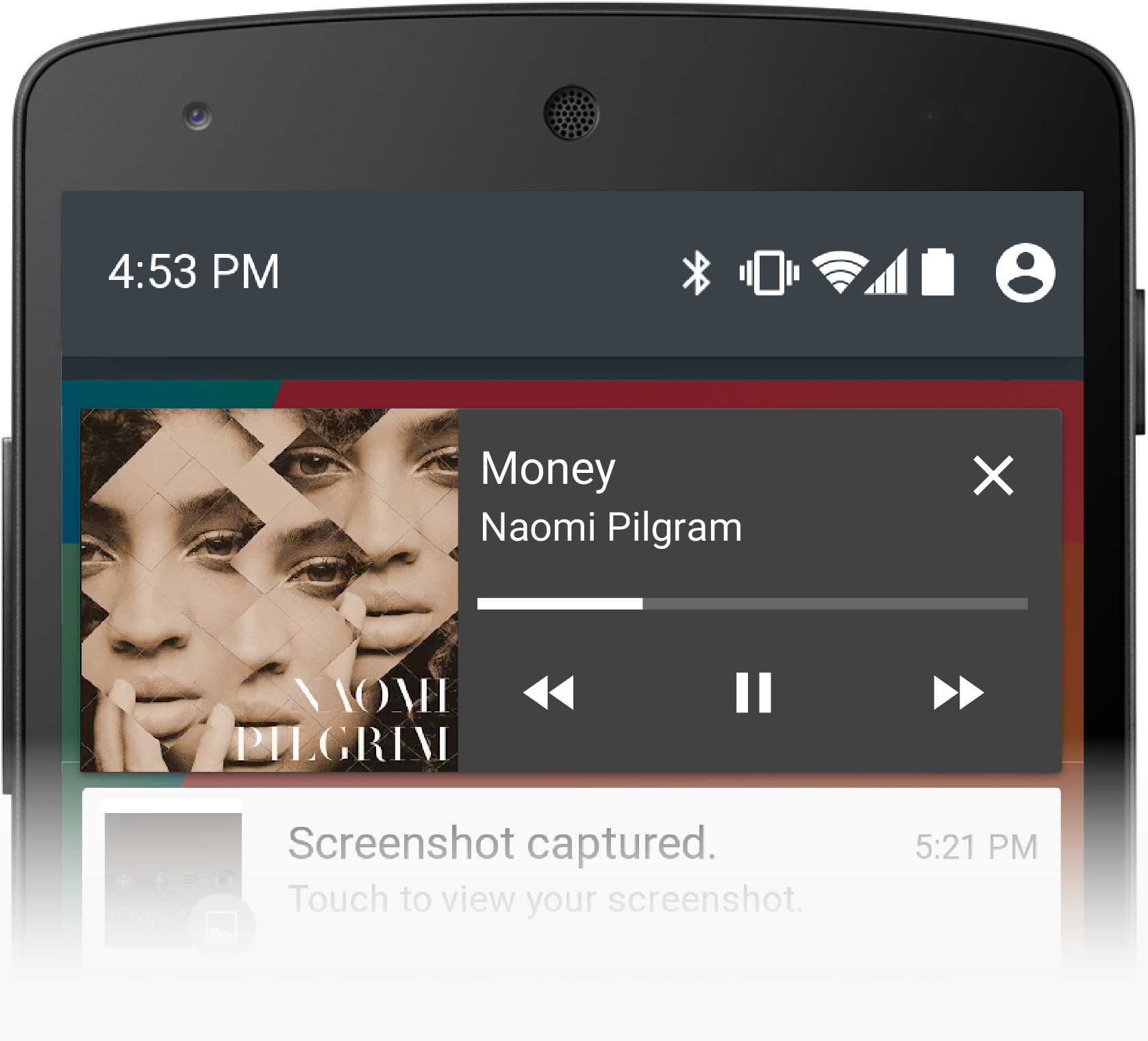
Ongoing notifications
Ongoing notifications keep users informed about an ongoing process in the background.
For example, music players announce the currently playing track in the notification system and
continue to do so until the user stops the playback. They can also be used to show the user
feedback for longer tasks like downloading a file, or encoding a video. Ongoing notifications
cannot be manually removed from the notification drawer.
The L lockscreen doesn't show transport controls for RCC (RemoteControlClient)s anymore. But the
lockscreen does show notifications, so each app's playback notification is now the primary
way for users to control playback from a locked state. This gives apps more control over which
buttons to show and in what way, while providing a consistent experience for the user whether on
the lockscreen or unlocked.
Dialogs
and toasts are for feedback not notifications
Your app should not create a dialog or toast if it is not currently on screen. Dialogs and Toasts
should only be displayed as the immediate response to the user taking an action inside of your app.
For further guidance on the use of dialogs and toasts, refer to
Confirming & Acknowledging.
Ranking and Ordering
Notifications are "news" and so they are essentially shown in reverse-chronological order, with
special consideration given to the app's stated notification priority.
In L, notifications are now a key part of the lockscreen, and are featured prominently every
time the device display comes on. Because space on the lockscreen is tight, it is more important
than ever to identify the most urgent or relevant notifications.
Therefore, L has a more sophisticated sorting algorithm for notifications, taking into account:
- The timestamp and application's stated priority, as before.
- Whether the notification has recently disturbed the user with sound or vibration. (That is,
if the phone just made noise, and the user wants to know "what just happened?" the lockscreen
should answer that at a glance.)
- Any people that are attached to the notification using
EXTRA_PEOPLE, and in
particular whether those are starred contacts.
To best take advantage of this sorting, developers should focus on the user experience they want
to create rather than aiming for any particular spot on the list.
Gmail notifications are default priority, so they
normally sort below messages from an instant messaging app like Hangouts, but Gmail will get a
temporary bump when new messages come in.
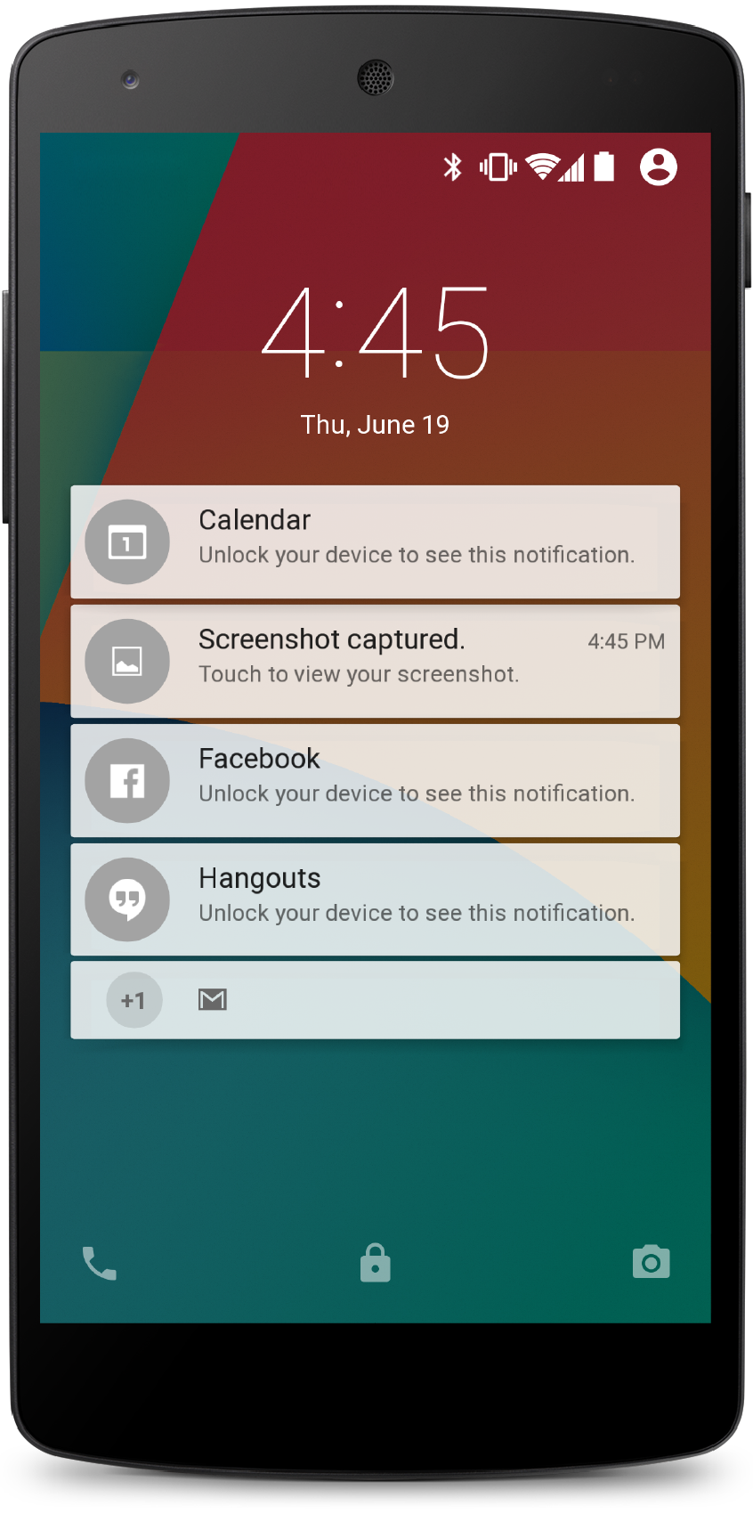
On the lockscreen
Starting in L, notifications are visible on the lockscreen, and so we must consider the user's
privacy. Notifications often contain sensitive information, and we must take care when showing it to
anyone who picks up the device and turns on the display.
- For devices without a secure lockscreen, a simple slide gesture unlocks the whole device.
Therefore, Android will always show the complete contents of all notifications on insecure lockscreens.
- When a device has a secure lockscreen (PIN, pattern, or password), however, it divides the
interface into two spheres: "public", the things that are displayed atop a secure lockscreen and
can therefore be seen by anyone; and "private", the world behind that lockscreen, which can only
be accessed by supplying the correct authentication.
The user decides what shows on the secure lockscreen
When setting up a secure lockscreen, the user can choose to conceal sensitive details from atop the secure lockscreen. In this case the SystemUI considers the notification's visibility level to figure out what can safely be shown.
To control the visibility level, call
Notification.Builder.setVisibility() and specify one of these values:
Notification.VISIBILITY_PUBLIC. Shows the notification's full content.
This is the system default if visibility is left unspecified.Notification.VISIBILITY_PRIVATE. The lockscreen will reveal basic information about the existence of this notification, including its icon and the name of the app that posted it. The rest of the notification's details, however, are not displayed.
- If you want to provide a different public version of your notification for the system to display on a secure lockscreen, supply a replacement Notification object in the
Notification.publicVersion field.
- This is an app's opportunity to create a redacted version of the content that is still useful but does not reveal personal information.
- Example: An SMS app whose notifications include the text of the SMS and the sender's name and contact icon. This notification should be
VISIBILITY_PRIVATE, but the publicVersion could still contain useful information like "3 new messages" without any other identifying details.
Notification.VISIBILITY_SECRET. Shows only the most minimal information, excluding even the notification's icon.