This tab provides some limited control over the graphical representation of model elements in the diagram in the editing pane.
Model elements that do not have any specific direct graphical representation on the screen (beyond their textual description) do not have style tabs of their own. For example the style sheet of an operation on a class will be downlighted.
Style sheets vary a little from model element to model element, but
Figure 13.8, “
A typical Presentation tab on the
details pane
” shows a typical style
tab for a model element in ArgoUML (in this case a class).
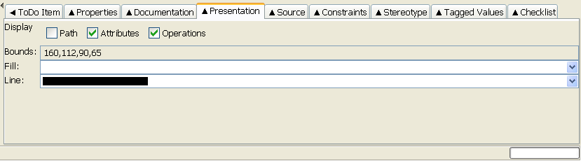
There may be further fields in some cases, e.g. for a package, but most fields are common to many model elements.
PathThis checkbox allow to display or hide the path in front of the name of the modelelement. It is shown in UML notation with::seperators. E.g. the ArgoUML Main class would be shown as:org::argouml::application::Main.AttributesThis checkbox allows to hide or show the attributes compartment of a class.OperationThis checkbox allows to hide or show the operations compartment of a class or interface.StereotypeThis checkbox allows to reveal or hide the stereotypes of a package, shown above the name.VisibilityThis checkbox allows to hide the visibility of a package. The visibility is shown in UML notation as +, -, # or ~.Extension PointsThis checkbox allows to reveal or hide the extensions points compartment of a usecase.Bounds:This defines the corners of the bounding box for a 2D model element. It comprises four numbers separated by commas. These four numbers are respectively: i) the X coordinate of the upper left corner of the box; ii) the Y coordinate of the upper left corner of the box; iii) the width of the box; and iv) the height of the box. All units are pixels on the editing pane.This field has no effect on 1D model elements that link other model elements (associations, generalizations etc), since their position is constrained by their connectedness. In this case the field is downlighted.
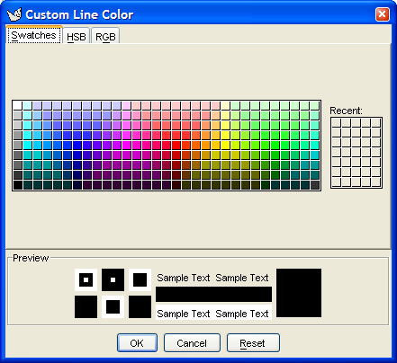
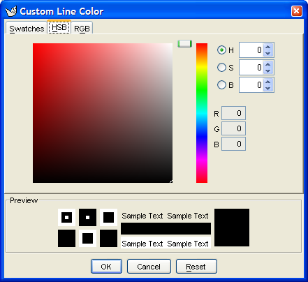
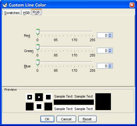
Fill:This drop-down selector specifies the fill color for 2D model elements. It is not present for line model elements. SelectingNo Fillmakes the model element transparant. SelectingCustomallows to create other colors then the ones listed. It causes the color selector dialog box to appear, see Figure 13.9, “ TheCustom Fill/Line Colordialog box ”.Line:This drop-down selector specifies the line color for model elements. SelectingNo Fillmakes the model element transparant. SelectingCustomallows to create other colors then the ones listed. It causes the color selector dialog box to appear, see Figure 13.9, “ TheCustom Fill/Line Colordialog box ”.