|
|
|
GTK+ 3 Reference Manual | |
|---|---|---|---|---|
| Top | Description | Object Hierarchy | Implemented Interfaces | ||||
#include <gtk/gtk.h> struct GtkCssProvider; GtkCssProvider * gtk_css_provider_get_default (void); GtkCssProvider * gtk_css_provider_get_named (const gchar *name,const gchar *variant); gboolean gtk_css_provider_load_from_data (GtkCssProvider *css_provider,const gchar *data,gssize length,GError **error); gboolean gtk_css_provider_load_from_file (GtkCssProvider *css_provider,GFile *file,GError **error); gboolean gtk_css_provider_load_from_path (GtkCssProvider *css_provider,const gchar *path,GError **error); GtkCssProvider * gtk_css_provider_new (void); #define GTK_CSS_PROVIDER_ERROR enum GtkCssProviderError;
GtkCssProvider is an object implementing the GtkStyleProvider interface. It is able to parse CSS-like input in order to style widgets.
An application can cause GTK+ to parse a specific CSS style sheet by
calling gtk_css_provider_load_from_file() and adding the provider with
gtk_style_context_add_provider() or gtk_style_context_add_provider_for_screen().
In addition, certain files will be read when GTK+ is initialized. First,
the file $XDG_CONFIG_HOME/gtk-3.0/gtk.css$HOME/.themes/theme-name/gtk-3.0/gtk.cssdatadir/share/themes/theme-name/gtk-3.0/gtk.csstheme-name is the name of the current theme
(see the "gtk-theme-name" setting) and datadir
is the prefix configured when GTK+ was compiled, unless overridden by the
GTK_DATA_PREFIX environment variable.
The basic structure of the style sheets understood by this provider is a series of statements, which are either rule sets or '@-rules', separated by whitespace.
A rule set consists of a selector and a declaration block, which is a series of declarations enclosed in curly braces ({ and }). The declarations are separated by semicolons (;). Multiple selectors can share the same declaration block, by putting all the separators in front of the block, separated by commas.
Selectors work very similar to the way they do in CSS, with widget class names taking the role of element names, and widget names taking the role of IDs. When used in a selector, widget names must be prefixed with a '#' character. The '*' character represents the so-called universal selector, which matches any widget.
To express more complicated situations, selectors can be combined in various ways:
To require that a widget satisfies several conditions,
combine several selectors into one by concatenating them. E.g.
GtkButton#button1 matches a GtkButton widget
with the name button1.
To only match a widget when it occurs inside some other
widget, write the two selectors after each other, separated by whitespace.
E.g. GtkToolBar GtkButton matches GtkButton widgets
that occur inside a GtkToolBar.
In the previous example, the GtkButton is matched even
if it occurs deeply nested inside the toolbar. To restrict the match
to direct children of the parent widget, insert a '>' character between
the two selectors. E.g. GtkNotebook > GtkLabel matches
GtkLabel widgets that are direct children of a GtkNotebook.
Example 24. Widget classes and names in selectors
1 2 3 4 5 6 7 8 9 10 11 12 13 14 15 16 17 18 19 20 21 22 23 24 25 26 27 28 29 30 31 32 |
/* Theme labels that are descendants of a window */ GtkWindow GtkLabel { background-color: #898989 } /* Theme notebooks, and anything that's within these */ GtkNotebook { background-color: #a939f0 } /* Theme combo boxes, and entries that are direct children of a notebook */ GtkComboBox, GtkNotebook > GtkEntry { color: @fg_color; background-color: #1209a2 } /* Theme any widget within a GtkBin */ GtkBin * { font-name: Sans 20 } /* Theme a label named title-label */ GtkLabel#title-label { font-name: Sans 15 } /* Theme any widget named main-entry */ #main-entry { background-color: #f0a810 } |
Widgets may also define style classes, which can be used for matching. When used in a selector, style classes must be prefixed with a '.' character.
Refer to the documentation of individual widgets to learn which style classes they define and see the section called “Style classes and regions” for a list of all style classes used by GTK+ widgets.
Note that there is some ambiguity in the selector syntax when it comes to differentiation widget class names from regions. GTK+ currently treats a string as a widget class name if it contains any uppercase characters (which should work for more widgets with names like GtkLabel).
Example 25. Style classes in selectors
1 2 3 4 5 6 7 8 9 |
/* Theme all widgets defining the class entry */ .entry { color: #39f1f9; } /* Theme spinbuttons' entry */ GtkSpinButton.entry { color: #900185 } |
In complicated widgets like e.g. a GtkNotebook, it may be desirable to style different parts of the widget differently. To make this possible, container widgets may define regions, whose names may be used for matching in selectors.
Some containers allow to further differentiate between regions by applying so-called pseudo-classes to the region. For example, the tab region in GtkNotebook allows to single out the first or last tab by using the :first-child or :last-child pseudo-class. When used in selectors, pseudo-classes must be prefixed with a ':' character.
Refer to the documentation of individual widgets to learn which regions and pseudo-classes they define and see the section called “Style classes and regions” for a list of all regions used by GTK+ widgets.
Example 26. Regions in selectors
1 2 3 4 5 6 7 8 9 10 11 12 13 14 15 16 |
/* Theme any label within a notebook */ GtkNotebook GtkLabel { color: #f90192; } /* Theme labels within notebook tabs */ GtkNotebook tab GtkLabel { color: #703910; } /* Theme labels in the any first notebook tab, both selectors are equivalent */ GtkNotebook tab:nth-child(first) GtkLabel, GtkNotebook tab:first-child GtkLabel { color: #89d012; } |
Another use of pseudo-classes is to match widgets depending on their state. This is conceptually similar to the :hover, :active or :focus pseudo-classes in CSS. The available pseudo-classes for widget states are :active, :prelight (or :hover), :insensitive, :selected, :focused and :inconsistent.
Example 27. Styling specific widget states
1 2 3 4 5 6 7 8 9 10 11 12 13 14 15 16 17 18 19 20 21 22 23 24 25 26 27 28 29 30 31 32 |
/* Theme active (pressed) buttons */ GtkButton:active { background-color: #0274d9; } /* Theme buttons with the mouse pointer on it, both are equivalent */ GtkButton:hover, GtkButton:prelight { background-color: #3085a9; } /* Theme insensitive widgets, both are equivalent */ :insensitive, *:insensitive { background-color: #320a91; } /* Theme selection colors in entries */ GtkEntry:selected { background-color: #56f9a0; } /* Theme focused labels */ GtkLabel:focused { background-color: #b4940f; } /* Theme inconsistent checkbuttons */ GtkCheckButton:inconsistent { background-color: #20395a; } |
Widget state pseudoclasses may only apply to the last element in a selector.
To determine the effective style for a widget, all the matching rule sets are merged. As in CSS, rules apply by specificity, so the rules whose selectors more closely match a widget path will take precedence over the others.
GTK+'s CSS supports the @import rule, in order to load another CSS style sheet in addition to the currently parsed one.
In order to extend key bindings affecting different widgets, GTK+ supports the @binding-set rule to parse a set of bind/unbind directives, see GtkBindingSet for the supported syntax. Note that the binding sets defined in this way must be associated with rule sets by setting the gtk-key-bindings style property.
Customized key bindings are typically defined in a separate
gtk-keys.css CSS file and GTK+ loads this file
according to the current key theme, which is defined by the
"gtk-key-theme-name" setting.
Example 29. Using the @binding rule
1 2 3 4 5 6 7 8 9 10 11 12 13 14 |
@binding-set binding-set1 { bind "<alt>Left" { "move-cursor" (visual-positions, -3, 0) }; unbind "End"; }; @binding-set binding-set2 { bind "<alt>Right" { "move-cursor" (visual-positions, 3, 0) }; bind "<alt>KP_space" { "delete-from-cursor" (whitespace, 1) "insert-at-cursor" (" ") }; }; GtkEntry { gtk-key-bindings: binding-set1, binding-set2; } |
GTK+ also supports an additional @define-color rule, in order to define a color name which may be used instead of color numeric representations. Also see the "gtk-color-scheme" setting for a way to override the values of these named colors.
Example 30. Defining colors
1 2 3 4 5 |
@define-color bg_color #f9a039; * { background-color: @bg_color; } |
Besides being able to define color names, the CSS parser is also able to read different color expressions, which can also be nested, providing a rich language to define colors which are derived from a set of base colors.
The various ways to express colors in GTK+ CSS are:
| Syntax | Explanation | Examples |
|---|---|---|
rgb(r, g, b) |
An opaque color; r, g, b can be either integers between
0 and 255 or percentages |
rgb(128, 10, 54) |
rgba(r, g, b, a) |
A translucent color; r, g, b are as in the previous row,
a is a floating point number between 0 and 1 |
rgba(255, 255, 0, 0.5) |
#xxyyzz
|
An opaque color; xx, yy, zz are hexadecimal numbers
specifying r, g, b variants with between 1 and 4
hexadecimal digits per component are allowed |
#ff12ab |
| @name | Reference to a color that has been defined with @define-color | @bg_color |
mix(color1, color2, f) |
A linear combination of color1 and color2. f is a
floating point number between 0 and 1. |
mix(#ff1e0a, @bg_color, 0.8) |
shade(color, f) |
A lighter or darker variant of color. f is a
floating point number.
|
shade(@fg_color, 0.5) |
lighter(color) |
A lighter variant of color
|
|
darker(color) |
A darker variant of color
|
Linear or radial Gradients can be used as background images.
A linear gradient along the line from (start_x, start_y) to
(end_x, end_y) is specified using the syntax
-gtk-gradient (linear,
start_x start_y, end_x end_y,
color-stop (position, color),
...)
where start_x and end_x can be either a floating point number between
0 and 1 or one of the special values 'left', 'right' or 'center', start_y
and end_y can be either a floating point number between 0 and 1 or one
of the special values 'top', 'bottom' or 'center', position is a floating
point number between 0 and 1 and color is a color expression (see above).
The color-stop can be repeated multiple times to add more than one color
stop. 'from (color)' and 'to (color)' can be used as abbreviations for
color stops with position 0 and 1, respectively.
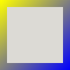
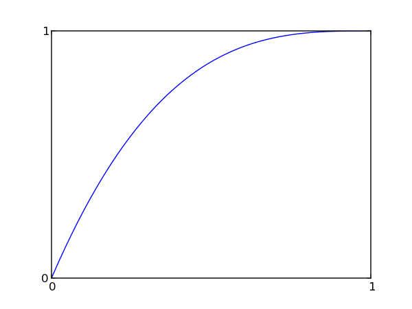
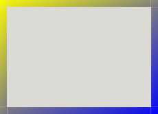
Example 32. A linear gradient

This gradient was specified with
-gtk-gradient (linear,
left top, right bottom,
from(@yellow), to(@blue))
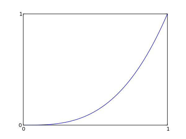
Example 33. Another linear gradient

This gradient was specified with
-gtk-gradient (linear,
0 0, 0 1,
color-stop(0, @yellow),
color-stop(0.2, @blue),
color-stop(1, #0f0))
A radial gradient along the two circles defined by (start_x, start_y,
start_radius) and (end_x, end_y, end_radius) is specified using the
syntax
-gtk-gradient (radial,
start_x start_y, start_radius,
end_x end_y, end_radius,
color-stop (position, color),
...)
where start_radius and end_radius are floating point numbers and
the other parameters are as before.
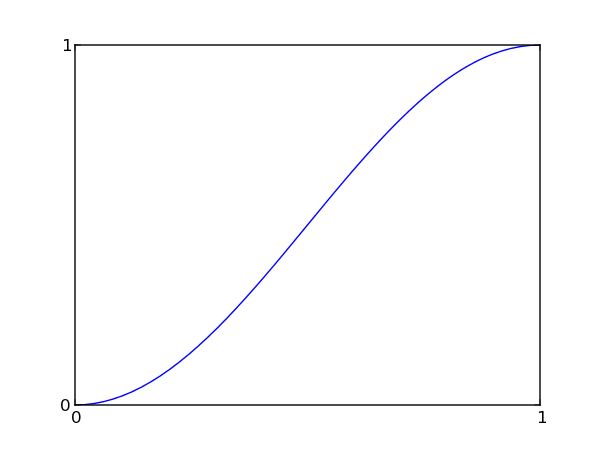
Example 34. A radial gradient
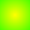
This gradient was specified with
-gtk-gradient (radial,
center center, 0,
center center, 1,
from(@yellow), to(@green))
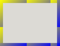
Example 35. Another radial gradient

This gradient was specified with
-gtk-gradient (radial,
0.4 0.4, 0.1,
0.6 0.6, 0.7,
color-stop (0, #f00),
color-stop (0.1, #a0f),
color-stop (0.2, @yellow),
color-stop (1, @green))
Images can be used in 'slices' for the purpose of creating scalable borders.

The syntax for specifying border images of this kind is:
url(path) top right bottom left [repeat|stretch]? [repeat|stretch]?
The sizes of the 'cut off' portions are specified
with the top, right, bottom and left parameters.
The 'middle' sections can be repeated or stretched to create
the desired effect, by adding the 'repeat' or 'stretch' options after
the dimensions. If two options are specified, the first one affects
the horizontal behaviour and the second one the vertical behaviour.
If only one option is specified, it affects both.
Example 37. A repeating border image
This border image was specified with
url("gradient1.png") 10 10 10 10 repeat
Example 38. A stretched border image
This border image was specified with
url("gradient1.png") 10 10 10 10 stretch
Styles can specify transitions that will be used to create a gradual change in the appearance when a widget state changes. The following syntax is used to specify transitions:
duration [s|ms] [linear|ease|ease-in|ease-out|ease-in-out] [loop]?
The duration is the amount of time that the animation will take for
a complete cycle from start to end. If the loop option is given, the
animation will be repated until the state changes again.
The option after the duration determines the transition function from a
small set of predefined functions.
Properties are the part that differ the most to common CSS, not all properties are supported (some are planned to be supported eventually, some others are meaningless or don't map intuitively in a widget based environment).
There is also a difference in shorthand properties, for
example in common CSS it is fine to define a font through
the different font-family, font-style, font-size
properties, meanwhile in GTK+'s CSS only the canonical
font property is supported.
The currently supported properties are:
| Property name | Syntax | Maps to | Examples |
|---|---|---|---|
| engine | engine-name | GtkThemingEngine | engine: clearlooks; engine: none; /* use the default (i.e. builtin) engine) */ |
| background-color | color (see above) | GdkRGBA |
background-color: #fff; |
| color | |||
| border-color | |||
| font |
family [style] [size] |
PangoFontDescription | font: Sans 15; |
| margin |
|
GtkBorder |
margin: 5; |
| padding | |||
| background-image | gradient (see above) or |
cairo_pattern_t |
-gtk-gradient (linear, |
| border-width | integer | gint | border-width: 5; |
| border-radius | integer | gint | border-radius: 5; |
| border-style | [none|solid|inset|outset] | GtkBorderStyle | border-style: solid; |
| border-image | border image (see above) |
internal use only |
border-image: url("/path/to/image.png") 3 4 3 4 stretch; |
| transition | transition (see above) | internal use only |
transition: 150ms ease-in-out; |
| gtk-key-bindings | binding set name list | internal use only |
gtk-bindings: binding1, binding2, ...; |
GtkThemingEngines can register their own, engine-specific style properties
with the function gtk_theming_engine_register_property(). These properties
can be set in CSS like other properties, using a name of the form
-namespace-name
, where namespace is typically
the name of the theming engine, and name is the
name of the property. Style properties that have been registered by widgets
using gtk_widget_class_install_style_property() can also be set in this
way, using the widget class name for namespace.
Example 39. Using engine-specific style properties
1 2 3 4 5 6 |
* { engine: clearlooks; border-radius: 4; -GtkPaned-handle-size: 6; -clearlooks-colorize-scrollbar: false; } |
GtkCssProvider * gtk_css_provider_get_default (void);
Returns the provider containing the style settings used as a fallback for all widgets.
Returns : |
The provider used for fallback styling. This memory is owned by GTK+, and you must not free it. [transfer none] |
GtkCssProvider * gtk_css_provider_get_named (const gchar *name,const gchar *variant);
Loads a theme from the usual theme paths
|
A theme name |
|
variant to load, for example, "dark", or
NULL for the default. [allow-none]
|
Returns : |
a GtkCssProvider with the theme loaded. This memory is owned by GTK+, and you must not free it. [transfer none] |
gboolean gtk_css_provider_load_from_data (GtkCssProvider *css_provider,const gchar *data,gssize length,GError **error);
Loads data into css_provider, making it clear any previously loaded
information.
|
a GtkCssProvider |
|
CSS data loaded in memory |
|
the length of data in bytes, or -1 for NUL terminated strings |
|
return location for a GError, or NULL. [out][allow-none]
|
Returns : |
TRUE if the data could be loaded. |
gboolean gtk_css_provider_load_from_file (GtkCssProvider *css_provider,GFile *file,GError **error);
Loads the data contained in file into css_provider, making it
clear any previously loaded information.
|
a GtkCssProvider |
|
GFile pointing to a file to load |
|
return location for a GError, or NULL. [out][allow-none]
|
Returns : |
TRUE if the data could be loaded. |
gboolean gtk_css_provider_load_from_path (GtkCssProvider *css_provider,const gchar *path,GError **error);
Loads the data contained in path into css_provider, making it clear
any previously loaded information.
|
a GtkCssProvider |
|
the path of a filename to load, in the GLib filename encoding |
|
return location for a GError, or NULL. [out][allow-none]
|
Returns : |
TRUE if the data could be loaded. |
GtkCssProvider * gtk_css_provider_new (void);
Returns a newly created GtkCssProvider.
Returns : |
A new GtkCssProvider |