| Inkscape » Quick Start » The Anatomy of the Inkscape Window |    |
|---|
| Inkscape » Quick Start » The Anatomy of the Inkscape Window | |
|---|
Updated for v0.46.
Start by opening Inkscape.[3] You will see a single window. This window contains several major areas, many containing clickable icons or pull-down menus. The following figure shows this window and labels key parts.
The Command Bar, Tool Controls, and Tool Box are detachable by dragging on the handles (highlighted in blue) at the far left or top. They can be returned to their normal place by dragging them back. They, as well as the Palette and Status Bar, can be hidden using the → submenu.
As Inkscape has grown more complex, the area required to include
icons and entry boxes for all the various items has also grown leading
to problems when Inkscape is used on small screens. As of v0.46 the
Command Bar and all the Tool Controls have variable widths. If
there are too many items to be shown in the width the Inkscape window,
a small down arrow will appear
on the right side of the bars. Clicking on this arrow will open a drop-down
menu with access to the missing items. One can also choose to use a smaller
set of icons by checking the
Make the commands toolbar icons smaller and
Make the main toolbar icons smaller boxes on the
Misc section of the Inkscape Preferences
dialog ( →
 Inkscape Preferences...
(Shift+Ctrl+P)).
With these boxes checked, the smallest Inkscape window
becomes 602 pixels wide and 620 pixels high (this may depend on
which operating system you are using and the availability of a small
icon set). By hiding all the various window components
(Command Bar, Palette, etc.), you can get an Inkscape window
just 447 pixels wide and 284 high.
Inkscape Preferences...
(Shift+Ctrl+P)).
With these boxes checked, the smallest Inkscape window
becomes 602 pixels wide and 620 pixels high (this may depend on
which operating system you are using and the availability of a small
icon set). By hiding all the various window components
(Command Bar, Palette, etc.), you can get an Inkscape window
just 447 pixels wide and 284 high.
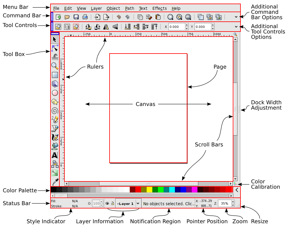
The drawing area. It may extend outside the viewable area. It can be panned (scrolled left/right and up/down) and zoomed.
The part of the Canvas area corresponding to a printed page or other predefined area. Useful for setting an output region in printing or exporting a bitmap image. It may extend outside the viewable area.[4]
Contains shortcuts to many of the items located in the menus. Click on the Down arrow on the right end to access entries missing due to space.
Contains “Tools” for selecting, drawing, or modifying, objects. Clicking on an icon selects a tool. Double-clicking brings up that tool's preference dialog. The cursor (pointer) changes shape when placed over the canvas depending on which tool is selected.
Available tools:
 ,
,
 ,
,
 ,
,
 ,
,
 ,
,
 ,
,
 ,
,
 ,
,
 ,
,
 ,
,
 ,
,
 ,
,
 ,
,
 ,
,
 ,
,
 ,
,
 .
.
Contains entry boxes and clickable icons that are specific to the selected tool. For example, when the Rectangle Tool is in use, an entry box to specify a selected rectangle's width appears. Click on the Down arrow on the right end to access entries that may be missing due to space. If there is no arrow then all options are being shown.
Contains a color palette. Colors can be dragged from the palette onto objects to change their Fill. Using the Shift key while dragging will change the Stroke color instead. The color used by some tools can be set by clicking on a color swatch. The palette can be changed by clicking on the arrow icon at the right end of the palette. Many predefined palettes are included. If the number of color swatches in a palette exceeds the space allocated, the scroll bar beneath the palette can be used to access the hidden swatches.
Contains several areas including the Style Indicator, current drawing layer, pointer position, current drawing layer (and if it is visible or locked), current zoom level, window resize handle, and a Notification Region that describes context dependent options.
Shows the style (Fill and Stroke) of a selected object, text fragment, or gradient stop. A Left Mouse Click on the Fill or Stroke paint part of the indicator opens the Fill and Stroke dialog. A Right Mouse Click opens up a pop-up menu. See the section called “Style Indicator” in Chapter 9, Attributes for details and more uses.
Contains context dependent information. If the region is too small to view all the text, placing the cursor over the region will display a tool tip with the full text.
![[Tip]](../images/admons/tip.png) | Tip |
|---|---|
The Notification Region contains very useful information. Pay close attention to it when using an unfamiliar tool. |
Show the x- and y-axis coordinates of the drawing. Click-dragging from a Ruler onto the Canvas creates a Guide Line.
Allows scrolling to adjust which part of the Canvas is viewable.
Button toggles on/off use of a Color Profile (if set up).
New in v0.46.
Inkscape v0.46 introduces Dockable Dialogs. With this feature, opened dialogs are placed inside the main Inkscape window on the right side as seen in the next figure.
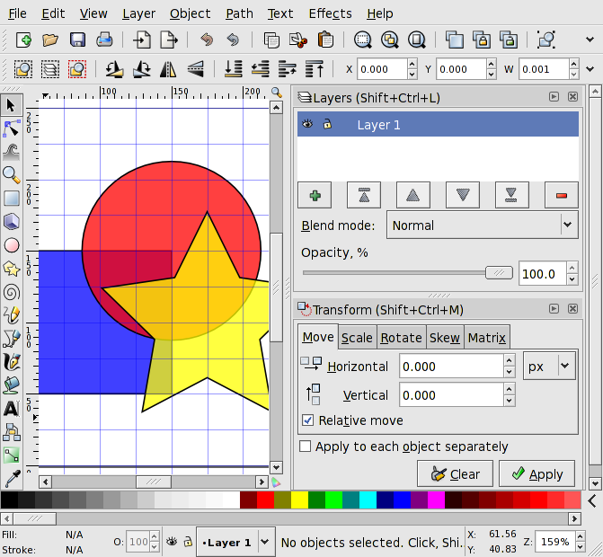
The docked dialogs can be rearranged, resized (if space permits), stacked, and iconified. To move a dialog, Left Mouse Drag in the dialog's title bar. Dialogs can also be dragged off of the main window into their own window. Each dialog can have its own window or they can be grouped in floating docks.
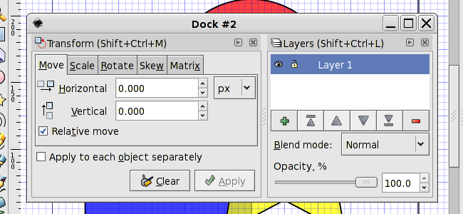
Selecting Floating under Dialog
behavior in the Windows section of
the Inkscape Preferences dialog ( →
Inkscape Preferences...
(Shift+Ctrl+P)) disables the use of
docks. Instead, all dialogs will be opened in their own window.
There is still some work to be done on the implementation of dockable dialogs. For example, a few dialogs have yet to be converted to be dockable (e.g. Text, Object properties). Bugs may also be encountered.
[3] On the Mac OS X operating system, the Inkscape interface uses the X11-window layer, available on the 10.4 and 10.5 installation DVDs. The non-native interface lacks the look and feel of “normal” Mac programs. Fear not, it will still work, although starting Inkscape may take a bit longer than other programs, especially the first time. A native version of Inkscape is in the works.
[4] Inkscape uses the terms Canvas and Page inconsistently. In this manual, Canvas will refer to the entire drawing area while Page will refer to a specified region of the Canvas corresponding to a defined output area.
| |  | |
| Chapter 1. Quick Start |  | The Swedish Flag - A Short Example |
© 2005-2008 Tavmjong Bah. | Get the book. |