Use recommended UI panel formatting
It is important to use consistent style and placement for text and icons in the UI.
Workflow navigation text
Use default values for page or window title bars, side navigation, fonts, and text size. For example, tab titles must be a smaller text size than the section heading.
Similarly, the node item title must be a smaller font than the page or window title. If necessary, you might have to shorten the node item title in order to maintain the default width.
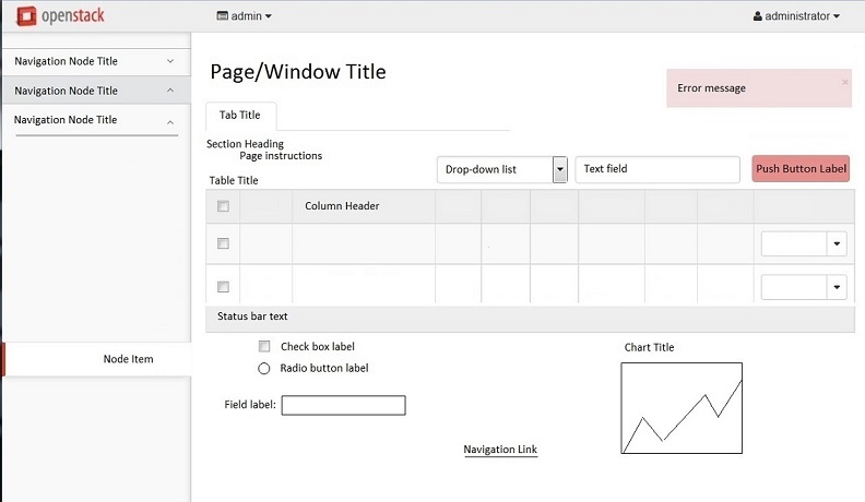
Note
The image below is not to scale. It is only intended as a reference for the various UI elements mentioned.
Icons
Be selective when deciding to use icons instead of text. It is often difficult for users to understand the intent of an icon. New icons should be thoroughly reviewed and tested by the user experience project. That said, icons can improve usability in specific instances.
For example:
You have limited space.
The icon is quickly recognizable.
Note
Consider global audiences and whether the icon is recognizable across cultural differences.
The icon enhances design appeal.
If you decide to use an icon, follow these tips:
- Keep the design simple and consistent.
- Keep the location of individual icons consistent. Users recognize and expect patterns which help to establish meaning and function.
- Ensure the icon is quickly recognizable and memorable. For help, work with the UX project.
- If there is space, consider adding a text label to the icon.

Except where otherwise noted, this document is licensed under Creative Commons Attribution 3.0 License. See all OpenStack Legal Documents.