
Creating Components
A component provides a way of defining a new visual item that you can re-use in other QML files. A component is like a black box; it interacts with the outside world through properties, signals, and slots, and is generally defined in its own QML file. You can import components to screens and applications.
You can use the following QML types to create components:
- BorderImage uses an image as a border or background.
- Image adds a bitmap to the scene. You can stretch and tile images.
- Item is the most basic of all visual types in QML. Even though it has no visual appearance, it defines all the properties that are common across visual types, such as the x and y position, width and height, anchoring, and key handling.
- Rectangle adds a rectangle that is painted with a solid fill color and an optional border. You can also use the radius property to create rounded rectangles.
- Text adds formatted read-only text.
- TextEdit adds a single line of editable formatted text that can be validated.
- TextInput adds a single line of editable plain text that can be validated.
You can also use ready-made Qt Quick 1 Components (for Qt 4) to create screens with a native look and feel for a particular target platform. Since Qt 5.1, Qt Quick Controls, Dialogs, and Layouts are available for creating classic desktop-style user interfaces using Qt Quick 2.1. You can use the Qt Quick Controls Styles to customize Qt Quick Controls.
The Qt Creator project wizards create Qt Quick applications that use Qt Quick Components or Controls.
Even if you use the Qt Quick Components, you can still write cross-platform applications, by using different sets of QML files for each platform.
Creating Components in Qt Quick Designer
- Select File > New File or Project > Files and Classes > Qt > QML File (Qt Quick 1) or QML File (Qt Quick 2) > Choose to create a new .qml file.
Note: Components are listed in the QML Components section of the Library only if the filename begins with a capital letter.
- Click Design to open the .qml file in Qt Quick Designer.
- Drag and drop a QML type from the Library to the editor.
- Edit its properties in the Properties pane.
The available properties depend on the QML type.
The following sections contain examples of how to create some common components:
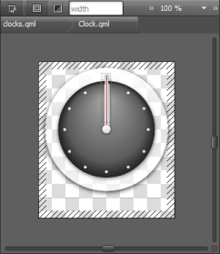
Moving Within Components
Components can consist of several other components. To view the component hierarchy as a bread crumb path when you edit a component on the canvas, select Go into Component or press F2. Click the component names in the path to navigate to them. You can easily navigate back to the top level when you are done editing the component.
© 2015 The Qt Company Ltd. Documentation contributions included herein are the copyrights of their respective owners. The documentation provided herein is licensed under the terms of the GNU Free Documentation License version 1.3 as published by the Free Software Foundation. Qt and respective logos are trademarks of The Qt Company Ltd in Finland and/or other countries worldwide. All other trademarks are property of their respective owners.