GUI Basics
This section will explain the bare necessities for scripting Controls with UnityGUI.
Making Controls with UnityGUI
UnityGUI controls make use of a special function called OnGUI(). The OnGUI() function gets called every frame as long as the containing script is enabled - just like the Update() function.
GUI controls themselves are very simple in structure. This structure is evident in the following example.
/* Example level loader */

function OnGUI () {
	// Make a background box
	GUI.Box (Rect (10,10,100,90), "Loader Menu");

	// Make the first button. If it is pressed, Application.Loadlevel (1) will be executed
	if (GUI.Button (Rect (20,40,80,20), "Level 1")) {
		Application.LoadLevel (1);
	}

	// Make the second button.
	if (GUI.Button (Rect (20,70,80,20), "Level 2")) {
		Application.LoadLevel (2);
	}
}
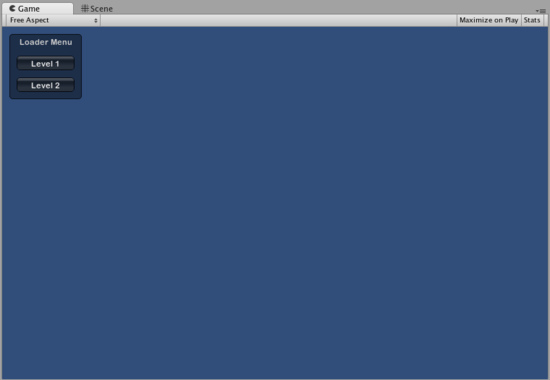
This example is a complete, functional level loader. If you copy/paste this script and attach it a GameObject, you'll see the following menu appear in when you enter Play Mode:

The Loader Menu created by the example code
Let's take a look at the details of the example code:
The first GUI line, GUI.Box (Rect (10,10,100,90), "Loader Menu"); displays a Box Control with the header text "Loader Menu". It follows the typical GUI Control declaration scheme which we'll explore momentarily.
The next GUI line is a Button Control declaration. Notice that it is slightly different from the Box Control declaration. Specifically, the entire Button declaration is placed inside an if statement. When the game is running and the Button is clicked, this if statement returns true and any code inside the if block is executed.
Since the OnGUI() code gets called every frame, you don't need to explicitly create or destroy GUI controls. The line that declares the Control is the same one that creates it. If you need to display Controls at specific times, you can use any kind of scripting logic to do so.
/* Flashing button example */

function OnGUI () {
	if (Time.time % 2 < 1) {
		if (GUI.Button (Rect (10,10,200,20), "Meet the flashing button")) {
			print ("You clicked me!");
		}
	}
}
Here, GUI.Button() only gets called every other second, so the button will appear and disappear. Naturally, the user can only click it when the button is visible.
As you can see, you can use any desired logic to control when GUI Controls are displayed and functional. Now we will explore the details of each Control's declaration.
Anatomy of a Control
There are three key pieces of information required when declaring a GUI Control:
Type (Position, Content)
Observe that this structure is a function with two arguments. We'll explore the details of this structure now.
Type
Type is the Control Type, and is declared by calling a function in Unity's GUI class or the GUILayout class, which is discussed at length in the Layout Modes section of the Guide. For example, GUI.Label() will create a non-interactive label. All the different control types are explained later, in the Controls section of the Guide.
Position
The Position is the first argument in any GUI Control function. The argument itself is provided with a Rect() function. Rect() defines four properties: left-most position, top-most position, total width, total height. All of these values are provided in integers, which correspond to pixel values. All UnityGUI controls work in Screen Space, which is the resolution of the published player in pixels.
The coordinate system is top-left based. Rect(10, 20, 300, 100) defines a Rectangle that starts at coordinates: 0,20 and ends at coordinates 310,120. It is worth repeating that the second pair of values in Rect() are total width and height, not the coordinates where the controls end. This is why the example mentioned above ends at 310,120 and not 300,100.
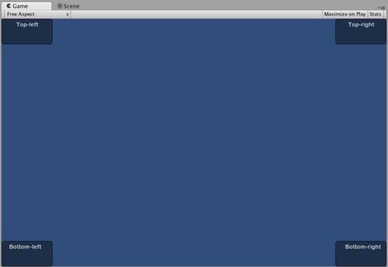
You can use the Screen.width and Screen.height properties to get the total dimensions of the screen space available in the player. The following example may help clarify how this is done:
/* Screen.width & Screen.height example */

function OnGUI () {
	GUI.Box (Rect (0,0,100,50), "Top-left");
	GUI.Box (Rect (Screen.width - 100,0,100,50), "Top-right");
	GUI.Box (Rect (0,Screen.height - 50,100,50), "Bottom-left");
	GUI.Box (Rect (Screen.width - 100,Screen.height - 50,100,50), "Bottom-right");
}

The Boxes positioned by the above example
Content
The second argument for a GUI Control is the actual content to be displayed with the Control. Most often you will want to display some text or an image on your Control. To display text, pass a string as the Content argument like this:
/* String Content example */

function OnGUI () {
	GUI.Label (Rect (0,0,100,50), "This is the text string for a Label Control");
}
To display an image, declare a Texture2D public variable, and pass the variable name as the content argument like this:
/* Texture2D Content example */

var controlTexture : Texture2D;

function OnGUI () {
	GUI.Label (Rect (0,0,100,50), controlTexture);
}
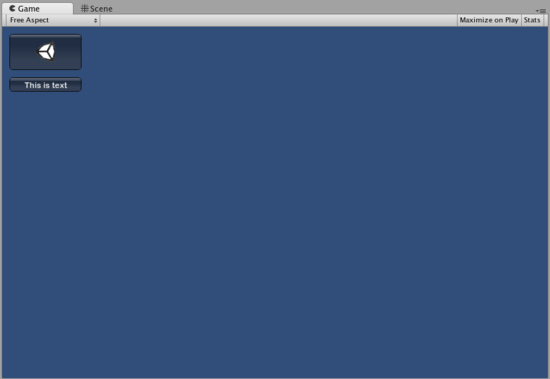
Here is an example closer to a real-world scenario:
/* Button Content examples */

var icon : Texture2D;

function OnGUI () {
	if (GUI.Button (Rect (10,10, 100, 50), icon)) {
		print ("you clicked the icon");
	}

	if (GUI.Button (Rect (10,70, 100, 20), "This is text")) {
		print ("you clicked the text button");
	}
}

The Buttons created by the above example
There is a third option which allows you to display images and text together in a GUI Control. You can provide a GUIContent object as the Content argument, and define the string and image to be displayed within the GUIContent.
/* Using GUIContent to display an image and a string */

var icon : Texture2D;

function OnGUI () {
	GUI.Box (Rect (10,10,100,50), GUIContent("This is text", icon));
}
You can also define a Tooltip in the GUIContent, and display it elsewhere in the GUI when the mouse hovers over it.
/* Using GUIContent to display a tooltip */

function OnGUI () {
	// This line feeds "This is the tooltip" into GUI.tooltip
	GUI.Button (Rect (10,10,100,20), GUIContent ("Click me", "This is the tooltip"));
	// This line reads and displays the contents of GUI.tooltip
	GUI.Label (Rect (10,40,100,20), GUI.tooltip);
}
If you're daring you can also use GUIContent to display a string, an icon, and a tooltip!
/* Using GUIContent to display an image, a string, and a tooltip */

var icon : Texture2D;

function OnGUI () {
	GUI.Button (Rect (10,10,100,20), GUIContent ("Click me", icon, "This is the tooltip"));
	GUI.Label (Rect (10,40,100,20), GUI.tooltip);
}
The scripting reference page for GUIContent's constructor for an extensive list of examples.
Page last updated: 2010-07-16


