We automatically generate the user interface for our information assistants from the hierarchical representation described earlier in this paper. We want to share some of the lessons learned about our human interface design and re-design over the last two years in this section, which is an elaboration of [2].
The greatest challenge in developing the user interface is that it is mixed-initiative: either the user or the system can provide the value for most of the slots. For example, the email address of a meeting contact can typically be automatically computed (from a user's Outlook address book, or from the company White Pages, for example) - but it can also be hand-typed. The user interface must convey which fields were provided by the system and which fields were provided by the user, and most importantly, must assure the users that they are in control and making steady progress on their task. (Imagine a mixed-initiative user interface where the data flow between fields is unclear or apparently cyclic and the system overwrites data provided by the user!)
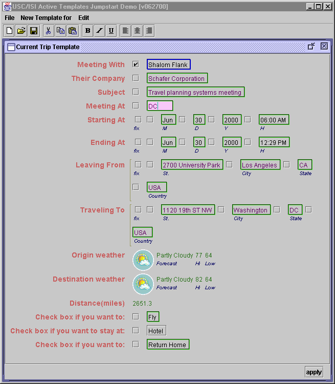
Figure 11 shows our initial design, which we based on the spreadsheet metaphor because our data flow from multiple Web sources is similar to the data flow in spreadsheets, and many users are already familiar and comfortable with that metaphor. Unfortunately, there was a key problem with that metaphor - having two fields in the same vertical column (e.g. San Diego and 28 in the screenshot) suggests a relationship where there is none. It was also difficult to visually distinguish subsections (we tried to do that by indenting the first column, but that was too subtle).
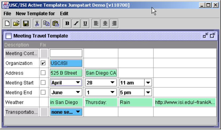
Figure 12 shows our subsequent design. What it shares with the original design is that fields whose values are provided by the user have a blue border, system-provided fields a green border, and fields currently being computed by the system a red border. In the black-and-white screenshot, all fields are green except the first one, provided by the user, which is blue. In addition, every field has a ``locked'' checkbox - whenever a user enters any field manually it is auto-locked and its value is never changed by the system. For example, in Figure 12 the first field is automatically locked because the value was selected by the user; the system is free to change any other field without asking the user. The user could explicitly ask the system to recompute a value by unchecking the checkbox, which then triggers a re-computation. We carried the idea of ``locking'' even further by letting the user lock entire groups of fields. For example, in the Starting At row of the screen shot, the entire date can be locked via the first checkbox and just the month in the second checkbox.
As Figure 1 demonstrates, we made a number of changes from that attempt but kept that basic design. The color-coding of the fields' origin proved to be valuable and understandable, but the locking checkboxes and their hierarchical nesting to be confusing and space-consuming. Fields are now still implicitly locked when the user manually provides a value but no checkbox is shown. Instead, the user can ``unlock'' the field by selecting ``Default'' from the drop-down menu. We also no longer automatically expand new sub-sections of the template, even if the system can safely determine the triggering value. For example, even though the system is quite confident you will fly to a meeting more than 2000 miles away, we do not expand the subsection and start displaying flights - it is a correct inference but too distracting and confusing to the user.
One remaining problem with the automatically generated form is that it can be very large since it does not use screen space as efficiently as if a human designer had laid it out by hand. We plan to address these issues by repeating less information in the subsections, packing the fields more tightly, using a more sophisticated layout mechanism, substituting windows for expanding sub-sections, and by possibly moving some of the more auxiliary supporting information (e.g., Weather) to an output-only Web page in the background.