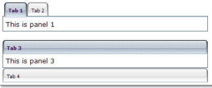
A tabbox that contains the tabs and tabpanels allows developers to separate a large number of components into several groups(each group contains a tab and a tabpanel), and show one group each time, such that the user interface won't be too complicate to read. There is only one group (aka., a tabpanel) is visible at the same time. Once the tab of an invisible group is clicked, it becomes visible and the previous visible group becomes invisible.
The currently selected tab component is given an additional selected property which is set to true. This is used to give the currently selected tab a different appearance so that it will look selected. Only one tab will have a true value for this property at a time. If none of tabs are selected, the first one is selected automatically.

<zk>
<tabbox width="400px">
    <tabs>
        <tab label="Tab 1"/>
        <tab label="Tab 2"/>
    </tabs>
    <tabpanels>
        <tabpanel>This is panel 1</tabpanel>
        <tabpanel>This is panel 2</tabpanel>
    </tabpanels>
</tabbox>
<space/>
<tabbox width="400px" mold="accordion">
    <tabs>
        <tab label="Tab 3"/>
        <tab label="Tab 4"/>
    </tabs>
    <tabpanels>
        <tabpanel>This is panel 3</tabpanel>
        <tabpanel>This is panel 4</tabpanel>
    </tabpanels>
</tabbox>
</zk>
|
Event Name |
Event Type |
|---|---|
|
|
Description: Denotes user has right-clicked the component. |
|
|
Description: Denotes user has selected a tab. onSelect is sent to both tab and tabbox. |
|
Property |
Description |
Data Type |
Default Value |
|---|---|---|---|
|
|
Sets the orient. Values : |
|
|
|
|
Sets the spacing between Tabpanel. This is used by certain molds, such as accordion. |
|
|
|
|
|
|
|
|
|
|
|
|
|
|
|
|
< |