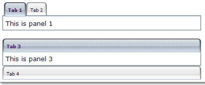
A tabpanel is the body of a single tab panel. You would place the content for a group of components within a tab panel. The first tabpanel corresponds to the first tab, the second tabpanel corresponds to the second tab and so on.

<zk>
<tabbox width="400px">
    <tabs>
        <tab label="Tab 1"/>
        <tab label="Tab 2"/>
    </tabs>
    <tabpanels>
        <tabpanel>This is panel 1</tabpanel>
        <tabpanel>This is panel 2</tabpanel>
    </tabpanels>
</tabbox>
<space/>
<tabbox width="400px" mold="accordion">
    <tabs>
        <tab label="Tab 3"/>
        <tab label="Tab 4"/>
    </tabs>
    <tabpanels>
        <tabpanel>This is panel 3</tabpanel>
        <tabpanel>This is panel 4</tabpanel>
    </tabpanels>
</tabbox>
</zk>
|
Event Name |
Event Type |
|---|---|
|
|
Description: Denotes user has clicked the component. |
|
|
Description: Denotes user has right-clicked the component. |
|
|
Description: Denotes user has double-clicked the component. |
|
Name |
Description |
Data Type |
Values |
|---|---|---|---|
|
|
Returns the index of this panel, or -1 if it doesn't belong to any tabpanels. |
| |
|
|
Returns the tab associated with this tab panel. |
| |
|
|
Returns the tabbox owns this component. |
| |
|
|
Returns whether this tab panel is selected. |
|